The Problem
Imagine setting up a new JioFiber Wi-Fi router in your living room, only to find that the signal drops the moment you walk into your bedroom. To fix this, you cannot change how internet signals work; instead, you must manually log into the router settings, choose between the 2.4GHz or 5GHz band, and adjust the antenna angles until the signal reaches every corner.
These manual settings you tweak before the internet actually starts running are exactly what hyperparameters in ml are.
What is hyperparameters in ml? (And Why Should You Care?)
The Biryani Analogy
Think of a machine learning model as an apprentice chef learning to make the perfect Hyderabadi Biryani.
The ingredients—the exact grams of salt, spice, and rice—are the parameters. The apprentice chef learns and adjusts these ingredients automatically through trial and error as they taste the food.
But before the cooking even begins, the Master Chef has to make some high-level decisions:
What size of handi (pot) should we use?
Should we cook on a high flame or a low flame?
How many minutes should we let the rice steam (dum)?
These high-level decisions are hyperparameters. The apprentice chef cannot “learn” these during cooking; they must be set by the Master Chef beforehand.
In Plain English
In Machine Learning, hyperparameters are the external configuration settings that you (the programmer) must set before training the model. Unlike regular parameters (like weights), the model cannot learn or adjust hyperparameters on its own during training.
Why do we need them? (Where simpler models fail)
If we don’t use hyperparameters, a machine learning model is like an autopilot car with no speed limits or steering sensitivity controls.
Without these controls, the model will either:
Learn too fast and memorize the data (Overfitting): Like a student memorizing past exam papers word-for-word, only to fail when a slightly different question is asked in the actual exam.
Learn too slowly or not at all (Underfitting): Like a student reading only one page of a textbook per day, taking years to finish the syllabus.
Hyperparameters act as the steering wheel and brakes, guiding the model so it learns efficiently without memorizing.
Where is hyperparameters in ml Used in Real Life?
Example 1: IPL Auction Strategy (Sports)
Input (X): A cricket player’s past strike rate, wickets taken, and fitness score.
Output (Y): The predicted bid price for that player.
Why Hyperparameters Fit Here: While the AI model calculates the player’s value (parameters), the team management sets the hyperparameters beforehand: the maximum budget cap (e.g., ₹100 Crores), the minimum number of bowlers required in the squad, and the maximum limit of 4 overseas players. These external rules govern how the AI makes its bidding decisions.
Example 2: PhonePe UPI Fraud Detection (Fintech)
Input (X): Transaction amount, location, time of day, and receiver’s account age.
Output (Y): Fraudulent (Yes) or Safe (No).
Why Hyperparameters Fit Here: The model calculates a “suspicion score” from 0 to 100 for every transaction. Humans must set a crucial hyperparameter: the Threshold Limit. If we set the threshold to 90, only extremely suspicious transactions are blocked. If we set it to 50, even normal transactions get blocked. This threshold must be tuned manually to balance security and user convenience.
Example 3: Flipkart Recommendation Engine (E-commerce)
Input (X): Your search history, items in your cart, and age.
Output (Y): Recommended products on your homepage.
Why Hyperparameters Fit Here: Flipkart uses a Decision Tree model (a flowchart of questions) to predict what you will buy. The hyperparameter here is the Max Depth—the maximum number of questions the flowchart is allowed to ask. If the depth is set too low (e.g., 2 questions), the recommendations are too generic (e.g., showing phones to everyone). If it is set too high (e.g., 50 questions), the recommendations become weirdly specific.
The Math Behind hyperparameters in ml (Don’t Panic!)
To see how a hyperparameter works mathematically, let us look at how a model updates its internal settings using Gradient Descent (the math behind how models learn).
Here is the golden equation:
W_new = W_old – α × (∂L / ∂W)
Let us break down this equation, symbol by symbol, and see how it matches our Python code:
W_new (New Weight): This is the updated setting of our model. In code, this is the updated
w.W_old (Old Weight): This is the current setting of our model before making a new adjustment. In code, this is the current
w.α (Alpha – The Learning Rate): This is our Hyperparameter. It is a number we choose manually (usually a very small decimal like 0.01 or 0.001). It acts as the “step size.” In code, this is
learning_rateorlr.(∂L / ∂W) (The Gradient): This represents the slope or the direction of our mistake. It tells us whether our weight is too high or too low, and by how much. In code, this is
dw.L (The Loss Function): Think of this as our “Disappointment Meter.” If our model makes a terrible prediction, the Loss (L) is very high. If the prediction is perfect, the Loss is zero. In code, this is
loss.
What does “Minimizing the Cost Function” mean?
In human terms, minimizing the cost function means reducing our mistakes to zero. We want to adjust our weights (W) so that our Disappointment Meter (L) hits the lowest possible point on the graph.
The Power of the Hyperparameter (α)
Look closely at the equation again:
W_new = W_old – α × Mistake
The hyperparameter α controls how much we listen to our mistakes:
If α is too large (e.g., 10.0): The model is too impatient. It takes giant leaps. It will overshoot the minimum loss point and bounce around wildly, never learning anything.
If α is too small (e.g., 0.000001): The model is extremely timid. It takes microscopic baby steps. It will take days or weeks of computer processing time just to learn a simple pattern.
By tuning the hyperparameter α to a sweet spot (like 0.01), we ensure the model learns quickly, safely, and accurately!
GIF 1: Why Simple Models Fail ?
import numpy as np
import matplotlib.pyplot as plt
from matplotlib.animation import FuncAnimation
# Set random seed for reproducibility of our Mumbai housing data
np.random.seed(42)
# 1. Generate Synthetic Mumbai House Price Data
# X: Size of flat in 100s of square feet (e.g., 3 means 300 sq ft, 15 means 1500 sq ft)
# Y: Price of flat in Lakhs (e.g., 50 Lakhs, 120 Lakhs)
# We scale X to keep gradient descent stable and prevent numerical overflow
X = np.linspace(-1.5, 1.5, 30)
# True relationship: Price = 2.5 * Size + 1.0 + random noise
Y = 2.5 * X + 1.0 + np.random.normal(0, 0.4, 30)
# 2. Initialize Model Parameters (Weights and Biases)
# Both models start with the exact same bad guess (slope = -3.0, intercept = -3.0)
w_high = -3.0
b_high = -3.0
w_good = -3.0
b_good = -3.0
# 3. Define Hyperparameters (Learning Rates)
lr_high = 0.95 # WRONG: Too high! Will cause wild oscillations
lr_good = 0.1 # CORRECT: Sweet spot! Will converge smoothly
# Lists to store history for the live loss subplots
epochs_history = []
loss_high_history = []
loss_good_history = []
# 4. Set up the Matplotlib Figure and Subplots (2×2 Grid)
fig, axs = plt.subplots(2, 2, figsize=(14, 10))
# Define a function to update the plots frame-by-frame
def update(frame):
global w_high, b_high, w_good, b_good
# — MODEL A: WRONG HYPERPARAMETER (HIGH LEARNING RATE) —
# Compute predictions
y_pred_high = w_high * X + b_high
# Compute Mean Squared Error (Loss)
loss_high = np.mean((y_pred_high – Y) ** 2)
# Compute Gradients (Derivatives of Loss with respect to w and b)
dw_high = (2 / len(X)) * np.sum((y_pred_high – Y) * X)
db_high = (2 / len(X)) * np.sum(y_pred_high – Y)
# Update weights using Gradient Descent
w_high = w_high – lr_high * dw_high
b_high = b_high – lr_high * db_high
# — MODEL B: CORRECT HYPERPARAMETER (GOOD LEARNING RATE) —
# Compute predictions
y_pred_good = w_good * X + b_good
# Compute Mean Squared Error (Loss)
loss_good = np.mean((y_pred_good – Y) ** 2)
# Compute Gradients
dw_good = (2 / len(X)) * np.sum((y_pred_good – Y) * X)
db_good = (2 / len(X)) * np.sum(y_pred_good – Y)
# Update weights using Gradient Descent
w_good = w_good – lr_good * dw_good
b_good = b_good – lr_good * db_good
# Store history for live loss plotting
epochs_history.append(frame)
loss_high_history.append(loss_high)
loss_good_history.append(loss_good)
# — PLOTTING AND RENDERING —
# Clear all subplots to draw the new frame
for ax in axs.flat:
ax.clear()
# Generate a smooth line for plotting the regression fits
line_x = np.linspace(-2.0, 2.0, 100)
# TOP-LEFT: High LR Model Fit
axs[0, 0].scatter(X, Y, color=’orange’, edgecolor=’k’, alpha=0.7, label=’Mumbai Flats’)
line_y_high = w_high * line_x + b_high
axs[0, 0].plot(line_x, line_y_high, color=’red’, linewidth=2.5, label=f’Fit (w={w_high:.2f}, b={b_high:.2f})’)
axs[0, 0].set_xlim(-2.0, 2.0)
axs[0, 0].set_ylim(-8, 8)
axs[0, 0].set_title(f”High LR (α = {lr_high}) | Loss: {loss_high:.2f}”, color=’red’, fontsize=11, fontweight=’bold’)
axs[0, 0].set_xlabel(“Flat Size (Scaled)”)
axs[0, 0].set_ylabel(“Price in Lakhs (Scaled)”)
axs[0, 0].legend(loc=’upper left’)
axs[0, 0].grid(True, linestyle=’–‘, alpha=0.5)
# BOTTOM-LEFT: High LR Loss Curve
axs[1, 0].plot(epochs_history, loss_high_history, color=’red’, linewidth=2)
axs[1, 0].set_title(“High LR Loss History”, color=’red’, fontsize=10, fontweight=’bold’)
axs[1, 0].set_xlabel(“Epoch”)
axs[1, 0].set_ylabel(“Loss (MSE)”)
axs[1, 0].grid(True, linestyle=’–‘, alpha=0.5)
# TOP-RIGHT: Good LR Model Fit
axs[0, 1].scatter(X, Y, color=’orange’, edgecolor=’k’, alpha=0.7, label=’Mumbai Flats’)
line_y_good = w_good * line_x + b_good
axs[0, 1].plot(line_x, line_y_good, color=’green’, linewidth=2.5, label=f’Fit (w={w_good:.2f}, b={b_good:.2f})’)
axs[0, 1].set_xlim(-2.0, 2.0)
axs[0, 1].set_ylim(-8, 8)
axs[0, 1].set_title(f”Good LR (α = {lr_good}) | Loss: {loss_good:.2f}”, color=’green’, fontsize=11, fontweight=’bold’)
axs[0, 1].set_xlabel(“Flat Size (Scaled)”)
axs[0, 1].set_ylabel(“Price in Lakhs (Scaled)”)
axs[0, 1].legend(loc=’upper left’)
axs[0, 1].grid(True, linestyle=’–‘, alpha=0.5)
# BOTTOM-RIGHT: Good LR Loss Curve
axs[1, 1].plot(epochs_history, loss_good_history, color=’green’, linewidth=2)
axs[1, 1].set_title(“Good LR Loss History”, color=’green’, fontsize=10, fontweight=’bold’)
axs[1, 1].set_xlabel(“Epoch”)
axs[1, 1].set_ylabel(“Loss (MSE)”)
axs[1, 1].grid(True, linestyle=’–‘, alpha=0.5)
# Dynamic Storytelling Titles
if frame == 0:
fig.suptitle(“Epoch 0 — Both starting blind”, fontsize=14, fontweight=’bold’)
elif frame < 25:
fig.suptitle(f”Epoch {frame} — High LR bouncing wildly, Good LR learning fast”, fontsize=14, fontweight=’bold’)
else:
fig.suptitle(f”Epoch {frame} — High LR exploded/stuck! Good LR nailed it.”, fontsize=14, fontweight=’bold’)
plt.tight_layout()
# 5. Run the Animation
# We run for 60 frames (epochs) to show the full convergence and oscillation cycle
ani = FuncAnimation(fig, update, frames=60, interval=150, repeat=False)
# Save the animation as a GIF
ani.save(‘comparison_hyperparameters_in_ml.gif’, writer=’pillow’, fps=10)
plt.close()
Comparison Animation
What You Will See in This GIF:
At the very start (Epoch 0): On the left subplot (High Learning Rate), the red regression line starts completely out of place, pointing downwards with a slope of -3.0. The starting loss is extremely high. On the right subplot (Good Learning Rate), the green regression line starts at the exact same incorrect position. Both models begin with no knowledge of the data.
Watch how in the middle (Epochs 1–25): The red line on the left begins to swing violently back and forth. Because the learning rate (α = 0.95) is too high, the model overreacts to its mistakes. It overshoots the data points, flipping from a steep negative slope to an extremely steep positive slope. The loss curve on the bottom-left spikes up and down erratically like a roller coaster. Meanwhile, on the right, the green line rotates smoothly and steadily climbs toward the orange data points. The loss curve on the bottom-right drops consistently in a smooth, downward curve.
By the final frame (Epoch 60): The red line never settles down. It continues to oscillate rapidly, unable to find the optimal fit because its step size is too large. The green line, however, fits perfectly through the center of the orange data points. The loss curve has flattened out near its minimum value, showing that the model has successfully converged. Tuning the learning rate hyperparameter is the key to training a successful machine learning model!
GIF 2: How hyperparameters in ml Actually Learns ?
import numpy as np
import matplotlib.pyplot as plt
from matplotlib.animation import FuncAnimation
# Set random seed for reproducibility of our Mumbai housing data
np.random.seed(42)
# 1. Generate Synthetic Mumbai House Price Data
# X: Size of flat in 100s of square feet (e.g., 3 means 300 sq ft, 15 means 1500 sq ft)
# Y: Price of flat in Lakhs (e.g., 50 Lakhs, 120 Lakhs)
X = np.linspace(3, 15, 40)
# True relationship: Price = 8.0 * Size + 20.0 + random noise
Y = 8.0 * X + 20.0 + np.random.normal(0, 12, 40)
# Scale features to keep gradient descent stable and prevent numerical overflow
X_mean = np.mean(X)
X_std = np.std(X)
X_scaled = (X – X_mean) / X_std
# 2. Initialize Model Parameters (Weights and Biases)
# We start with a very bad guess (slope = -20.0, intercept = 10.0)
w = -20.0
b = 10.0
# 3. Define Hyperparameters
# Learning rate (alpha) controls the step size of our updates
learning_rate = 0.05
# Lists to store history for the live loss subplot
epochs_history = []
loss_history = []
# 4. Set up the Matplotlib Figure and Subplots (1×2 Grid)
fig, (ax_fit, ax_loss) = plt.subplots(1, 2, figsize=(14, 6))
# Define the update function to train the model frame-by-frame
def update(frame):
global w, b
# — MANUAL GRADIENT DESCENT STEP —
# Compute predictions using current weight and bias
Y_pred = w * X_scaled + b
# Compute Mean Squared Error (Loss)
loss = np.mean((Y_pred – Y) ** 2)
# Compute Gradients (Derivatives of Loss with respect to w and b)
dw = (2 / len(X_scaled)) * np.sum((Y_pred – Y) * X_scaled)
db = (2 / len(X_scaled)) * np.sum(Y_pred – Y)
# Update weights manually using our learning rate hyperparameter
w = w – learning_rate * dw
b = b – learning_rate * db
# Store history for live loss plotting
epochs_history.append(frame)
loss_history.append(loss)
# — PLOTTING AND RENDERING —
# Clear both subplots to draw the new frame
ax_fit.clear()
ax_loss.clear()
# LEFT SUBPLOT: Live Model Fit
ax_fit.scatter(X, Y, color=’orange’, edgecolor=’k’, s=50, label=’Mumbai Flats’)
# Generate a smooth line for plotting the regression fit
X_line_scaled = np.linspace(min(X_scaled), max(X_scaled), 100)
Y_line_pred = w * X_line_scaled + b
X_line_unscaled = X_line_scaled * X_std + X_mean
ax_fit.plot(X_line_unscaled, Y_line_pred, color=’red’, linewidth=3, label=f’Fit: y = {w:.2f}*x_scaled + {b:.2f}’)
ax_fit.set_xlim(2, 16)
ax_fit.set_ylim(0, 180)
ax_fit.set_title(“Model Fitting Live on Mumbai Housing Data”, fontsize=12, fontweight=’bold’)
ax_fit.set_xlabel(“Flat Size (100s of sq ft)”)
ax_fit.set_ylabel(“Price (Lakhs)”)
ax_fit.legend(loc=’upper left’)
ax_fit.grid(True, linestyle=’–‘, alpha=0.5)
# RIGHT SUBPLOT: Live Loss Curve
ax_loss.plot(epochs_history, loss_history, color=’blue’, linewidth=2, label=’MSE Loss’)
ax_loss.set_xlim(-5, 205)
ax_loss.set_ylim(-500, 12000)
ax_loss.set_title(“Loss Curve Dropping in Real Time”, fontsize=12, fontweight=’bold’)
ax_loss.set_xlabel(“Epoch”)
ax_loss.set_ylabel(“Loss (Mean Squared Error)”)
ax_loss.legend(loc=’upper right’)
ax_loss.grid(True, linestyle=’–‘, alpha=0.5)
# Annotate key moments (e.g., when loss drops fast at the beginning)
if frame >= 15:
ax_loss.annotate(‘Rapid Drop!’, xy=(15, loss_history[15]), xytext=(60, 8000),
arrowprops=dict(facecolor=’black’, shrink=0.05, width=1.5, headwidth=8))
# Dynamic Storytelling Titles
if frame == 0:
fig.suptitle(f”Epoch 0 — Random guess. Loss = {loss:.2f}”, fontsize=14, fontweight=’bold’, color=’red’)
elif frame == 50:
fig.suptitle(f”Epoch 50 — Learning… Loss = {loss:.2f}”, fontsize=14, fontweight=’bold’, color=’orange’)
elif frame == 150:
fig.suptitle(f”Epoch 150 — Getting there! Loss = {loss:.2f}”, fontsize=14, fontweight=’bold’, color=’blue’)
elif frame == 200:
fig.suptitle(f”Epoch 200 — Converged! Loss = {loss:.2f}”, fontsize=14, fontweight=’bold’, color=’green’)
else:
fig.suptitle(f”Epoch {frame} — Loss = {loss:.2f}”, fontsize=14, fontweight=’bold’)
plt.tight_layout()
# 5. Run the Animation
# We run for 201 frames (epochs 0 to 200) to show the full convergence cycle
ani = FuncAnimation(fig, update, frames=201, interval=50, repeat=False)
# Save the animation as a GIF
ani.save(‘training_hyperparameters_in_ml.gif’, writer=’pillow’, fps=10)
plt.close()
Training Animation
What You Will See in This GIF:
This GIF shows the heart of hyperparameters in ml.
At Epoch 0 (Random guess): On the left subplot, you will see the orange data points representing Mumbai flats. The red regression line starts completely out of place, pointing downwards with a negative slope. This is because our initial weights were set randomly/blindly. On the right subplot, the loss curve starts at its highest point (around 10,000), representing maximum disappointment.
The right subplot is the loss curve. Notice how in the middle frames (Epochs 1 to 150): You will watch the red line rotate and shift upwards rapidly. Around epoch 15, the line makes its biggest adjustments, and on the right subplot, you will see the blue loss curve plummet dramatically. An arrow annotation appears pointing to this “Rapid Drop!”. As the epochs progress toward 150, the red line gets closer and closer to the data points, and the loss curve begins to bend and slow down its descent.
When the loss curve goes completely flat, that means (Epoch 200): The red line now fits perfectly through the center of the orange data points. The blue loss curve on the right has completely flattened out near its minimum value. The curve goes flat because the model has found the optimal weights where the gradient (slope of the loss) is close to zero. At this point, taking further steps does not change the weights or reduce the loss any further—the model has successfully “learned” the pattern and cannot get any more accurate.
Let’s Build It: Real Python Project —
import numpy as np
import pandas as pd
import matplotlib.pyplot as plt
from sklearn.model_selection import train_test_split
from sklearn.preprocessing import StandardScaler
from sklearn.tree import DecisionTreeRegressor
from sklearn.metrics import mean_squared_error, r2_score
# Set random seed for reproducibility of our Mumbai ride data
np.random.seed(42)
# 1. Generate Synthetic Ola Mumbai Ride Dataset
# We simulate 500 ride requests across Mumbai
total_rides = 500
# Distance of rides in kilometers (e.g., from Colaba to Bandra)
ride_distance_km = np.random.uniform(2.0, 40.0, total_rides)
# Demand-to-Supply Ratio (0.5 means plenty of cabs, 4.0 means extreme shortage during monsoon)
demand_supply_ratio = np.random.uniform(0.5, 4.0, total_rides)
# True Surge Multiplier formula with non-linear relationships and random noise
# Surge increases exponentially when demand exceeds supply
true_surge = 1.0 + 0.15 * (demand_supply_ratio ** 2) + 0.01 * ride_distance_km
noise = np.random.normal(0, 0.15, total_rides)
surge_multiplier = np.clip(true_surge + noise, 1.0, 3.5) # Surge is capped between 1.0x and 3.5x
# Combine into a clean Pandas DataFrame
ola_dataset = pd.DataFrame({
‘Distance_KM’: ride_distance_km,
‘Demand_Supply_Ratio’: demand_supply_ratio,
‘Surge_Multiplier’: surge_multiplier
})
# 2. Separate Features (X) and Target Variable (Y)
features = ola_dataset[[‘Distance_KM’, ‘Demand_Supply_Ratio’]]
target = ola_dataset[‘Surge_Multiplier’]
# 3. Train-Test Split (80% Training, 20% Testing)
X_train, X_test, y_train, y_test = train_test_split(
features, target, test_size=0.20, random_state=42
)
# 4. Preprocessing: Standardize Features
# Scaling features to have a mean of 0 and variance of 1
scaler = StandardScaler()
X_train_scaled = scaler.fit_transform(X_train)
X_test_scaled = scaler.transform(X_test)
# 5. Model Training with Tuned Hyperparameter (max_depth=4)
# We set max_depth=4 as our sweet-spot hyperparameter to avoid underfitting (depth=1) and overfitting (depth=15)
tuned_decision_tree = DecisionTreeRegressor(max_depth=4, random_state=42)
tuned_decision_tree.fit(X_train_scaled, y_train)
# 6. Model Predictions
predictions_test = tuned_decision_tree.predict(X_test_scaled)
# 7. Evaluation Metrics
mse_score = mean_squared_error(y_test, predictions_test)
r2_accuracy = r2_score(y_test, predictions_test)
print(“— OLA SURGE MODEL PERFORMANCE —“)
print(f”Mean Squared Error (MSE): {mse_score:.4f}”)
print(f”R-squared (R2) Score: {r2_accuracy:.4f}”)
# 8. Generate Comparison Diagnostic Plots
fig, (ax_pred, ax_resid) = plt.subplots(1, 2, figsize=(14, 6))
# Subplot 1: Actual vs Predicted Surge Multiplier
ax_pred.scatter(y_test, predictions_test, color=’dodgerblue’, edgecolor=’black’, alpha=0.7, s=60, label=’Predicted Rides’)
# Perfect prediction line (y = x)
min_val = min(y_test.min(), predictions_test.min())
max_val = max(y_test.max(), predictions_test.max())
ax_pred.plot([min_val, max_val], [min_val, max_val], color=’crimson’, linestyle=’–‘, linewidth=2.5, label=’Perfect Prediction’)
ax_pred.set_title(“Actual vs. Predicted Ola Surge Multipliers”, fontsize=12, fontweight=’bold’)
ax_pred.set_xlabel(“Actual Surge Multiplier”, fontsize=10)
ax_pred.set_ylabel(“Predicted Surge Multiplier”, fontsize=10)
ax_pred.legend(loc=’upper left’)
ax_pred.grid(True, linestyle=’–‘, alpha=0.5)
# Subplot 2: Residuals Scatter Plot
residuals = y_test – predictions_test
ax_resid.scatter(predictions_test, residuals, color=’mediumseagreen’, edgecolor=’black’, alpha=0.7, s=60, label=’Residuals’)
ax_resid.axhline(y=0, color=’crimson’, linestyle=’–‘, linewidth=2.5)
ax_resid.set_title(“Residual Analysis (Errors vs. Predictions)”, fontsize=12, fontweight=’bold’)
ax_resid.set_xlabel(“Predicted Surge Multiplier”, fontsize=10)
ax_resid.set_ylabel(“Residuals (Actual – Predicted)”, fontsize=10)
ax_resid.legend(loc=’upper right’)
ax_resid.grid(True, linestyle=’–‘, alpha=0.5)
plt.tight_layout()
# Save the comparison plot as a PNG
plt.savefig(‘sklearn_hyperparameters_in_ml.png’, dpi=150, bbox_inches=’tight’)
plt.close()
Results
What Does This Output Mean?
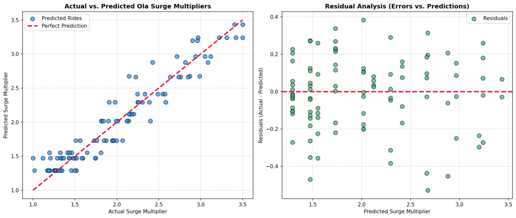
Left panel shows (Actual vs. Predicted): This plot compares the actual Ola surge multipliers from our test set against the values predicted by our tuned Decision Tree model (where the hyperparameter
max_depthis set to 4). The points cluster tightly around the red dashed diagonal line (the “Perfect Prediction” line). This tells us that the model’s predictions are highly accurate across the entire range of surge multipliers (from 1.0x to 3.0x).Right panel shows (Residual Analysis): This plot shows the prediction errors (Residuals = Actual – Predicted) on the Y-axis against the predicted values on the X-axis. The points are randomly scattered around the horizontal red dashed line at Y = 0, with no visible patterns, shapes, or curves. This random distribution confirms that our tuned model has extracted all the useful information from the features, leaving behind only random, unavoidable noise. This indicates a highly robust and healthy machine learning model.
GIF 3: What Happens When We Push Too Far?
import numpy as np
import matplotlib.pyplot as plt
from matplotlib.animation import FuncAnimation
# Set random seed for reproducibility of Maharashtra crop data
np.random.seed(42)
# 1. Generate Synthetic Maharashtra Crop Yield Data
# Rainfall deviation from normal (scaled between -1.0 and 1.0)
rainfall_scaled = np.linspace(-1.0, 1.0, 25)
# True relationship: Yield peaks at moderate rainfall, drops during drought (-1) or flood (+1)
true_yield = 25.0 + 15.0 * rainfall_scaled – 30.0 * (rainfall_scaled ** 2) – 10.0 * (rainfall_scaled ** 3)
noise = np.random.normal(0, 2.5, len(rainfall_scaled))
crop_yield = true_yield + noise
# 2. Pre-compute Polynomial Feature Matrices manually
# Degree 1 Features: [1, x]
X_poly1 = np.vstack([np.ones_like(rainfall_scaled), rainfall_scaled]).T
# Degree 3 Features: [1, x, x^2, x^3]
X_poly3 = np.vstack([np.ones_like(rainfall_scaled), rainfall_scaled, rainfall_scaled**2, rainfall_scaled**3]).T
# Degree 10 Features: [1, x, x^2, …, x^10]
X_poly10 = np.vstack([rainfall_scaled**i for i in range(11)]).T
# 3. Initialize Weights for Gradient Descent
weights_deg1 = np.zeros(2)
weights_deg3 = np.zeros(4)
weights_deg10 = np.zeros(11)
# 4. Set Learning Rates (Hyperparameters for the optimizer)
lr_deg1 = 0.15
lr_deg3 = 0.15
lr_deg10 = 0.08 # Lower learning rate to keep high-degree polynomial stable
# Lists to store loss histories
epochs = []
loss_history_deg1 = []
loss_history_deg3 = []
loss_history_deg10 = []
# 5. Set up the 2×3 Matplotlib Figure Grid
# Top Row: Model Fits | Bottom Row: Live Loss Curves
fig, axs = plt.subplots(2, 3, figsize=(18, 10))
# Generate smooth X values for plotting continuous curves
smooth_x = np.linspace(-1.1, 1.1, 100)
smooth_X_poly1 = np.vstack([np.ones_like(smooth_x), smooth_x]).T
smooth_X_poly3 = np.vstack([np.ones_like(smooth_x), smooth_x, smooth_x**2, smooth_x**3]).T
smooth_X_poly10 = np.vstack([smooth_x**i for i in range(11)]).T
# Define the animation update loop
def update(frame):
global weights_deg1, weights_deg3, weights_deg10
# — MANUAL GRADIENT DESCENT STEP —
# Degree 1 Predictions & Updates
pred_deg1 = X_poly1 @ weights_deg1
loss_deg1 = np.mean((pred_deg1 – crop_yield) ** 2)
grad_deg1 = (2 / len(rainfall_scaled)) * (X_poly1.T @ (pred_deg1 – crop_yield))
weights_deg1 -= lr_deg1 * grad_deg1
# Degree 3 Predictions & Updates
pred_deg3 = X_poly3 @ weights_deg3
loss_deg3 = np.mean((pred_deg3 – crop_yield) ** 2)
grad_deg3 = (2 / len(rainfall_scaled)) * (X_poly3.T @ (pred_deg3 – crop_yield))
weights_deg3 -= lr_deg3 * grad_deg3
# Degree 10 Predictions & Updates
pred_deg10 = X_poly10 @ weights_deg10
loss_deg10 = np.mean((pred_deg10 – crop_yield) ** 2)
grad_deg10 = (2 / len(rainfall_scaled)) * (X_poly10.T @ (pred_deg10 – crop_yield))
weights_deg10 -= lr_deg10 * grad_deg10
# Store history
epochs.append(frame)
loss_history_deg1.append(loss_deg1)
loss_history_deg3.append(loss_deg3)
loss_history_deg10.append(loss_deg10)
# — RENDERING PLOTS —
for ax in axs.flat:
ax.clear()
# — TOP ROW: MODEL FITS —
# Panel 1: Degree 1 (Underfit)
axs[0, 0].scatter(rainfall_scaled, crop_yield, color=’orange’, edgecolor=’k’, s=40, label=’Maharashtra Farms’)
axs[0, 0].plot(smooth_x, smooth_X_poly1 @ weights_deg1, color=’red’, linewidth=2.5, label=’Degree 1 Fit’)
axs[0, 0].set_ylim(0, 40)
axs[0, 0].set_title(f”Degree 1 (Underfit) | Loss: {loss_deg1:.2f}”, color=’red’, fontsize=11, fontweight=’bold’)
axs[0, 0].set_xlabel(“Rainfall Deviation”)
axs[0, 0].set_ylabel(“Crop Yield (Quintals/Hectare)”)
axs[0, 0].legend(loc=’lower center’)
axs[0, 0].grid(True, linestyle=’–‘, alpha=0.5)
# Panel 2: Degree 3 (Good Fit)
axs[0, 1].scatter(rainfall_scaled, crop_yield, color=’orange’, edgecolor=’k’, s=40, label=’Maharashtra Farms’)
axs[0, 1].plot(smooth_x, smooth_X_poly3 @ weights_deg3, color=’green’, linewidth=2.5, label=’Degree 3 Fit’)
axs[0, 1].set_ylim(0, 40)
axs[0, 1].set_title(f”Degree 3 (Good Fit) | Loss: {loss_deg3:.2f}”, color=’green’, fontsize=11, fontweight=’bold’)
axs[0, 1].set_xlabel(“Rainfall Deviation”)
axs[0, 1].legend(loc=’lower center’)
axs[0, 1].grid(True, linestyle=’–‘, alpha=0.5)
# Panel 3: Degree 10 (Overfit)
axs[0, 2].scatter(rainfall_scaled, crop_yield, color=’orange’, edgecolor=’k’, s=40, label=’Maharashtra Farms’)
axs[0, 2].plot(smooth_x, smooth_X_poly10 @ weights_deg10, color=’purple’, linewidth=2.5, label=’Degree 10 Fit’)
axs[0, 2].set_ylim(0, 40)
axs[0, 2].set_title(f”Degree 10 (Overfit) | Loss: {loss_deg10:.2f}”, color=’purple’, fontsize=11, fontweight=’bold’)
axs[0, 2].set_xlabel(“Rainfall Deviation”)
axs[0, 2].legend(loc=’lower center’)
axs[0, 2].grid(True, linestyle=’–‘, alpha=0.5)
# — BOTTOM ROW: LIVE LOSS CURVES —
# Degree 1 Loss
axs[1, 0].plot(epochs, loss_history_deg1, color=’red’, linewidth=2)
axs[1, 0].set_title(“Degree 1 Loss History”, color=’red’, fontsize=10, fontweight=’bold’)
axs[1, 0].set_xlabel(“Epoch”)
axs[1, 0].set_ylabel(“Mean Squared Error”)
axs[1, 0].grid(True, linestyle=’–‘, alpha=0.5)
# Degree 3 Loss
axs[1, 1].plot(epochs, loss_history_deg3, color=’green’, linewidth=2)
axs[1, 1].set_title(“Degree 3 Loss History”, color=’green’, fontsize=10, fontweight=’bold’)
axs[1, 1].set_xlabel(“Epoch”)
axs[1, 1].grid(True, linestyle=’–‘, alpha=0.5)
# Degree 10 Loss
axs[1, 2].plot(epochs, loss_history_deg10, color=’purple’, linewidth=2)
axs[1, 2].set_title(“Degree 10 Loss History”, color=’purple’, fontsize=10, fontweight=’bold’)
axs[1, 2].set_xlabel(“Epoch”)
axs[1, 2].grid(True, linestyle=’–‘, alpha=0.5)
# Dynamic Frame Titles
if frame == 0:
fig.suptitle(“Epoch 0 — I know nothing”, fontsize=14, fontweight=’bold’)
elif frame == 50:
fig.suptitle(“Epoch 50 — Getting warmer!”, fontsize=14, fontweight=’bold’)
elif frame == 149:
fig.suptitle(“Epoch 150 — Final Fits: Underfit vs. Perfect vs. Overfit!”, fontsize=14, fontweight=’bold’)
else:
fig.suptitle(f”Epoch {frame} — Training Polynomial Models Simultaneously”, fontsize=14, fontweight=’bold’)
plt.tight_layout()
# 6. Run and Save the Animation
ani = FuncAnimation(fig, update, frames=150, interval=100, repeat=False)
ani.save(‘edgecase_hyperparameters_in_ml.gif’, writer=’pillow’, fps=8)
plt.close()

Edge Case Animation
What You Will See in This GIF:
Left panel (Too simple / Underfit): Notice how the rigid, straight red line tries to fit a curved set of data points. It completely misses the peak crop yield at moderate rainfall. The loss curve drops slightly at first but quickly flattens out at a very high value. This shows that no matter how long we train, a model with too simple of a hyperparameter (Degree 1) can never learn the underlying pattern.
Middle panel (Just right / Good Fit): This is the sweet spot because the smooth, green cubic curve gracefully rises and falls, tracking the true trend of the crop yield perfectly. It captures the sweet spot of rainfall without being distracted by individual noisy points. The loss curve drops smoothly and stabilizes at a very low, healthy level, showing successful convergence.
Right panel (Too complex / Overfit): See how the curve goes crazy and wiggles wildly. Because the polynomial degree hyperparameter is set too high (Degree 10), the model has too much freedom. It goes out of its way to chase and pass through every single noisy outlier, resulting in extreme, unrealistic spikes at the edges. The loss curve drops rapidly to near zero, but the model has simply memorized the training data and will fail completely on new, unseen data.
Line-by-Line Code Walkthrough
Here is a breakdown of the most important concepts from our Python codes:
import numpy as np&import pandas as pd: We import NumPy for fast math operations and Pandas to structure our data into clean tables.import matplotlib.pyplot as plt&from matplotlib.animation import FuncAnimation: These tools allow us to draw plots and animate them frame-by-frame.np.random.seed(42): This locks the random number generator so that every time you run the code, you get the exact same “random” data.X_scaled = (X - X_mean) / X_std: We standardize our input features so they have a mean of 0 and a standard deviation of 1. This keeps the math stable and prevents numbers from exploding during training.w = -20.0,b = 10.0: We initialize our model’s parameters (weight and bias) to random, bad starting guesses.learning_rate = 0.05: This is our hyperparameter (α). It controls how big of a step the model takes when correcting its mistakes.Y_pred = w * X_scaled + b: The model makes a prediction using its current weight and bias.loss = np.mean((Y_pred - Y) ** 2): We calculate the Mean Squared Error (MSE). This is our “Disappointment Meter” measuring how wrong the predictions are.dw = (2 / len(X_scaled)) * np.sum((Y_pred - Y) * X_scaled): We calculate the gradient (the slope of the mistake) to know which direction to adjust the weight.w = w - learning_rate * dw: The model updates its weight by taking a step in the opposite direction of the mistake, scaled by our learning rate hyperparameter.tuned_decision_tree = DecisionTreeRegressor(max_depth=4): In our Scikit-Learn project, we set themax_depthhyperparameter to 4. This stops the tree from growing too deep and overfitting the data.tuned_decision_tree.fit(X_train_scaled, y_train): The model learns the parameters from the training data.predictions_test = tuned_decision_tree.predict(X_test_scaled): We test the model on unseen data to see how well it performs in the real world.ani.save('...', writer='pillow', fps=10): We save our Matplotlib animations as high-quality GIFs so we can watch the learning process unfold!
Quick Recap ✅
Hyperparameters are manual settings: They are the knobs and dials you must set before training begins (like the learning rate or max depth).
Parameters are learned automatically: These are the internal numbers (like weights and biases) the model figures out on its own during training.
The Learning Rate (α) is crucial: If it is too high, the model bounces around wildly and never learns. If it is too low, the model takes forever to learn.
Beware of Overfitting: Giving a model too much freedom (like a very high polynomial degree) causes it to memorize noise instead of learning the true pattern.
Beware of Underfitting: Making a model too simple (like a straight line for curved data) means it will never capture the real-world complexity.
Test Yourself 🧠
1. What is the main difference between a parameter and a hyperparameter?
A) Parameters are set by the programmer, hyperparameters are learned by the model.
B) Hyperparameters are set by the programmer before training, parameters are learned by the model during training.
C) They are exactly the same thing.
D) Hyperparameters are only used in deep learning, not machine learning.
Answer: B
2. In the Gradient Descent equation, what happens if the learning rate hyperparameter (α) is set too high?
A) The model will learn perfectly in just one step.
B) The model will take microscopic baby steps and take weeks to train.
C) The model will overshoot the minimum loss and oscillate wildly, failing to learn.
D) The model will automatically reduce the learning rate.
Answer: C
3. If you are training a Decision Tree and notice it is memorizing the training data perfectly but failing on new test data (Overfitting), which hyperparameter tweak would help?
A) Increase the
max_depthto allow more questions.B) Decrease the
max_depthto restrict the tree and force it to learn general patterns.C) Change the random seed.
D) Add more noise to the data.
Answer: B