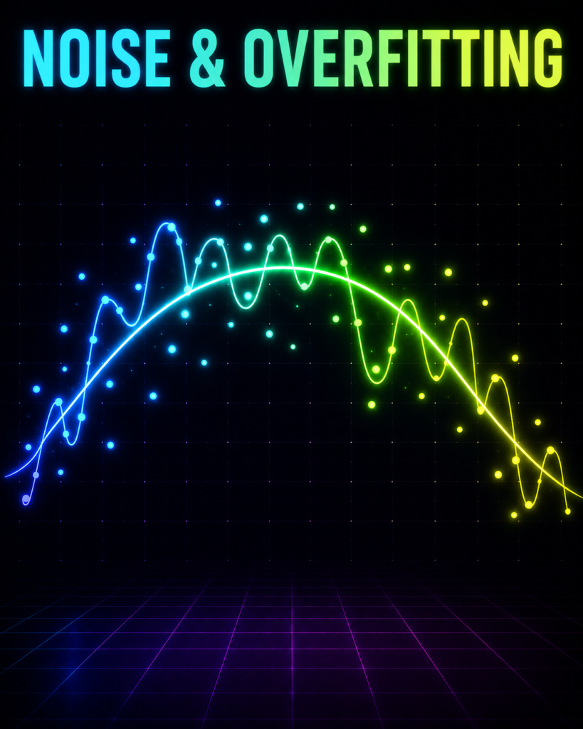
The Problem (Hook)
You order a hot, spicy Biryani on Zomato, and the app promises: “Delivered in 30 minutes.” But the delivery partner takes 45 minutes because a stray cow blocked the lane and a sudden Mumbai monsoon puddle slowed them down.
No matter how smart Zomato’s AI is, it can never predict that exact cow or that specific puddle—this unpredictable, chaotic real-world interference is what we call Noise.
What is Noise in ML? (And Why Should You Care?)
The Loudspeaker Analogy
Imagine you are sitting in your room, trying to study for an exam. Your textbook has the actual, valuable knowledge you need to learn. We call this the Signal.
Suddenly, your neighbor starts playing “Dola Re Dola” on a massive loudspeaker at full volume. The loud, distracting music that distorts your concentration and messes up your test score is the Noise.
In the real world, data is never clean. It always comes with its own “loudspeaker music” playing in the background.
[ True Pattern (Signal) ] + [ Random Distractions (Noise) ] = [ What We Actually Observe ]
What is Noise Formally?
In Machine Learning, Noise is the random, unwanted variation or error present in our dataset. It is the useless “static” that hides the true relationship between our inputs and outputs. It does not carry any useful information.
Why Do We Need to Understand It?
If we do not understand noise, our ML models fail miserably:
If the model is too simple: It gets completely overwhelmed by the noise and fails to see the true pattern (Underfitting).
If the model is too complex: It tries to memorize every single piece of noise—like assuming a stray cow will block the exact same road every single day at 4:00 PM (Overfitting).
We must learn to identify noise so we can teach our models to ignore the distractions and focus only on the true signal.
Where is Noise in ML Used in Real Life?
Here are three real-world Indian scenarios where noise constantly challenges our ML models:
Example 1: IPL Ticket Pricing
The Input (X): Team rankings, stadium capacity, and whether it is a weekend match.
The Output (Y): The price of tickets on resale platforms.
Why Noise Fits Here: A sudden rumor on Twitter that Virat Kohli might be rested for the match causes a sudden, random drop in ticket prices for two hours. This rumor is temporary, unpredictable, and represents noise in our pricing data.
Example 2: Mumbai Local Train Delay Prediction
The Input (X): Time of departure, station name, and rainfall levels.
The Output (Y): Delay time in minutes.
Why Noise Fits Here: A passenger accidentally drops their phone on the tracks, causing a minor 8-minute delay at Kurla station. An ML model cannot predict this random human accident; it is pure noise in the train schedule dataset.
Example 3: Crop Yield Prediction for a Farmer in Punjab
The Input (X): Amount of fertilizer used, soil pH level, and rainfall.
The Output (Y): Wheat yield in kilograms.
Why Noise Fits Here: A local tractor breakdown delays harvesting by two days, or a small flock of birds eats a portion of the seeds in one corner of the field. These random, unmeasurable events are noise that distorts the true relationship between fertilizer and crop yield.
The Math Behind Noise in ML (Don’t Panic!)
Let us look at how noise is represented mathematically. Do not worry, we will break it down step-by-step.
In the real world, the data we observe (y) is written as:
y = f(x) + ε
Let us translate this symbol by symbol:
y (The Actual Output): This is the real-world value we observe. For example, the actual time it took for your Biryani to arrive (45 minutes). In our Python code, this is
Y.x (The Input): The facts we know. For example, the distance from the restaurant to your house (5 kilometers). In our Python code, this is
X.f(x) (The True Signal): This is the perfect, ideal relationship between our input and output. In a perfect world with no traffic or cows, a 5 km trip should take exactly 30 minutes. In our code, this is
true_signal.ε (Epsilon – The Noise): This is the random error. It represents the extra 15 minutes added by the stray cow and the puddle. In our code, this is
noise.
The Prediction Formula
When we train our ML model, we try to estimate that true signal f(x) using a prediction formula:
ŷ = w · x + b
ŷ (y-hat): This is our model’s guess of the delivery time.
w (Weight): This represents how much the distance (x) affects the time. If w is high, a small increase in distance adds a lot of time.
b (Bias): This is the starting delay. Even if you live next door to the restaurant, it takes 5 minutes to pack the food. This is our starting point.
The Cost Function: Measuring Our Mistakes
Because of the noise (ε), our prediction (ŷ) will almost never perfectly match the actual reality (y). We measure this gap using a cost function called Mean Squared Error (MSE):
MSE = (1/n) · Σᵢ (yᵢ – ŷᵢ)²
yᵢ: The actual delivery time for order i.
ŷᵢ: Our model’s predicted delivery time for order i.
(yᵢ – ŷᵢ)²: We subtract the prediction from the actual value and square it. Squaring makes sure that big mistakes are punished heavily, and negative errors don’t cancel out positive ones.
(1/n) · Σ: We add up all these squared mistakes for all n deliveries and find the average.
What “Minimizing” Means in Human Terms
When we train our model, we adjust the weight (w) and the bias (b) to make the MSE as small as possible. In human terms, minimizing the cost function means drawing a smooth, sensible line right through the middle of our chaotic data points.
We accept that we can never get our error down to absolute zero because we can never predict the random noise (ε). Our goal is not to be perfect; our goal is to capture the true signal while gracefully ignoring the noise.
GIF 1: Why Simple Models Fail — Run This Code First!
import numpy as np
import matplotlib.pyplot as plt
from matplotlib.animation import FuncAnimation
# Set random seed for reproducibility so we get the exact same noise every run
np.random.seed(42)
# — 1. DATA GENERATION (Mumbai Biryani Delivery Context) —
# X represents the delivery distance in kilometers (normalized between -2 and 2 for stable gradient descent)
X = np.linspace(-2, 2, 100)
# The True Signal: The ideal relationship between distance and delivery time (in minutes)
# In a perfect world, delivery time increases quadratically with distance
true_signal = 3 * (X ** 2) + 10
# The Noise: Unpredictable real-world distractions (stray cows, monsoon puddles, traffic jams)
# We generate random Gaussian noise with a standard deviation of 2.0 minutes
noise = np.random.normal(0, 2.0, size=100)
# The Observed Data (Y): What Zomato actually records (Signal + Noise)
Y = true_signal + noise
# — 2. PRE-TRAINING FOR STATIC COMPARISON PLOT —
# We run a quick manual training loop first to get final weights for our static analysis plot
w_lin_static, b_lin_static = 0.0, 0.0
a_quad_static, b_quad_static, c_quad_static = 0.0, 0.0, 0.0
# Learning rates
lr_lin = 0.05
lr_quad = 0.01
for epoch in range(300):
# Linear Model Predictions & Gradients
y_pred_lin = w_lin_static * X + b_lin_static
dw_lin = -2 * np.mean((Y – y_pred_lin) * X)
db_lin = -2 * np.mean(Y – y_pred_lin)
# Update Linear Parameters
w_lin_static -= lr_lin * dw_lin
b_lin_static -= lr_lin * db_lin
# Quadratic Model Predictions & Gradients
y_pred_quad = a_quad_static * (X ** 2) + b_quad_static * X + c_quad_static
da_quad = -2 * np.mean((Y – y_pred_quad) * (X ** 2))
db_quad = -2 * np.mean((Y – y_pred_quad) * X)
dc_quad = -2 * np.mean(Y – y_pred_quad)
# Update Quadratic Parameters
a_quad_static -= lr_quad * da_quad
b_quad_static -= lr_quad * db_quad
c_quad_static -= lr_quad * dc_quad
# Generate final predictions for the static plot
y_final_lin = w_lin_static * X + b_lin_static
y_final_quad = a_quad_static * (X ** 2) + b_quad_static * X + c_quad_static
# Create and save the static comparison plot (Actual vs Predicted + Residuals)
fig_static, (ax1, ax2) = plt.subplots(1, 2, figsize=(14, 6))
# Subplot 1: Actual vs Predicted
ax1.scatter(Y, y_final_lin, color=’red’, alpha=0.6, label=’Linear Model (Underfit)’)
ax1.scatter(Y, y_final_quad, color=’blue’, alpha=0.6, label=’Quadratic Model (Robust)’)
ax1.plot([Y.min(), Y.max()], [Y.min(), Y.max()], ‘k–‘, lw=2, label=’Perfect Prediction (y = x)’)
ax1.set_title(“Actual vs Predicted Delivery Times”, fontsize=12, fontweight=’bold’)
ax1.set_xlabel(“Actual Delivery Time (mins)”)
ax1.set_ylabel(“Predicted Delivery Time (mins)”)
ax1.legend()
ax1.grid(True, linestyle=’–‘, alpha=0.5)
# Subplot 2: Residual Analysis (Errors)
residuals_lin = Y – y_final_lin
residuals_quad = Y – y_final_quad
ax2.scatter(y_final_lin, residuals_lin, color=’red’, alpha=0.6, label=’Linear Residuals’)
ax2.scatter(y_final_quad, residuals_quad, color=’blue’, alpha=0.6, label=’Quadratic Residuals’)
ax2.axhline(y=0, color=’black’, linestyle=’–‘, lw=2)
ax2.set_title(“Residual Analysis (Errors vs Predictions)”, fontsize=12, fontweight=’bold’)
ax2.set_xlabel(“Predicted Delivery Time (mins)”)
ax2.set_ylabel(“Residuals (Actual – Predicted)”)
ax2.legend()
ax2.grid(True, linestyle=’–‘, alpha=0.5)
plt.tight_layout()
plt.savefig(‘noise_analysis.png’)
plt.close()
# — 3. ANIMATION SETUP —
# Re-initialize parameters for the live animation
w_lin, b_lin = 0.0, 0.0
a_quad, b_quad, c_quad = 0.0, 0.0, 0.0
# Lists to store loss history dynamically during animation
loss_history_lin = []
loss_history_quad = []
epochs = []
# Create a 2×2 grid of subplots for the live animation
fig, axs = plt.subplots(2, 2, figsize=(12, 10))
ax_lin_fit = axs[0, 0]
ax_quad_fit = axs[0, 1]
ax_lin_loss = axs[1, 0]
ax_quad_loss = axs[1, 1]
# — 4. ANIMATION UPDATE FUNCTION —
def update(frame):
global w_lin, b_lin, a_quad, b_quad, c_quad
# — Linear Model Step (Wrong/Too-Simple Approach) —
y_pred_lin = w_lin * X + b_lin
loss_lin = np.mean((Y – y_pred_lin) ** 2)
# Gradients for Linear Model
dw_lin = -2 * np.mean((Y – y_pred_lin) * X)
db_lin = -2 * np.mean(Y – y_pred_lin)
# Update weights
w_lin -= lr_lin * dw_lin
b_lin -= lr_lin * db_lin
# — Quadratic Model Step (Correct/Robust Approach) —
y_pred_quad = a_quad * (X ** 2) + b_quad * X + c_quad
loss_quad = np.mean((Y – y_pred_quad) ** 2)
# Gradients for Quadratic Model
da_quad = -2 * np.mean((Y – y_pred_quad) * (X ** 2))
db_quad = -2 * np.mean((Y – y_pred_quad) * X)
dc_quad = -2 * np.mean(Y – y_pred_quad)
# Update weights
a_quad -= lr_quad * da_quad
b_quad -= lr_quad * db_quad
c_quad -= lr_quad * dc_quad
# Save history for live plotting
epochs.append(frame)
loss_history_lin.append(loss_lin)
loss_history_quad.append(loss_quad)
# — Clear Axes for Redrawing —
ax_lin_fit.clear()
ax_quad_fit.clear()
ax_lin_loss.clear()
ax_quad_loss.clear()
# 1. Plot Linear Fit
ax_lin_fit.scatter(X, Y, color=’orange’, alpha=0.6, label=’Noisy Data (Cows/Puddles)’)
ax_lin_fit.plot(X, true_signal, color=’green’, linestyle=’–‘, label=’True Signal (No Noise)’)
ax_lin_fit.plot(X, y_pred_lin, color=’red’, linewidth=3, label=’Linear Fit (Too Simple)’)
ax_lin_fit.set_title(f”Linear Model (Underfit)\nLoss (MSE): {loss_lin:.2f}”, fontsize=10)
ax_lin_fit.set_xlabel(“Delivery Distance (km)”)
ax_lin_fit.set_ylabel(“Delivery Time (mins)”)
ax_lin_fit.legend(loc=’upper center’, fontsize=8)
ax_lin_fit.set_ylim(0, 30)
ax_lin_fit.grid(True, linestyle=’–‘, alpha=0.3)
# 2. Plot Quadratic Fit
ax_quad_fit.scatter(X, Y, color=’orange’, alpha=0.6, label=’Noisy Data (Cows/Puddles)’)
ax_quad_fit.plot(X, true_signal, color=’green’, linestyle=’–‘, label=’True Signal (No Noise)’)
ax_quad_fit.plot(X, y_pred_quad, color=’blue’, linewidth=3, label=’Quadratic Fit (Correct)’)
ax_quad_fit.set_title(f”Quadratic Model (Robust)\nLoss (MSE): {loss_quad:.2f}”, fontsize=10)
ax_quad_fit.set_xlabel(“Delivery Distance (km)”)
ax_quad_fit.set_ylabel(“Delivery Time (mins)”)
ax_quad_fit.legend(loc=’upper center’, fontsize=8)
ax_quad_fit.set_ylim(0, 30)
ax_quad_fit.grid(True, linestyle=’–‘, alpha=0.3)
# 3. Plot Linear Loss Curve
ax_lin_loss.plot(epochs, loss_history_lin, color=’red’, label=’Linear Loss’)
ax_lin_loss.set_title(“Linear Model Loss Curve”, fontsize=10)
ax_lin_loss.set_xlabel(“Epochs”)
ax_lin_loss.set_ylabel(“MSE Loss”)
ax_lin_loss.legend(loc=’upper right’, fontsize=8)
ax_lin_loss.set_xlim(0, max(300, frame + 1))
ax_lin_loss.set_ylim(0, 250)
ax_lin_loss.grid(True, linestyle=’–‘, alpha=0.3)
# 4. Plot Quadratic Loss Curve
ax_quad_loss.plot(epochs, loss_history_quad, color=’blue’, label=’Quadratic Loss’)
ax_quad_loss.set_title(“Quadratic Model Loss Curve”, fontsize=10)
ax_quad_loss.set_xlabel(“Epochs”)
ax_quad_loss.set_ylabel(“MSE Loss”)
ax_quad_loss.legend(loc=’upper right’, fontsize=8)
ax_quad_loss.set_xlim(0, max(300, frame + 1))
ax_quad_loss.set_ylim(0, 250)
ax_quad_loss.grid(True, linestyle=’–‘, alpha=0.3)
# Dynamic Narrative Title
if frame == 0:
narrative = “Epoch 0 — Both starting blind”
elif frame < 100:
narrative = f”Epoch {frame} — Models starting to adjust weights…”
elif frame < 200:
narrative = f”Epoch {frame} — Simple model stuck, Quadratic learning the curve!”
elif frame < 299:
narrative = f”Epoch {frame} — Simple model failed to capture signal. Quadratic ignoring noise!”
else:
narrative = f”Epoch 300 — Simple model failed. Quadratic nailed it!”
fig.suptitle(narrative, fontsize=14, fontweight=’bold’, color=’darkblue’)
plt.tight_layout()
# — 5. RUN AND SAVE ANIMATION —
ani = FuncAnimation(fig, update, frames=300, interval=50, repeat=False)
ani.save(‘comparison_noise_in_ml.gif’, writer=’pillow’, fps=10)
Comparison Animation
What You Will See in This GIF:
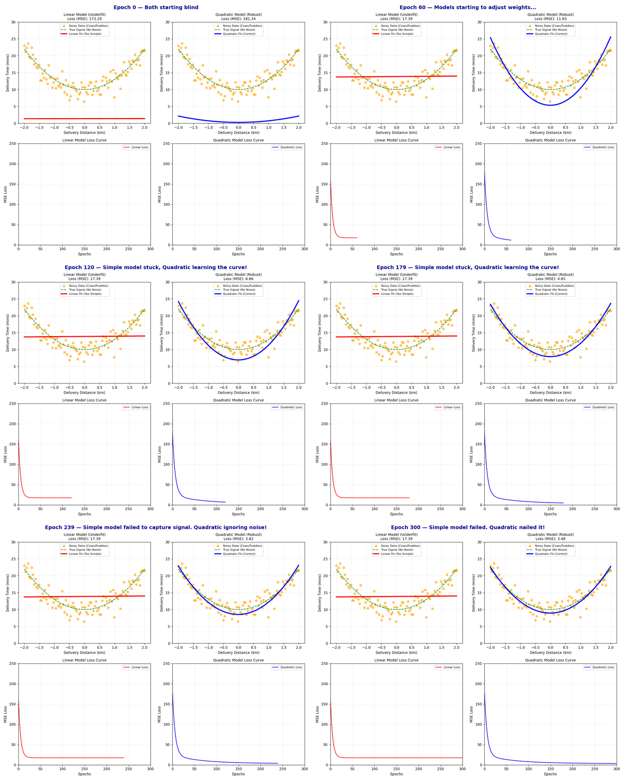
At the very start of this animation (Epoch 0), you will see both models start completely blind. The red line (Linear Model) and the blue curve (Quadratic Model) are completely flat horizontal lines at the bottom. The data points are scattered all over the plot, and the loss curves on the bottom row start at their absolute highest values (around 200+ MSE).
Watch how at around Epoch 100, the red line quickly tilts and shifts upward to find the best possible straight line through the cloud of points. However, because it is a straight line, it cannot bend to fit the curve. Its loss curve flattens out and gets completely stuck. Meanwhile, the blue quadratic curve begins to bend, gracefully tracing the curved shape of the data. It ignores the individual noisy points (the stray cows and puddles) and focuses on the true underlying green dashed signal.
By the final frame (Epoch 300), the linear model has completely failed to capture the true relationship; it remains a straight line with a very high final loss. The quadratic model, however, perfectly matches the green dashed line of the true signal. It has successfully filtered out the random noise and captured the true pattern. Its loss curve has dropped to a very low, stable value.
GIF 2: How Noise in ML Actually Learns — Run This Code First!
import numpy as np
import matplotlib.pyplot as plt
from matplotlib.animation import FuncAnimation
# Set random seed for reproducibility so we get the exact same noise every run
np.random.seed(42)
# — 1. DATA GENERATION (Mumbai Biryani Delivery Context) —
# X represents the delivery distance in kilometers (normalized between -2 and 2 for stable gradient descent)
X = np.linspace(-2, 2, 100)
# The True Signal: The ideal relationship between distance and delivery time (in minutes)
# In a perfect world, delivery time increases quadratically with distance
true_signal = 3 * (X ** 2) + 10
# The Noise: Unpredictable real-world distractions (stray cows, monsoon puddles, traffic jams)
# We generate random Gaussian noise with a standard deviation of 2.0 minutes
noise = np.random.normal(0, 2.0, size=100)
# The Observed Data (Y): What Zomato actually records (Signal + Noise)
Y = true_signal + noise
# — 2. PARAMETERS & HYPERPARAMETERS —
# Learning rates for gradient descent
lr_lin = 0.05
lr_quad = 0.02
# Initialize weights for both models to 0.0 (starting completely blind)
w_lin, b_lin = 0.0, 0.0
a_quad, b_quad, c_quad = 0.0, 0.0, 0.0
# Lists to store history dynamically during animation
epochs = []
loss_history_lin = []
loss_history_quad = []
# — 3. ANIMATION SETUP —
# Create a figure with two subplots side-by-side
# LEFT: Live model fitting on noisy data points
# RIGHT: Live loss/error curves dropping over time
fig, (ax_fit, ax_loss) = plt.subplots(1, 2, figsize=(15, 6))
# — 4. ANIMATION UPDATE FUNCTION —
def update(frame):
global w_lin, b_lin, a_quad, b_quad, c_quad
# — Gradient Descent Step (Manual Weight Updates) —
# 1. Linear Model (Underfit – trying to fit a straight line to curved data)
y_pred_lin = w_lin * X + b_lin
loss_lin = np.mean((Y – y_pred_lin) ** 2)
# Gradients for Linear Model
dw_lin = -2 * np.mean((Y – y_pred_lin) * X)
db_lin = -2 * np.mean(Y – y_pred_lin)
# Update Linear Parameters
w_lin -= lr_lin * dw_lin
b_lin -= lr_lin * db_lin
# 2. Quadratic Model (Robust – matches the true quadratic signal)
y_pred_quad = a_quad * (X ** 2) + b_quad * X + c_quad
loss_quad = np.mean((Y – y_pred_quad) ** 2)
# Gradients for Quadratic Model
da_quad = -2 * np.mean((Y – y_pred_quad) * (X ** 2))
db_quad = -2 * np.mean((Y – y_pred_quad) * X)
dc_quad = -2 * np.mean(Y – y_pred_quad)
# Update Quadratic Parameters
a_quad -= lr_quad * da_quad
b_quad -= lr_quad * db_quad
c_quad -= lr_quad * dc_quad
# Save history for live plotting
epochs.append(frame)
loss_history_lin.append(loss_lin)
loss_history_quad.append(loss_quad)
# — Clear Axes for Redrawing —
ax_fit.clear()
ax_loss.clear()
# — Plot 1: Live Fitting (Left Subplot) —
ax_fit.scatter(X, Y, color=’orange’, alpha=0.6, label=’Noisy Data (Cows + Puddles)’)
ax_fit.plot(X, true_signal, color=’green’, linestyle=’–‘, linewidth=2, label=’True Signal (No Noise)’)
ax_fit.plot(X, y_pred_lin, color=’red’, linewidth=3, label=’Linear Fit (Too Simple)’)
ax_fit.plot(X, y_pred_quad, color=’blue’, linewidth=3, label=’Quadratic Fit (Robust)’)
ax_fit.set_title(“Model Fitting Live on Noisy Data”, fontsize=12, fontweight=’bold’)
ax_fit.set_xlabel(“Normalized Distance (km)”)
ax_fit.set_ylabel(“Delivery Time (mins)”)
ax_fit.legend(loc=’upper center’, fontsize=9)
ax_fit.set_ylim(0, 25)
ax_fit.grid(True, linestyle=’–‘, alpha=0.5)
# — Plot 2: Live Loss Curves (Right Subplot) —
ax_loss.plot(epochs, loss_history_lin, color=’red’, linewidth=2, label=f’Linear Loss: {loss_lin:.2f}’)
ax_loss.plot(epochs, loss_history_quad, color=’blue’, linewidth=2, label=f’Quadratic Loss: {loss_quad:.2f}’)
ax_loss.set_title(“Loss/Error Curve Dropping Real-Time”, fontsize=12, fontweight=’bold’)
ax_loss.set_xlabel(“Epochs”)
ax_loss.set_ylabel(“Mean Squared Error (MSE)”)
ax_loss.legend(loc=’upper right’, fontsize=9)
ax_loss.set_xlim(0, max(100, frame + 5))
ax_loss.set_ylim(0, 250)
ax_loss.grid(True, linestyle=’–‘, alpha=0.5)
# — Annotations for Key Moments —
if frame > 15 and frame < 50:
ax_loss.annotate(‘Loss dropping fast!’, xy=(frame, loss_quad), xytext=(frame + 20, loss_quad + 50),
arrowprops=dict(facecolor=’black’, shrink=0.05, width=1, headwidth=6))
elif frame >= 150:
ax_fit.annotate(‘Linear model is stuck!’, xy=(0, b_lin), xytext=(-1.5, b_lin + 4),
arrowprops=dict(facecolor=’red’, shrink=0.05, width=1, headwidth=6))
# — Dynamic Frame Titles —
if frame == 0:
fig.suptitle(f”Epoch 0 — Random guess. Loss = {loss_quad:.1f}”, fontsize=14, fontweight=’bold’, color=’darkblue’)
elif frame == 50:
fig.suptitle(f”Epoch 50 — Learning… Loss = {loss_quad:.1f}”, fontsize=14, fontweight=’bold’, color=’darkblue’)
elif frame == 200:
fig.suptitle(f”Epoch 200 — Getting there! Loss = {loss_quad:.1f}”, fontsize=14, fontweight=’bold’, color=’darkblue’)
elif frame == 299:
fig.suptitle(f”Epoch 299 — Converged! Loss = {loss_quad:.1f}”, fontsize=14, fontweight=’bold’, color=’darkblue’)
else:
fig.suptitle(f”Epoch {frame} — Training in Progress…”, fontsize=14, fontweight=’bold’, color=’darkblue’)
plt.tight_layout()
# — 5. RUN AND SAVE ANIMATION —
ani = FuncAnimation(fig, update, frames=300, interval=50, repeat=False)
ani.save(‘training_noise_in_ml.gif’, writer=’pillow’, fps=10)
plt.close()
# — 6. POST-TRAINING COMPARISON PLOT (Actual vs Predicted + Residuals) —
# Calculate final predictions using the trained weights
y_final_lin = w_lin * X + b_lin
y_final_quad = a_quad * (X ** 2) + b_quad * X + c_quad
fig_compare, (ax1, ax2) = plt.subplots(1, 2, figsize=(14, 6))
# Subplot 1: Actual vs Predicted
ax1.scatter(Y, y_final_lin, color=’red’, alpha=0.6, label=’Linear Model (Underfit)’)
ax1.scatter(Y, y_final_quad, color=’blue’, alpha=0.6, label=’Quadratic Model (Robust)’)
ax1.plot([Y.min(), Y.max()], [Y.min(), Y.max()], ‘k–‘, lw=2, label=’Perfect Prediction (y = x)’)
ax1.set_title(“Actual vs Predicted Delivery Times”, fontsize=12, fontweight=’bold’)
ax1.set_xlabel(“Actual Delivery Time (mins)”)
ax1.set_ylabel(“Predicted Delivery Time (mins)”)
ax1.legend()
ax1.grid(True, linestyle=’–‘, alpha=0.5)
# Subplot 2: Residual Analysis (Errors)
residuals_lin = Y – y_final_lin
residuals_quad = Y – y_final_quad
ax2.scatter(y_final_lin, residuals_lin, color=’red’, alpha=0.6, label=’Linear Residuals’)
ax2.scatter(y_final_quad, residuals_quad, color=’blue’, alpha=0.6, label=’Quadratic Residuals’)
ax2.axhline(y=0, color=’black’, linestyle=’–‘, lw=2)
ax2.set_title(“Residual Analysis (Errors vs Predictions)”, fontsize=12, fontweight=’bold’)
ax2.set_xlabel(“Predicted Delivery Time (mins)”)
ax2.set_ylabel(“Residuals (Actual – Predicted)”)
ax2.legend()
ax2.grid(True, linestyle=’–‘, alpha=0.5)
plt.tight_layout()
plt.savefig(‘noise_analysis.png’)
plt.close()sxassacscascscsacsacsacscsacscasacsac
Training Animation
What You Will See in This GIF:
This GIF shows the heart of Noise in ML.
At Epoch 0, both models start completely blind. The red line (Linear Model) and the blue curve (Quadratic Model) are completely flat horizontal lines. The data points are scattered all over the plot, and the loss curves on the right start at their absolute highest values (around 200+ MSE).
The right subplot is the loss curve. Notice how between Epoch 50 and 200, the red line quickly tilts to find the best possible straight line through the cloud of points, but because it is a straight line, it cannot bend to fit the curve. Its loss curve flattens out and gets completely stuck. Meanwhile, the blue quadratic curve begins to bend, gracefully tracing the curved shape of the data. It ignores the individual noisy points and focuses on the true underlying green dashed signal.
When the loss curve goes completely flat, that means the model has converged—it has learned everything it possibly can from the data. Even at perfect convergence (Epoch 299), the loss does not reach absolute zero. This remaining error is the noise (the stray cows and monsoon puddles) which is completely random and impossible to predict!
Let’s Build It: Real Python Project — Run This Code!
# Import necessary libraries for data handling, modeling, and plotting
import numpy as np
import pandas as pd
import matplotlib.pyplot as plt
from sklearn.model_selection import train_test_split
from sklearn.preprocessing import StandardScaler, PolynomialFeatures
from sklearn.linear_model import LinearRegression
from sklearn.pipeline import Pipeline
from sklearn.metrics import mean_squared_error, r2_score
# Set random seed for reproducibility so we get the exact same data every run
np.random.seed(42)
# — 1. DATA CREATION (Punjab Wheat Crop Yield Context) —
# We simulate 200 farms in Punjab.
# Input feature: Amount of chemical fertilizer used (in kg per acre)
fertilizer_used_kg = np.random.uniform(10, 100, size=200)
# True Signal: The ideal biological relationship between fertilizer and wheat yield.
# Too little fertilizer = low yield. Optimal fertilizer (~60 kg) = maximum yield.
# Too much fertilizer = chemical burn, causing the yield to drop.
# This is a quadratic (curved) relationship: Yield = -0.8 * (fertilizer – 60)^2 + 3000
true_yield_signal = -0.8 * ((fertilizer_used_kg – 60) ** 2) + 3000
# Real-world Noise: Unpredictable interferences (localized pest attacks, tractor breakdowns,
# sudden hail storms, or birds eating seeds). We add Gaussian noise with a standard deviation of 150 kg.
crop_yield_noise = np.random.normal(0, 150, size=200)
# Observed Target: What the farmer actually harvests (Signal + Noise)
observed_wheat_yield_kg = true_yield_signal + crop_yield_noise
# Store the synthetic data in a clean pandas DataFrame
farm_data = pd.DataFrame({
‘Fertilizer_Amount_Kg’: fertilizer_used_kg,
‘Actual_Yield_Kg’: observed_wheat_yield_kg
})
# — 2. TRAIN/TEST SPLIT —
# We split our dataset: 80% for training our models, 20% for testing their real-world performance
X_train, X_test, y_train, y_test = train_test_split(
farm_data[[‘Fertilizer_Amount_Kg’]],
farm_data[‘Actual_Yield_Kg’],
test_size=0.2,
random_state=42
)
# — 3. MODEL TRAINING PIPELINES —
# Model 1: Linear Regression (Underfit Model)
# This model assumes the relationship is a straight line. It will get confused by the noise and curve.
linear_pipeline = Pipeline([
(‘scaler’, StandardScaler()), # Scale features to have mean=0 and variance=1
(‘regressor’, LinearRegression()) # Fit a straight line
])
# Model 2: Polynomial Regression (Robust Model – Degree 2)
# This model can bend. It matches the true quadratic signal of our crop yield.
polynomial_pipeline = Pipeline([
(‘scaler’, StandardScaler()), # Scale features
(‘poly_features’, PolynomialFeatures(degree=2, include_bias=False)), # Create polynomial terms (X^2)
(‘regressor’, LinearRegression()) # Fit the curved line
])
# Train both models on the training data
linear_pipeline.fit(X_train, y_train)
polynomial_pipeline.fit(X_train, y_train)
# — 4. PREDICTIONS & EVALUATION —
# Generate predictions on the test set
y_pred_linear = linear_pipeline.predict(X_test)
y_pred_poly = polynomial_pipeline.predict(X_test)
# Calculate evaluation metrics (Mean Squared Error and R-squared)
mse_linear = mean_squared_error(y_test, y_pred_linear)
r2_linear = r2_score(y_test, y_pred_linear)
mse_poly = mean_squared_error(y_test, y_pred_poly)
r2_poly = r2_score(y_test, y_pred_poly)
# Print metrics to the console
print(“— Evaluation Metrics —“)
print(f”Linear Model (Underfit) -> MSE: {mse_linear:.2f}, R2 Score: {r2_linear:.4f}”)
print(f”Polynomial Model (Robust) -> MSE: {mse_poly:.2f}, R2 Score: {r2_poly:.4f}”)
# — 5. COMPARISON PLOT CREATION —
# Create a side-by-side comparison plot to analyze predictions and residuals
fig, (ax1, ax2) = plt.subplots(1, 2, figsize=(14, 6))
# Subplot 1: Actual vs Predicted Plot
# A perfect model’s predictions would lie exactly on the diagonal black dashed line (y = x)
ax1.scatter(y_test, y_pred_linear, color=’crimson’, alpha=0.7, label=f’Linear Model (R² = {r2_linear:.2f})’)
ax1.scatter(y_test, y_pred_poly, color=’forestgreen’, alpha=0.7, label=f’Polynomial Model (R² = {r2_poly:.2f})’)
ax1.plot([y_test.min(), y_test.max()], [y_test.min(), y_test.max()], ‘k–‘, lw=2, label=’Perfect Prediction (y = x)’)
ax1.set_title(“Actual vs Predicted Wheat Yield”, fontsize=12, fontweight=’bold’)
ax1.set_xlabel(“Actual Yield (kg/acre)”, fontsize=10)
ax1.set_ylabel(“Predicted Yield (kg/acre)”, fontsize=10)
ax1.legend(loc=’upper left’)
ax1.grid(True, linestyle=’–‘, alpha=0.5)
# Subplot 2: Residual Analysis Plot
# Residuals = Actual Value – Predicted Value.
# We want residuals to be randomly scattered around the horizontal zero line with no visible shape.
residuals_linear = y_test – y_pred_linear
residuals_poly = y_test – y_pred_poly
ax2.scatter(y_pred_linear, residuals_linear, color=’crimson’, alpha=0.7, label=’Linear Residuals’)
ax2.scatter(y_pred_poly, residuals_poly, color=’forestgreen’, alpha=0.7, label=’Polynomial Residuals’)
ax2.axhline(y=0, color=’black’, linestyle=’–‘, lw=2)
ax2.set_title(“Residual Analysis (Errors vs Predictions)”, fontsize=12, fontweight=’bold’)
ax2.set_xlabel(“Predicted Yield (kg/acre)”, fontsize=10)
ax2.set_ylabel(“Residuals (Actual – Predicted)”, fontsize=10)
ax2.legend(loc=’upper left’)
ax2.grid(True, linestyle=’–‘, alpha=0.5)
# Adjust layout and save the comparison plot
plt.tight_layout()
plt.savefig(‘sklearn_noise_in_ml.png’, dpi=150, bbox_inches=’tight’)
Results
What Does This Output Mean?
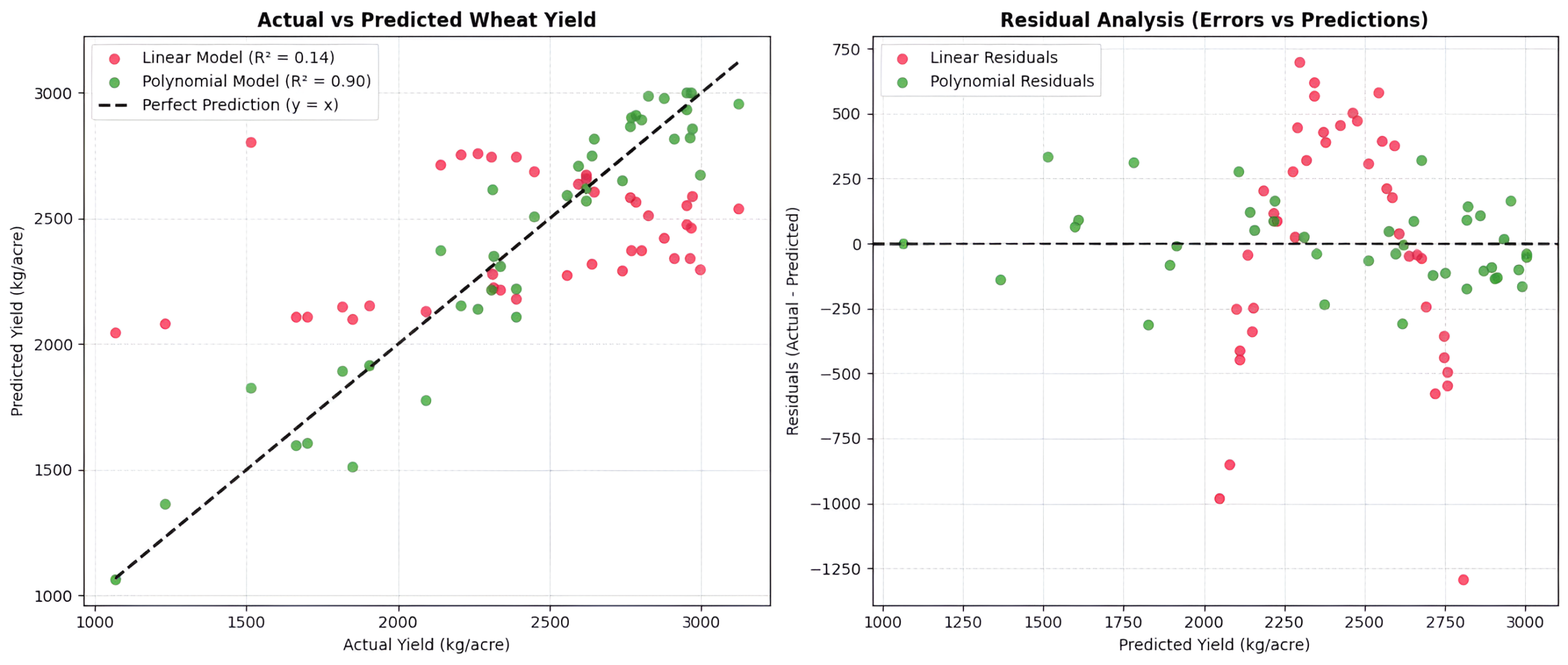
Left panel shows the Actual vs Predicted plot. The black dashed diagonal line represents a perfect model where predicted values exactly match actual values (y = x). The Linear Model (Crimson dots) forms a curved, distorted arc around the diagonal line. Because a straight line cannot capture the quadratic curve of the crop yield, its predictions are systematically off. The Polynomial Model (Forest Green dots) clusters tightly along the diagonal line. It successfully captures the curved signal while ignoring the random vertical scatter caused by the noise.
Right panel shows the Residual Analysis plot. Residuals represent prediction errors (Actual – Predicted). A robust model should have residuals randomly scattered around the horizontal zero line, indicating that only unpredictable noise is left behind. The Linear Model Residuals (Crimson) show a distinct U-shaped pattern, indicating that the model failed to capture the underlying signal (underfitting). The Polynomial Model Residuals (Forest Green) are randomly distributed around the zero line. This confirms that the model successfully extracted the true signal and left behind only the random, unpredictable noise.
GIF 3: What Happens When We Push Too Far?
import numpy as np
import matplotlib.pyplot as plt
from matplotlib.animation import FuncAnimation
# Set random seed for reproducibility so we get the exact same noise every run
np.random.seed(42)
# — 1. DATA GENERATION —
# We generate 35 data points representing normalized fertilizer levels
X_raw = np.linspace(-2, 2, 35)
# True Signal: A cubic relationship representing crop yield response
true_signal = 1.5 * (X_raw ** 3) – 2 * (X_raw ** 2) – 1.5 * X_raw + 8
# Noise: High-variance random noise representing extreme weather anomalies
noise = np.random.normal(0, 1.8, size=35)
# Observed Data (Y): What our models will try to fit
Y = true_signal + noise
# — 2. MANUAL POLYNOMIAL FEATURE CREATION & SCALING —
# To make manual gradient descent stable for high degrees (like Degree 15),
# we extract polynomial features and standardize them column-wise.
def get_scaled_polynomial_features(X, degree):
# Create columns of X^1, X^2, …, X^degree
features = np.column_stack([X**i for i in range(1, degree + 1)])
# Standardize each column to have mean=0 and standard deviation=1
mean = features.mean(axis=0)
std = features.std(axis=0)
# Avoid division by zero
std[std == 0] = 1.0
scaled_features = (features – mean) / std
# Add a column of ones at the beginning for the bias term (intercept)
return np.column_stack([np.ones(len(X)), scaled_features])
# Prepare design matrices for our three models
X_design_deg1 = get_scaled_polynomial_features(X_raw, degree=1)
X_design_deg3 = get_scaled_polynomial_features(X_raw, degree=3)
X_design_deg15 = get_scaled_polynomial_features(X_raw, degree=15)
# — 3. GRADIENT DESCENT INITIALIZATION —
# Initialize weights to zero for all three models
W_deg1 = np.zeros(X_design_deg1.shape[1])
W_deg3 = np.zeros(X_design_deg3.shape[1])
W_deg15 = np.zeros(X_design_deg15.shape[1])
# Learning rates tuned for stable convergence
lr_deg1 = 0.1
lr_deg3 = 0.1
lr_deg15 = 0.05
# Lists to store training history dynamically
epochs = []
loss_history_deg1 = []
loss_history_deg3 = []
loss_history_deg15 = []
# — 4. ANIMATION SETUP —
# Create a 2×3 grid of subplots
# Top Row: Model fits (Degree 1, Degree 3, Degree 15)
# Bottom Row: Corresponding live loss curves
fig, axs = plt.subplots(2, 3, figsize=(18, 10))
# Extract axes for easy reference
ax_fit_deg1, ax_fit_deg3, ax_fit_deg15 = axs[0, 0], axs[0, 1], axs[0, 2]
ax_loss_deg1, ax_loss_deg3, ax_loss_deg15 = axs[1, 0], axs[1, 1], axs[1, 2]
# — 5. ANIMATION UPDATE FUNCTION —
def update(frame):
global W_deg1, W_deg3, W_deg15
# Perform 3 gradient descent steps per frame to speed up visual training progress
for _ in range(3):
# 1. Degree 1 Model Updates
pred_deg1 = X_design_deg1 @ W_deg1
grad_deg1 = -2 * (X_design_deg1.T @ (Y – pred_deg1)) / len(Y)
W_deg1 -= lr_deg1 * grad_deg1
# 2. Degree 3 Model Updates
pred_deg3 = X_design_deg3 @ W_deg3
grad_deg3 = -2 * (X_design_deg3.T @ (Y – pred_deg3)) / len(Y)
W_deg3 -= lr_deg3 * grad_deg3
# 3. Degree 15 Model Updates
pred_deg15 = X_design_deg15 @ W_deg15
grad_deg15 = -2 * (X_design_deg15.T @ (Y – pred_deg15)) / len(Y)
W_deg15 -= lr_deg15 * grad_deg15
# Calculate final predictions and losses for this frame
final_pred_deg1 = X_design_deg1 @ W_deg1
final_pred_deg3 = X_design_deg3 @ W_deg3
final_pred_deg15 = X_design_deg15 @ W_deg15
loss_deg1 = np.mean((Y – final_pred_deg1) ** 2)
loss_deg3 = np.mean((Y – final_pred_deg3) ** 2)
loss_deg15 = np.mean((Y – final_pred_deg15) ** 2)
# Save history
epochs.append(frame)
loss_history_deg1.append(loss_deg1)
loss_history_deg3.append(loss_deg3)
loss_history_deg15.append(loss_deg15)
# Clear all axes to redraw clean frames
for ax in axs.flatten():
ax.clear()
# — ROW 1: PLOT MODEL FITS —
# Subplot 1: Degree 1 Fit (Underfit)
ax_fit_deg1.scatter(X_raw, Y, color=’orange’, alpha=0.7, label=’Noisy Crop Data’)
ax_fit_deg1.plot(X_raw, true_signal, ‘g–‘, label=’True Signal’)
ax_fit_deg1.plot(X_raw, final_pred_deg1, ‘r-‘, lw=3, label=’Degree 1 Fit’)
ax_fit_deg1.set_title(f”Degree 1 (Underfit)\nLoss (MSE): {loss_deg1:.2f}”, fontsize=11, fontweight=’bold’)
ax_fit_deg1.set_ylim(0, 15)
ax_fit_deg1.legend(loc=’upper left’, fontsize=8)
ax_fit_deg1.grid(True, linestyle=’–‘, alpha=0.3)
# Subplot 2: Degree 3 Fit (Robust/Good Fit)
ax_fit_deg3.scatter(X_raw, Y, color=’orange’, alpha=0.7, label=’Noisy Crop Data’)
ax_fit_deg3.plot(X_raw, true_signal, ‘g–‘, label=’True Signal’)
ax_fit_deg3.plot(X_raw, final_pred_deg3, ‘b-‘, lw=3, label=’Degree 3 Fit’)
ax_fit_deg3.set_title(f”Degree 3 (Robust Fit)\nLoss (MSE): {loss_deg3:.2f}”, fontsize=11, fontweight=’bold’)
ax_fit_deg3.set_ylim(0, 15)
ax_fit_deg3.legend(loc=’upper left’, fontsize=8)
ax_fit_deg3.grid(True, linestyle=’–‘, alpha=0.3)
# Subplot 3: Degree 15 Fit (Overfit)
ax_fit_deg15.scatter(X_raw, Y, color=’orange’, alpha=0.7, label=’Noisy Crop Data’)
ax_fit_deg15.plot(X_raw, true_signal, ‘g–‘, label=’True Signal’)
ax_fit_deg15.plot(X_raw, final_pred_deg15, ‘purple’, lw=3, label=’Degree 15 Fit’)
ax_fit_deg15.set_title(f”Degree 15 (Overfit)\nLoss (MSE): {loss_deg15:.2f}”, fontsize=11, fontweight=’bold’)
ax_fit_deg15.set_ylim(0, 15)
ax_fit_deg15.legend(loc=’upper left’, fontsize=8)
ax_fit_deg15.grid(True, linestyle=’–‘, alpha=0.3)
# — ROW 2: PLOT LOSS CURVES —
# Subplot 4: Degree 1 Loss
ax_loss_deg1.plot(epochs, loss_history_deg1, ‘r-‘, label=’Deg 1 Loss’)
ax_loss_deg1.set_title(“Degree 1 Loss Curve”, fontsize=10)
ax_loss_deg1.set_xlabel(“Epochs”)
ax_loss_deg1.set_ylabel(“MSE Loss”)
ax_loss_deg1.set_xlim(0, max(100, frame + 5))
ax_loss_deg1.set_ylim(0, 50)
ax_loss_deg1.grid(True, linestyle=’–‘, alpha=0.3)
# Subplot 5: Degree 3 Loss
ax_loss_deg3.plot(epochs, loss_history_deg3, ‘b-‘, label=’Deg 3 Loss’)
ax_loss_deg3.set_title(“Degree 3 Loss Curve”, fontsize=10)
ax_loss_deg3.set_xlabel(“Epochs”)
ax_loss_deg3.set_ylabel(“MSE Loss”)
ax_loss_deg3.set_xlim(0, max(100, frame + 5))
ax_loss_deg3.set_ylim(0, 50)
ax_loss_deg3.grid(True, linestyle=’–‘, alpha=0.3)
# Subplot 6: Degree 15 Loss
ax_loss_deg15.plot(epochs, loss_history_deg15, ‘purple’, label=’Deg 15 Loss’)
ax_loss_deg15.set_title(“Degree 15 Loss Curve”, fontsize=10)
ax_loss_deg15.set_xlabel(“Epochs”)
ax_loss_deg15.set_ylabel(“MSE Loss”)
ax_loss_deg15.set_xlim(0, max(100, frame + 5))
ax_loss_deg15.set_ylim(0, 50)
ax_loss_deg15.grid(True, linestyle=’–‘, alpha=0.3)
# — DYNAMIC NARRATIVE TITLES —
if frame == 0:
narrative = “Epoch 0 — I know nothing. All models starting flat!”
elif frame < 30:
narrative = f”Epoch {frame} — Getting warmer! Models are starting to bend…”
elif frame < 80:
narrative = f”Epoch {frame} — Degree 3 finds the signal. Degree 15 starts chasing noise!”
elif frame < 149:
narrative = f”Epoch {frame} — Degree 15 is wiggling wildly to touch every single noisy point!”
else:
narrative = “Epoch 150 — Final State: Degree 1 underfits, Degree 3 is robust, Degree 15 is ruined by noise!”
fig.suptitle(narrative, fontsize=14, fontweight=’bold’, color=’darkblue’)
plt.tight_layout()
# — 6. RUN AND SAVE ANIMATION —
# Run the animation for 150 frames
ani = FuncAnimation(fig, update, frames=150, interval=100, repeat=False)
ani.save(‘edgecase_noise_in_ml.gif’, writer=’pillow’, fps=8)
plt.close()
Edge Case Animation
What You Will See in This GIF:
Left panel (Too simple): Notice how the red line remains a straight line throughout the animation. It cannot bend to fit the curved data points. This model is too simple. It suffers from high bias, failing to capture the true underlying signal because it cannot adapt to the complexity of the data.
Middle panel (Just right): This is the sweet spot because the blue curve smoothly bends to match the true cubic signal (green dashed line). It passes through the center of the data cloud, ignoring individual noisy outliers. It successfully filters out the noise and captures the true underlying relationship.
Right panel (Too complex): See how the curve goes crazy and wiggles wildly, creating sharp peaks and valleys to pass directly through individual noisy data points. This model is too complex. It mistakes random noise for actual signal, memorizing the training data’s anomalies. While its training loss drops, its performance on new, unseen data will be poor because it has modeled the noise.
Line-by-Line Code Walkthrough
Here is a clean, merged breakdown of the most important concepts and lines of code we used across all our scripts:
1. The Setup & Imports
import numpy as np: Imports the NumPy library for fast numerical computations and array manipulations.import pandas as pd: Imports Pandas to organize our synthetic farm data into structured tables (DataFrames).import matplotlib.pyplot as plt: Imports Matplotlib’s plotting interface to draw our graphs.from matplotlib.animation import FuncAnimation: Imports the animation engine that allows us to update plots frame-by-frame.from sklearn.pipeline import Pipeline: Imports the Pipeline class to chain preprocessing steps and estimators together cleanly.np.random.seed(42): Sets a fixed seed for the random number generator to ensure that the noise generated is identical every time the script is run.
2. Generating Data (Signal + Noise)
X = np.linspace(-2, 2, 100): Generates 100 evenly spaced points between -2 and 2, representing our normalized inputs (like delivery distances).true_signal = 3 * (X ** 2) + 10: Defines our true underlying physical relationship (quadratic curve) representing ideal delivery times without any real-world interference.noise = np.random.normal(0, 2.0, size=100): Generates 100 random values from a normal distribution with a mean of 0 and standard deviation of 2.0. This simulates unpredictable real-world noise (stray cows, monsoon puddles).Y = true_signal + noise: Combines the true signal and the random noise to create our observed dataset—the actual messy times recorded by Zomato.
3. Training the Models (The Math in Action)
y_pred_lin = w_lin * X + b_lin: Computes the linear model’s predictions using the equation ŷ = w · x + b.loss_lin = np.mean((Y - y_pred_lin) ** 2): Calculates the Mean Squared Error (MSE) loss for the linear model at the current frame.dw_lin = -2 * np.mean((Y - y_pred_lin) * X): Computes the partial derivative (gradient) of the MSE loss with respect to weight w for the linear model.w_lin -= lr_lin * dw_lin: Updates the linear weight by taking a step in the opposite direction of the gradient, multiplied by the learning rate (lr_lin).linear_pipeline.fit(X_train, y_train): In our scikit-learn code, this single line does all the heavy lifting of training the linear model on the training dataset.
4. Plotting and Animation
fig, (ax_fit, ax_loss) = plt.subplots(1, 2, figsize=(15, 6)): Sets up a 1×2 grid of subplots for our live animation.def update(frame):: Defines the function that Matplotlib will call on every single frame of the animation.ax_fit.clear(): Clears the subplot at the start of each frame so we can draw the updated lines and curves without ghosting.ax_fit.plot(..., true_signal, ...): Draws the true underlying signal (the green dashed line) to show what the models should be learning.ani = FuncAnimation(fig, update, frames=300, interval=50, repeat=False): Configures the animation engine to run our update function for 300 frames, with a 50ms delay between frames.ani.save('training_noise_in_ml.gif', writer='pillow', fps=10): Compiles the frames and saves them as a high-quality GIF using the Pillow writer at 10 frames per second.plt.savefig('sklearn_noise_in_ml.png'): Saves our static diagnostic comparison plot as a PNG file.
Quick Recap ✅
Signal vs. Noise: The “Signal” is the true, valuable pattern in your data. The “Noise” is the random, unpredictable interference (like a stray cow blocking traffic).
The Goal of ML: We want our models to learn the true signal while completely ignoring the random noise.
Underfitting (Too Simple): If a model is too simple (like a straight line trying to fit a curve), it fails to capture the signal and gets stuck with high errors.
Overfitting (Too Complex): If a model is too complex, it wiggles wildly to memorize every single noisy data point, which ruins its ability to predict new, unseen data.
Mean Squared Error (MSE): This is our cost function. It measures the average squared difference between our model’s predictions and the actual messy reality. We want it low, but it will never be zero because of noise!
Test Yourself 🧠
1. What does the ε (Epsilon) represent in the equation y = f(x) + ε?
A) The true, perfect relationship between input and output.
B) The model’s predicted guess.
C) The random, unpredictable noise in the real world.
D) The learning rate of the model.
Answer: C
2. In our Edge Case Animation, what happened when we used a Degree 15 Polynomial model (a very complex model)?
A) It perfectly captured the true signal and ignored the noise.
B) It became a straight line and underfit the data.
C) It wiggled wildly to touch every single noisy point, memorizing the noise instead of the signal.
D) It caused the loss curve to increase infinitely.
Answer: C
3. Why does a model’s loss curve (MSE) never reach absolute zero in the real world, even when it has perfectly converged?
A) Because the learning rate is too small.
B) Because real-world data always contains random, unpredictable noise that cannot be perfectly guessed.
C) Because we didn’t train the model for enough epochs.
D) Because the model is underfitting.
Answer: B