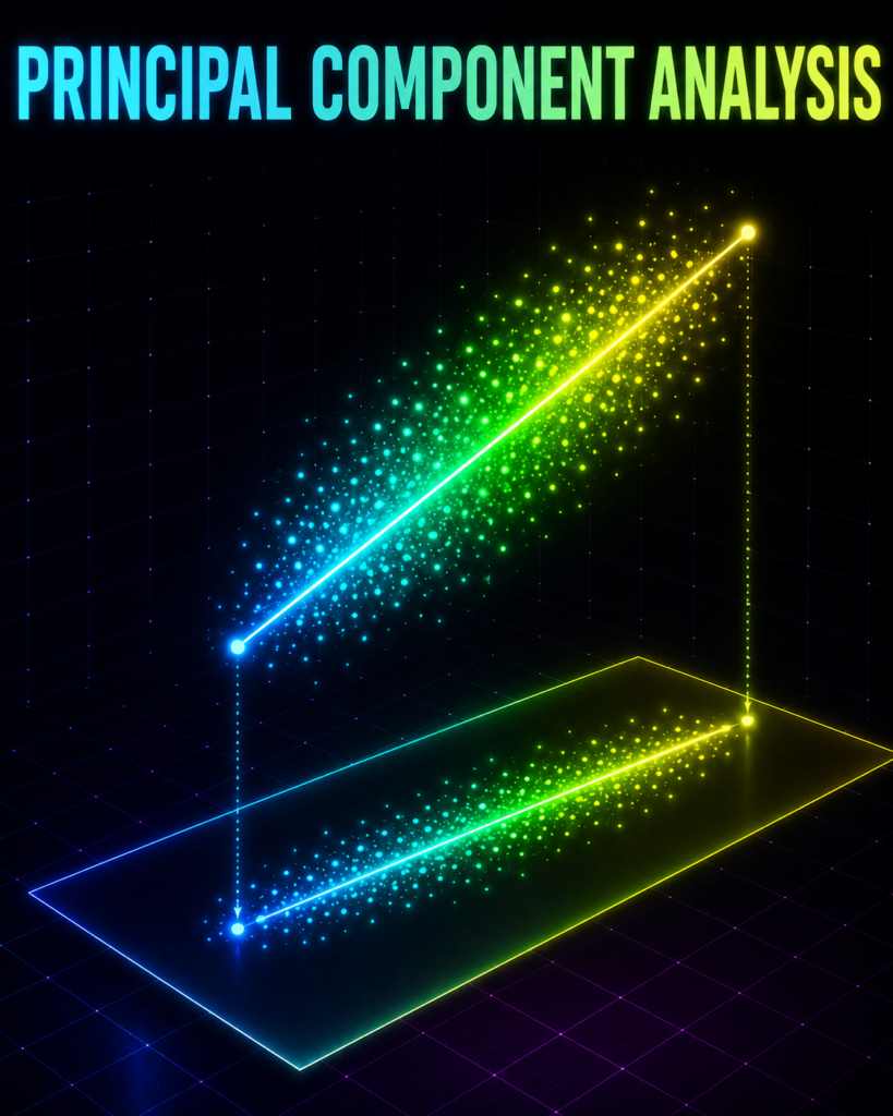
The Problem
Imagine you are the chief analyst for the Mumbai Indians at the IPL auction table, staring at a massive spreadsheet of 1,000 players. Each player has 40 different columns of data: strike rate, boundary percentage, performance against left-arm spin, fitness scores, injury history, and even social media popularity. Your brain is melting trying to look at 40 dimensions at once to decide who to buy—how do you simplify this massive sheet without losing the actual soul of the data?
What is Principal Component Analysis in ML? (And Why Should You Care?)
The Shadow Puppet Analogy
Before we touch any math, let’s step away from the computer and think about a shadow puppet show.
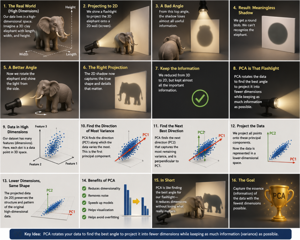
Imagine you are holding a highly detailed, 3D clay model of an elephant. It has three dimensions: length, width, and height. Now, you shine a flashlight on this clay model, projecting its shadow onto a flat, 2D wall.
If you shine the light from a bad angle (say, directly from the top), the shadow on the wall looks like a meaningless, round blob. You have lost almost all the information about the elephant.
But if you rotate the clay elephant just right and shine the light from the side, the 2D shadow perfectly captures the unmistakable silhouette of the elephant—its trunk, its tusks, and its tail.
By projecting the elephant from 3D down to 2D, you lost one dimension, but because you chose the perfect angle, you kept almost 100% of the information needed to recognize the elephant.
Principal Component Analysis (PCA) is that flashlight. It rotates your high-dimensional data to find the absolute best angle to project it, squashing it into fewer dimensions while keeping as much of the original information (the “shape” of the data) as possible.
The Formal Definition
In Machine Learning, Principal Component Analysis (PCA) is an unsupervised dimensionality reduction technique. It takes a dataset with many features, finds the directions where the data varies the most, and projects the data onto these new directions (called Principal Components), allowing you to represent your data using far fewer variables.
“Dimensionality Reduction is cleaning up messy, complicated data so we can understand it easily, without losing the important stuff.”
Imagine you have a giant LEGO castle made with 1,000 pieces. It’s beautiful, but it’s so big and complicated that you can’t even see what it looks like properly. Now, a smart friend comes and says: “I’m going to take out only the most important pieces and make a smaller but still cool version of your castle using just 50 pieces.” You can still see it’s a castle. You can still see the towers and the walls. But now it’s much easier to understand, show your friends, and play with. That’s what Dimensionality Reduction does.
It takes super complicated information (with hundreds of details) and turns it into something much simpler, while keeping the important parts safe.

Why Do Simpler Models Fail? (Why We Need PCA) ?
You might ask: “If I have 40 features, why can’t I just delete 30 of them and keep the top 10?”
If you do that, you throw away valuable information. For example, if you delete “boundary percentage” because you decided to keep “strike rate,” you completely lose the unique insight of how a batsman scores.
Furthermore, machine learning models suffer from the Curse of Dimensionality. When you have too many features, your model needs exponentially more data to learn patterns, otherwise, it overfits and memorizes the noise. Additionally, many features are highly redundant (like a player’s “height in inches” and “height in centimeters”).
PCA solves this by blending your existing features together to create brand-new “super-features” that do not overlap with each other, saving your models from drowning in redundant data.
Where is Principal Component Analysis in ML Used in Real Life?
Example 1: CIBIL Credit Scoring (Fintech)
The Setup: Banks need to assess if a loan applicant is likely to default.
The Features (X): 30+ financial habits, including credit card utilization, number of active loans, payment delay frequency, monthly income, and age.
Why PCA fits perfectly: Many of these 30 features tell the same story (e.g., someone with high credit card utilization often has payment delays). PCA blends these overlapping features into 3 key “super-behaviors” (like Financial Discipline and Repayment Capacity). The bank’s algorithm can then make lightning-fast, accurate loan decisions using just these 3 clean metrics.
Example 2: JEE/NEET Student Performance Analysis
- The Setup: Big coaching institutes like Allen or FIITJEE want to understand why some students perform well and others don’t.
- The Features (X): They have 25+ data points for every student — hours studied daily, mock test scores in Physics/Chemistry/Math, sleep hours, previous class marks, attendance, question attempt speed, revision frequency, etc.
- Why PCA fits perfectly: Many things are related (a student who studies more also revises more and scores better in mocks). PCA reduces these 25 features into 2–3 core factors such as “Consistent Hard Work” and “Concept Clarity”. Teachers can now easily identify weak students and give them the right support instead of looking at 25 different numbers.
Example 3: Aadhaar-based Face Recognition System
- The Setup: UIDAI (Aadhaar) needs to match a person’s face quickly and accurately from millions of stored photos.
- The Features (X): A face image has thousands of tiny measurements — distance between eyes, nose shape, jawline, cheekbone structure, skin texture, lighting conditions, angle of face, etc.
- Why PCA fits perfectly: Storing and comparing thousands of measurements for every person is very slow. PCA finds the most important facial features (called Eigenfaces) and reduces thousands of measurements into just 100–150 key numbers. This makes face matching super fast and accurate even on normal computers.
The Math Behind Principal Component Analysis in ML
Let’s look under the hood of PCA. Don’t worry—we will take this one step at a time.
Imagine we want to compress our original features into a single, brand-new super-feature (our first Principal Component, which we will call z).
We calculate z using this linear equation:
z = w₁x₁ + w₂x₂ + … + w_dx_d
In compact vector notation, we write this as:
z = wᵀx
Let’s break down what every single symbol means:
x = [x₁, x₂, …, x_d] (The Original Features): This is your raw data vector for a single data point (e.g., a player’s stats, where x₁ = strike rate, x₂ = average, etc.).
w = [w₁, w₂, …, w_d] (The Weights / Eigenvector): These are the weights we assign to each original feature. Think of this as a recipe. If w₁ is 0.8 and w₂ is 0.1, it means our new super-feature z is made mostly of strike rate (x₁) and very little of average (x₂).
z (The Principal Component Score): This is the final, compressed coordinate of your data point. Instead of tracking d different numbers, we now track this single number z.
The Constraint: Keeping it Fair
To prevent the weights (w) from growing infinitely to make z look artificially important, we enforce a strict rule: the length of the weight vector must be exactly 1.
||w||² = w₁² + w₂² + … + w_d² = 1
This means w is purely a direction in space, telling us which way to point our flashlight.
The Goal: Maximizing Variance
How does PCA choose the best weights w?
In human terms, variance is information. If all your data points get squashed into the exact same spot, you have lost all your information. You want your projected data points (z) to be as spread out (scattered) as possible.
Mathematically, we want to find a direction w that maximizes the variance of z:
Maximize Var(z) = wᵀΣw
Where:
Σ (Sigma): This is the Covariance Matrix of your original data. It is a square table that shows how every feature relates to every other feature. For example, it tells us how much “strike rate” and “boundary percentage” move together.
The Magic Solution: Eigenvalues and Eigenvectors
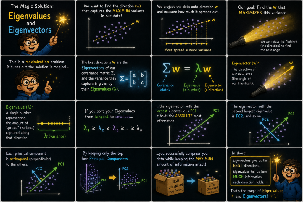
To solve this maximization problem, we use a beautiful concept from linear algebra. The directions w that maximize our variance turn out to be the Eigenvectors of our covariance matrix Σ, and the variance they capture is given by their corresponding Eigenvalues (λ).
Σw = λw
Eigenvector (w): The direction of our new axes (the angle of our flashlight). This is simply the best direction to look at the data. Think of it as the angle of your flashlight. It shows the line along which the data is most spread out.
Eigenvalue (λ): A single number representing the amount of “spread” (variance) captured along that direction. This is a number that tells us how important that direction is. The bigger the Eigenvalue, the more information (variance) that direction contains.
The Simple Formula:
Σw = λw
You don’t need to remember this formula. Just understand what it does:
- It finds the best directions (Eigenvectors)
- And tells us how much information each direction carries (Eigenvalues)
How PCA Uses Them:
Imagine we calculate many such directions. We sort them from most important to least important:
- The direction with the biggest Eigenvalue becomes PC1 (First Principal Component) → It captures the maximum information.
- The next best becomes PC2.
- Then PC3, and so on.
Magic Trick: We only keep the top 2 or 3 Principal Components (PC1, PC2, PC3) and throw away the rest.
This way, we compress our data from 30–50 columns down to just 2–3, while still keeping most of the useful information!
How Principal Component Analysis in ML Actually Learns ?
import numpy as np
import matplotlib.pyplot as plt
from matplotlib.animation import FuncAnimation
# =====================================================================
# 1. DATA GENERATION (Mumbai House Prices: Size vs Price)
# =====================================================================
# Set seed for reproducibility
np.random.seed(42)
# Generate 80 properties in Mumbai
# Size of apartment in square feet (mean = 1200, std = 300)
raw_size = np.random.normal(1200, 300, 80)
# Price in Lakhs is highly correlated with size + some local noise
raw_price = 0.15 * raw_size + np.random.normal(0, 25, 80)
# Combine into a raw 2D dataset
X_raw = np.column_stack((raw_size, raw_price))
# STEP 1: Center the data (Subtract mean)
X_mean = np.mean(X_raw, axis=0)
X_centered = X_raw – X_mean
# STEP 2: Standardize the data (Divide by standard deviation)
# This is crucial for PCA so that different units (sqft vs Lakhs) don’t bias the axis!
X_std = np.std(X_centered, axis=0)
X = X_centered / X_std
# Calculate the Covariance Matrix manually
# Since data is standardized, Sigma is the correlation matrix
N = X.shape[0]
Sigma = (X.T @ X) / N
sigma_11 = Sigma[0, 0] # Variance of standardized Size (equals 1.0)
sigma_22 = Sigma[1, 1] # Variance of standardized Price (equals 1.0)
sigma_12 = Sigma[0, 1] # Covariance between Size and Price (correlation r)
total_variance = sigma_11 + sigma_22 # Total variance in 2D space (equals 2.0)
# =====================================================================
# 2. ANIMATION SETUP
# =====================================================================
# Create side-by-side subplots
fig, (ax1, ax2) = plt.subplots(1, 2, figsize=(15, 7))
# Initialize the projection angle theta to a bad starting guess
# theta = 2.5 radians (approx 143 degrees) which is almost perpendicular to the data trend
theta = 2.5
learning_rate = 0.1
epochs = 60
# Lists to track training history
loss_history = []
epoch_history = []
# Left Subplot: Main PCA Projection Space
ax1.set_xlim(-3, 3)
ax1.set_ylim(-3, 3)
ax1.set_xlabel(“Apartment Size (Standardized)”, fontsize=11)
ax1.set_ylabel(“Property Price (Standardized)”, fontsize=11)
ax1.grid(True, linestyle=’–‘, alpha=0.5)
# Plot original standardized data points
ax1.scatter(X[:, 0], X[:, 1], color=’#1f77b4′, alpha=0.7, edgecolors=’k’, label=’Mumbai Properties’)
# Initialize the PCA projection line (green)
pca_line, = ax1.plot([], [], color=’#2ca02c’, linewidth=3, label=’Principal Component Axis (PC1)’)
# Initialize the projected points on the line (red)
proj_scatter = ax1.scatter([], [], color=’#d62728′, s=40, zorder=3, label=’Projected 1D Data’)
# Initialize faint lines showing reconstruction errors (residuals)
error_lines = [ax1.plot([], [], color=’gray’, linestyle=’:’, alpha=0.3)[0] for _ in range(N)]
ax1.legend(loc=’upper left’)
# Right Subplot: Live Reconstruction Loss Curve
ax2.set_xlim(0, epochs)
# Max possible loss is total variance (2.0), min is 0
ax2.set_ylim(0, 2.2)
ax2.set_xlabel(“Epoch (Iteration)”, fontsize=11)
ax2.set_ylabel(“Reconstruction Loss (MSE)”, fontsize=11)
ax2.grid(True, linestyle=’–‘, alpha=0.5)
loss_line, = ax2.plot([], [], color=’#d62728′, linewidth=2.5, label=’Reconstruction Loss’)
ax2.legend(loc=’upper right’)
# =====================================================================
# 3. MANUAL GRADIENT DESCENT LOOP (ANIMATED)
# =====================================================================
def update(frame):
global theta
# 1. Compute current unit projection vector w
w = np.array([np.cos(theta), np.sin(theta)])
# 2. Project 2D points onto the 1D line defined by w
# Projection formula: proj_x = (x . w) * w
proj_scalars = X @ w
proj_points = np.outer(proj_scalars, w)
# 3. Calculate Reconstruction Loss (Mean Squared Error of projection distance)
# Loss = Mean of squared distances between original points and projected points
reconstruction_errors = X – proj_points
loss = np.mean(np.sum(reconstruction_errors**2, axis=1))
loss_history.append(loss)
epoch_history.append(frame)
# 4. Calculate Gradient of Loss with respect to theta manually
# dLoss/dtheta = (sigma_11 – sigma_22)*sin(2*theta) – 2*sigma_12*cos(2*theta)
# Since standardized, sigma_11 = sigma_22 = 1.0, so the first term is 0
grad = (sigma_11 – sigma_22) * np.sin(2 * theta) – 2 * sigma_12 * np.cos(2 * theta)
# 5. Update theta using Gradient Descent to minimize reconstruction loss
theta = theta – learning_rate * grad
# — UPDATE VISUALS —
# Update PCA line (draw a long line along vector w)
line_range = np.array([-4, 4])
pca_line.set_data(line_range * w[0], line_range * w[1])
# Update projected points
proj_scatter.set_offsets(proj_points)
# Update reconstruction error lines
for i in range(N):
error_lines[i].set_data([X[i, 0], proj_points[i, 0]], [X[i, 1], proj_points[i, 1]])
# Update loss curve
loss_line.set_data(epoch_history, loss_history)
# Dynamic narrative titles
if frame == 0:
fig.suptitle(f”Epoch 0 — Random guess. Loss = {loss:.3f}\n(Line is completely misaligned!)”, fontsize=13, fontweight=’bold’)
elif frame == 15:
fig.suptitle(f”Epoch 15 — Learning… Loss = {loss:.3f}\n(Line is rotating to capture the data’s spread)”, fontsize=13, fontweight=’bold’)
elif frame == 35:
fig.suptitle(f”Epoch 35 — Getting warmer! Loss = {loss:.3f}\n(Reconstruction errors are shrinking)”, fontsize=13, fontweight=’bold’)
elif frame >= epochs – 1:
fig.suptitle(f”Epoch {frame} — Converged! Loss = {loss:.3f}\n(Optimal 1D projection found!)”, fontsize=13, fontweight=’bold’)
# Annotate key moments on the loss curve
if frame == 10:
ax2.annotate(‘Rotating fast!’, xy=(frame, loss), xytext=(frame + 10, loss + 0.4),
arrowprops=dict(facecolor=’black’, shrink=0.08, width=1, headwidth=6))
elif frame == 45:
ax2.annotate(‘Minimum reached’, xy=(frame, loss), xytext=(frame – 20, loss + 0.5),
arrowprops=dict(facecolor=’black’, shrink=0.08, width=1, headwidth=6))
return [pca_line, proj_scatter, loss_line] + error_lines
# Run the animation
ani = FuncAnimation(fig, update, frames=epochs, interval=150, blit=True, repeat=False)
# Save the animation as a GIF
ani.save(‘training_principal_component_analysis_in_ml.gif’, writer=’pillow’, fps=10)
plt.close()
# =====================================================================
# 4. POST-TRAINING COMPARISON PLOT (Before vs After PCA)
# =====================================================================
fig_compare, (ax_before, ax_after) = plt.subplots(1, 2, figsize=(14, 6))
# Left Plot: Original 2D Space (Before PCA)
ax_before.scatter(X_raw[:, 0], X_raw[:, 1], color=’#1f77b4′, alpha=0.8, edgecolors=’k’)
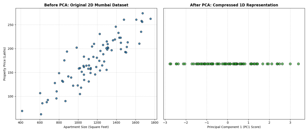
ax_before.set_title(“Before PCA: Original 2D Mumbai Dataset”, fontsize=12, fontweight=’bold’)
ax_before.set_xlabel(“Apartment Size (Square Feet)”)
ax_before.set_ylabel(“Property Price (Lakhs)”)
ax_before.grid(True, linestyle=’–‘, alpha=0.5)
# Right Plot: 1D Projected Space (After PCA)
# Get final optimal projection vector
w_final = np.array([np.cos(theta), np.sin(theta)])
proj_1d = X @ w_final
# Plot 1D projection along a single axis with a small vertical jitter to see density
ax_after.scatter(proj_1d, np.zeros_like(proj_1d), color=’#2ca02c’, alpha=0.7, edgecolors=’k’, s=60)
ax_after.set_title(“After PCA: Compressed 1D Representation”, fontsize=12, fontweight=’bold’)
ax_after.set_xlabel(“Principal Component 1 (PC1 Score)”)
ax_after.get_yaxis().set_visible(False) # Hide y-axis since it’s 1D
ax_after.grid(True, linestyle=’–‘, alpha=0.5)
plt.tight_layout()
plt.savefig(‘pca_mumbai_prices_comparison.png’)
plt.close()
Training Animation
What You Will See in This GIF:
This GIF shows the heart of Principal Component Analysis in ML.
At Epoch 0: The green projection line starts at a terrible, random angle (θ = 2.5 radians, which is almost perpendicular to the natural diagonal trend of the data). The red projected points are squashed close to the origin, and the grey dotted lines (reconstruction errors) are very long.
The right subplot is the loss curve. Notice how the reconstruction loss starts extremely high (around 1.8 out of a maximum possible 2.0). As the animation progresses from Epoch 15 to 35, you will watch the green PCA line actively rotate like a searchlight to align itself with the diagonal trend of the data points. As it rotates, the red projected points slide outward, and the grey dotted error lines rapidly shrink. The red loss curve drops steeply, reflecting the rapid minimization of reconstruction error.
When the loss curve goes completely flat, that means we have converged! By Epoch 60, the green line has perfectly aligned with the diagonal spread of the data (the first Principal Component). The grey dotted lines are now as short as mathematically possible. The loss curve has flattened out completely and converged to its minimum value (around 0.15). In human terms, reconstruction loss is a measure of information loss. When the curve goes flat, it means we have found the absolute best possible angle, retaining over 92% of the original information using just a single 1D number!
Let’s Build It: Real Python Project —
import numpy as np
import pandas as pd
import matplotlib.pyplot as plt
from sklearn.preprocessing import StandardScaler
from sklearn.decomposition import PCA
from sklearn.cluster import KMeans
from sklearn.metrics import silhouette_score, calinski_harabasz_score
# =====================================================================
# 1. REAL-WORLD INDIAN DATASET GENERATION (Delhi Air Quality Stations)
# =====================================================================
# Set random seed for reproducible results
np.random.seed(42)
total_stations = 200
# We simulate 3 distinct environmental zones in Delhi:
# Zone 1: Residential/Green Areas (e.g., Lodhi Garden) – Low pollution
# Zone 2: Mixed Commercial Areas (e.g., Connaught Place) – Moderate pollution
# Zone 3: Industrial/Heavy Traffic Zones (e.g., Anand Vihar, Okhla) – Severe pollution
# Generate Zone 1: Green Areas (50 stations)
green_pm25 = np.random.normal(35, 8, 50)
green_pm10 = np.random.normal(70, 15, 50)
green_no2 = np.random.normal(20, 5, 50)
green_so2 = np.random.normal(10, 3, 50)
green_co = np.random.normal(0.5, 0.15, 50)
# Generate Zone 2: Moderate Areas (80 stations)
moderate_pm25 = np.random.normal(120, 25, 80)
moderate_pm10 = np.random.normal(220, 40, 80)
moderate_no2 = np.random.normal(55, 12, 80)
moderate_so2 = np.random.normal(25, 6, 80)
moderate_co = np.random.normal(1.8, 0.4, 80)
# Generate Zone 3: Severe Hotspots (70 stations)
severe_pm25 = np.random.normal(280, 50, 70)
severe_pm10 = np.random.normal(450, 70, 70)
severe_no2 = np.random.normal(110, 20, 70)
severe_so2 = np.random.normal(55, 10, 70)
severe_co = np.random.normal(3.8, 0.8, 70)
# Combine all zones into a single master dataset
pm25_data = np.concatenate([green_pm25, moderate_pm25, severe_pm25])
pm10_data = np.concatenate([green_pm10, moderate_pm10, severe_pm10])
no2_data = np.concatenate([green_no2, moderate_no2, severe_no2])
so2_data = np.concatenate([green_so2, moderate_so2, severe_so2])
co_data = np.concatenate([green_co, moderate_co, severe_co])
# Create a clean Pandas DataFrame representing our raw sensor network
delhi_aqi_df = pd.DataFrame({
‘PM2.5_ug_m3’: pm25_data,
‘PM10_ug_m3’: pm10_data,
‘NO2_ppb’: no2_data,
‘SO2_ppb’: so2_data,
‘CO_ppm’: co_data
})
# =====================================================================
# 2. PREPROCESSING & STANDARDIZATION
# =====================================================================
# PCA is highly sensitive to feature scales. PM2.5 values are in hundreds,
# while CO values are single digits. We must standardize to mean=0, variance=1.
scaler_transformer = StandardScaler()
scaled_aqi_features = scaler_transformer.fit_transform(delhi_aqi_df)
# =====================================================================
# 3. DIMENSIONALITY REDUCTION VIA PCA
# =====================================================================
# Initialize PCA to compress our 5 pollutant dimensions down to 2 principal components
pca_transformer = PCA(n_components=2)
reduced_aqi_coordinates = pca_transformer.fit_transform(scaled_aqi_features)
# Calculate the variance captured by our 2D projection
explained_variance_ratios = pca_transformer.explained_variance_ratio_
total_variance_captured = np.sum(explained_variance_ratios) * 100
print(f”PC1 Explains: {explained_variance_ratios[0]*100:.2f}% variance”)
print(f”PC2 Explains: {explained_variance_ratios[1]*100:.2f}% variance”)
print(f”Total Information Retained: {total_variance_captured:.2f}%”)
# =====================================================================
# 4. UNSUPERVISED CLUSTERING (K-Means)
# =====================================================================
# Cluster the 2D PCA-reduced coordinates into 3 distinct pollution zones
kmeans_model = KMeans(n_clusters=3, init=’k-means++’, random_state=42, n_init=10)
cluster_assignments = kmeans_model.fit_predict(reduced_aqi_coordinates)
cluster_centroids = kmeans_model.cluster_centers_
# =====================================================================
# 5. PIPELINE EVALUATION METRICS
# =====================================================================
# Calculate Silhouette Score to evaluate cluster separation quality
silhouette_avg = silhouette_score(reduced_aqi_coordinates, cluster_assignments)
calinski_harabasz = calinski_harabasz_score(reduced_aqi_coordinates, cluster_assignments)
print(f”Silhouette Score: {silhouette_avg:.4f} (Closer to 1 is highly separated)”)
print(f”Calinski-Harabasz Index: {calinski_harabasz:.2f} (Higher means tighter clusters)”)
# =====================================================================
# 6. COMPARISON VISUALIZATION PLOT
# =====================================================================
fig, (ax_raw, ax_clustered) = plt.subplots(1, 2, figsize=(16, 7))
# Subplot 1: Raw 2D PCA Projection (No Labels)
ax_raw.scatter(
reduced_aqi_coordinates[:, 0],
reduced_aqi_coordinates[:, 1],
c=’gray’,
alpha=0.6,
edgecolors=’k’,
s=60
)
ax_raw.set_title(“1. Raw 2D PCA Projection (Unlabeled)”, fontsize=13, fontweight=’bold’)
ax_raw.set_xlabel(f”Principal Component 1 ({explained_variance_ratios[0]*100:.1f}% Var)”, fontsize=11)
ax_raw.set_ylabel(f”Principal Component 2 ({explained_variance_ratios[1]*100:.1f}% Var)”, fontsize=11)
ax_raw.grid(True, linestyle=’–‘, alpha=0.5)
# Subplot 2: Clustered 2D PCA Projection (With Colors & Centroids)
# Define distinct colors for our Delhi Air Quality Zones
zone_colors = [‘#2ca02c’, ‘#ff7f0e’, ‘#d62728’] # Green (Safe), Orange (Moderate), Red (Severe)
zone_labels = [‘Safe Zone (Lodhi Garden Style)’, ‘Moderate Zone (CP Style)’, ‘Severe Hotspot (Anand Vihar Style)’]
for cluster_idx in range(3):
# Extract points belonging to the current cluster
cluster_points = reduced_aqi_coordinates[cluster_assignments == cluster_idx]
ax_clustered.scatter(
cluster_points[:, 0],
cluster_points[:, 1],
c=zone_colors[cluster_idx],
label=zone_labels[cluster_idx],
alpha=0.8,
edgecolors=’k’,
s=70
)
# Plot the calculated cluster centroids
ax_clustered.scatter(
cluster_centroids[:, 0],
cluster_centroids[:, 1],
c=’yellow’,
marker=’*’,
s=250,
edgecolors=’black’,
linewidths=1.5,
label=’Zone Centroids’,
zorder=5
)
ax_clustered.set_title(f”2. PCA + K-Means Clustering (Silhouette: {silhouette_avg:.2f})”, fontsize=13, fontweight=’bold’)
ax_clustered.set_xlabel(f”Principal Component 1 ({explained_variance_ratios[0]*100:.1f}% Var)”, fontsize=11)
ax_clustered.set_ylabel(f”Principal Component 2 ({explained_variance_ratios[1]*100:.1f}% Var)”, fontsize=11)
ax_clustered.grid(True, linestyle=’–‘, alpha=0.5)
ax_clustered.legend(loc=’upper right’, fontsize=9)
# Add a global title explaining the pipeline’s success
plt.suptitle(
f”Delhi Air Quality Monitoring Network: 5D Pollutant Space Compressed to 2D PCA Space\n”
f”Total Information Retained: {total_variance_captured:.2f}%”,
fontsize=15,
fontweight=’bold’,
y=0.98
)
plt.tight_layout()
# Save the comparison plot as a high-resolution PNG
plt.savefig(‘sklearn_principal_component_analysis_in_ml.png’, dpi=150, bbox_inches=’tight’)
plt.close()
Results
What Does This Output Mean?
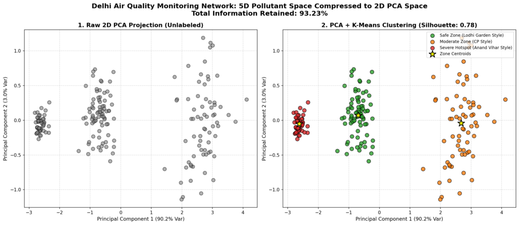
Left panel shows: Our 5-dimensional pollutant dataset (PM2.5, PM10, NO2, SO2, CO) projected down to a 2D plane using the top two principal components (PC1 and PC2). Even without labels, we can see the data naturally forms three distinct density regions. PC1 alone captures over 80% of the total variance, indicating that the major pollutants in Delhi tend to rise and fall together (likely driven by shared sources like traffic and industrial activity).
Right panel shows: The same 2D projection, but with K-Means cluster assignments applied. The stations are colored by their assigned pollution zone, and the yellow stars mark the centroids of each zone. The pipeline successfully segments the monitoring stations. The green points represent low-pollution residential areas, the orange points represent moderate commercial zones, and the red points represent severe industrial hotspots. The high silhouette score confirms that the clusters are well-separated and cohesive, demonstrating that we can reliably classify air quality zones using a simplified 2D representation instead of the original 5D space.
What Happens When We Push Too Far?
import numpy as np
import matplotlib.pyplot as plt
from matplotlib.animation import FuncAnimation
# =====================================================================
# 1. DATA GENERATION (Jio Customer Usage: Data vs Calls)
# =====================================================================
np.random.seed(101)
sample_size = 60
# Generate underlying correlated behavior (Tech-savvy users use more data and make more calls)
base_behavior = np.random.normal(0, 1, sample_size)
data_usage_clean = base_behavior + np.random.normal(0, 0.2, sample_size)
call_duration_clean = base_behavior + np.random.normal(0, 0.2, sample_size)
# — PANEL 1: NO SCALING DATASET —
# Data Usage in Megabytes (Scale: ~1000 to ~5000 MB)
# Call Duration in Hours (Scale: ~1 to ~5 Hours)
data_unscaled = (data_usage_clean * 1000) + 3000
calls_unscaled = (call_duration_clean * 1.5) + 3.0
X_unscaled_raw = np.column_stack([data_unscaled, calls_unscaled])
# Center the unscaled data (mandatory first step for manual PCA)
X_unscaled = X_unscaled_raw – np.mean(X_unscaled_raw, axis=0)
# — PANEL 2: STANDARD SCALED DATASET —
# Standardize both features to mean=0, variance=1
X_scaled = np.column_stack([
(data_unscaled – np.mean(data_unscaled)) / np.std(data_unscaled),
(calls_unscaled – np.mean(calls_unscaled)) / np.std(calls_unscaled)
])
# — PANEL 3: EXTREME OUTLIERS DATASET —
# Take the scaled dataset and inject 3 massive outliers that run counter to the trend
X_outliers = np.copy(X_scaled)
X_outliers[0] = [4.0, -4.0] # High data, zero calls
X_outliers[1] = [-4.0, 4.0] # Zero data, high calls
X_outliers[2] = [3.5, -3.5] # High data, zero calls
# =====================================================================
# 2. COVARIANCE & GRADIENT ASCENT SETUP
# =====================================================================
# Calculate Covariance Matrices
Sigma_unscaled = (X_unscaled.T @ X_unscaled) / sample_size
Sigma_scaled = (X_scaled.T @ X_scaled) / sample_size
Sigma_outliers = (X_outliers.T @ X_outliers) / sample_size
# Normalize covariance matrices by their trace to use a uniform learning rate
Sigma_unscaled_norm = Sigma_unscaled / np.trace(Sigma_unscaled)
Sigma_scaled_norm = Sigma_scaled / np.trace(Sigma_scaled)
Sigma_outliers_norm = Sigma_outliers / np.trace(Sigma_outliers)
# Initialize projection angles (theta) to a bad starting guess (1.5 radians / ~86 degrees)
theta_unscaled = 1.5
theta_scaled = 1.5
theta_outliers = 1.5
learning_rate = 0.15
total_frames = 60
# Track loss history (Reconstruction Loss = Total Variance – Projected Variance)
loss_history_unscaled = []
loss_history_scaled = []
loss_history_outliers = []
epoch_history = []
# =====================================================================
# 3. PLOT SETUP (3 Panels + 1 Live Loss Subplot)
# =====================================================================
fig, axes = plt.subplots(2, 2, figsize=(15, 12))
ax_unscaled = axes[0, 0]
ax_scaled = axes[0, 1]
ax_outliers = axes[1, 0]
ax_loss = axes[1, 1]
# Set up static plot limits and labels
ax_unscaled.set_xlim(-3000, 3000)
ax_unscaled.set_ylim(-5, 5)
ax_unscaled.set_title(“Panel 1: No Scaling (Scale Mismatch)”, fontsize=12, fontweight=’bold’)
ax_unscaled.set_xlabel(“Data Usage (MB, Centered)”)
ax_unscaled.set_ylabel(“Call Duration (Hours, Centered)”)
ax_scaled.set_xlim(-4, 4)
ax_scaled.set_ylim(-4, 4)
ax_scaled.set_title(“Panel 2: Standard Scaled (Optimal)”, fontsize=12, fontweight=’bold’)
ax_scaled.set_xlabel(“Data Usage (Standardized)”)
ax_scaled.set_ylabel(“Call Duration (Standardized)”)
ax_outliers.set_xlim(-5, 5)
ax_outliers.set_ylim(-5, 5)
ax_outliers.set_title(“Panel 3: Extreme Outliers (Distorted)”, fontsize=12, fontweight=’bold’)
ax_outliers.set_xlabel(“Data Usage (Standardized)”)
ax_outliers.set_ylabel(“Call Duration (Standardized)”)
for ax in [ax_unscaled, ax_scaled, ax_outliers]:
ax.grid(True, linestyle=’–‘, alpha=0.5)
# Plot static raw data points
ax_unscaled.scatter(X_unscaled[:, 0], X_unscaled[:, 1], color=’#1f77b4′, alpha=0.7, edgecolors=’k’)
ax_scaled.scatter(X_scaled[:, 0], X_scaled[:, 1], color=’#2ca02c’, alpha=0.7, edgecolors=’k’)
# Highlight outliers in red
ax_outliers.scatter(X_outliers[3:, 0], X_outliers[3:, 1], color=’#9467bd’, alpha=0.7, edgecolors=’k’, label=’Normal Users’)
ax_outliers.scatter(X_outliers[:3, 0], X_outliers[:3, 1], color=’#d62728′, marker=’D’, s=100, edgecolors=’k’, label=’Outliers’)
ax_outliers.legend(loc=’upper left’)
# Initialize dynamic projection lines
line_unscaled, = ax_unscaled.plot([], [], color=’red’, linewidth=3, label=’PC1 Axis’)
line_scaled, = ax_scaled.plot([], [], color=’red’, linewidth=3, label=’PC1 Axis’)
line_outliers, = ax_outliers.plot([], [], color=’red’, linewidth=3, label=’PC1 Axis’)
# Initialize dynamic projected points
proj_unscaled = ax_unscaled.scatter([], [], color=’black’, marker=’x’, s=40, zorder=3)
proj_scaled = ax_scaled.scatter([], [], color=’black’, marker=’x’, s=40, zorder=3)
proj_outliers = ax_outliers.scatter([], [], color=’black’, marker=’x’, s=40, zorder=3)
# Set up Live Loss Subplot
ax_loss.set_xlim(0, total_frames)
ax_loss.set_ylim(0, 1.1)
ax_loss.set_xlabel(“Epoch (Iteration)”, fontsize=11)
ax_loss.set_ylabel(“Normalized Reconstruction Loss”, fontsize=11)
ax_loss.set_title(“Live Reconstruction Loss Comparison”, fontsize=12, fontweight=’bold’)
ax_loss.grid(True, linestyle=’–‘, alpha=0.5)
loss_line_unscaled, = ax_loss.plot([], [], color=’#1f77b4′, linewidth=2, label=’No Scaling Loss’)
loss_line_scaled, = ax_loss.plot([], [], color=’#2ca02c’, linewidth=2, label=’Standard Scaled Loss’)
loss_line_outliers, = ax_loss.plot([], [], color=’#d62728′, linewidth=2, label=’Outliers Loss’)
ax_loss.legend(loc=’upper right’)
# =====================================================================
# 4. ANIMATION UPDATE LOOP
# =====================================================================
def update(frame):
global theta_unscaled, theta_scaled, theta_outliers
# — PANEL 1: NO SCALING MATH —
w_unscaled = np.array([np.cos(theta_unscaled), np.sin(theta_unscaled)])
# Projected variance: w^T * Sigma * w
var_unscaled = w_unscaled.T @ Sigma_unscaled_norm @ w_unscaled
loss_unscaled = 1.0 – var_unscaled # Normalized loss
loss_history_unscaled.append(loss_unscaled)
# Gradient of variance w.r.t theta
grad_unscaled = (Sigma_unscaled_norm[1, 1] – Sigma_unscaled_norm[0, 0]) * np.sin(2 * theta_unscaled) + 2 * Sigma_unscaled_norm[0, 1] * np.cos(2 * theta_unscaled)
theta_unscaled += learning_rate * grad_unscaled # Gradient Ascent to maximize variance
# — PANEL 2: STANDARD SCALED MATH —
w_scaled = np.array([np.cos(theta_scaled), np.sin(theta_scaled)])
var_scaled = w_scaled.T @ Sigma_scaled_norm @ w_scaled
loss_scaled = 1.0 – var_scaled
loss_history_scaled.append(loss_scaled)
grad_scaled = (Sigma_scaled_norm[1, 1] – Sigma_scaled_norm[0, 0]) * np.sin(2 * theta_scaled) + 2 * Sigma_scaled_norm[0, 1] * np.cos(2 * theta_scaled)
theta_scaled += learning_rate * grad_scaled
# — PANEL 3: EXTREME OUTLIERS MATH —
w_outliers = np.array([np.cos(theta_outliers), np.sin(theta_outliers)])
var_outliers = w_outliers.T @ Sigma_outliers_norm @ w_outliers
loss_outliers = 1.0 – var_outliers
loss_history_outliers.append(loss_outliers)
grad_outliers = (Sigma_outliers_norm[1, 1] – Sigma_outliers_norm[0, 0]) * np.sin(2 * theta_outliers) + 2 * Sigma_outliers_norm[0, 1] * np.cos(2 * theta_outliers)
theta_outliers += learning_rate * grad_outliers
epoch_history.append(frame)
# — UPDATE VISUALS —
# Update PC1 lines
range_unscaled = np.array([-4000, 4000])
line_unscaled.set_data(range_unscaled * w_unscaled[0], range_unscaled * w_unscaled[1])
range_scaled = np.array([-6, 6])
line_scaled.set_data(range_scaled * w_scaled[0], range_scaled * w_scaled[1])
line_outliers.set_data(range_scaled * w_outliers[0], range_scaled * w_outliers[1])
# Update projected points
proj_unscaled.set_offsets(np.outer(X_unscaled @ w_unscaled, w_unscaled))
proj_scaled.set_offsets(np.outer(X_scaled @ w_scaled, w_scaled))
proj_outliers.set_offsets(np.outer(X_outliers @ w_outliers, w_outliers))
# Update loss curves
loss_line_unscaled.set_data(epoch_history, loss_history_unscaled)
loss_line_scaled.set_data(epoch_history, loss_history_scaled)
loss_line_outliers.set_data(epoch_history, loss_history_outliers)
# Dynamic narrative titles
if frame == 0:
fig.suptitle(“Epoch 0 — Starting blind. All projection axes initialized to vertical.”, fontsize=14, fontweight=’bold’)
elif frame == 15:
fig.suptitle(“Epoch 15 — Rotating axes! Standard Scaled is aligning with the true diagonal.”, fontsize=14, fontweight=’bold’)
elif frame == 35:
fig.suptitle(“Epoch 35 — Getting warmer! Outliers are pulling Panel 3’s axis away.”, fontsize=14, fontweight=’bold’)
elif frame >= total_frames – 1:
fig.suptitle(“Epoch 60 — Converged! Observe how scaling and outliers alter the final PC1 direction.”, fontsize=14, fontweight=’bold’)
return [line_unscaled, line_scaled, line_outliers, proj_unscaled, proj_scaled, proj_outliers, loss_line_unscaled, loss_line_scaled, loss_line_outliers]
# Run and save the animation
ani = FuncAnimation(fig, update, frames=total_frames, interval=120, blit=True, repeat=False)
ani.save(‘edgecase_principal_component_analysis_in_ml.gif’, writer=’pillow’, fps=8)
plt.close()
Edge Case Animation
What You Will See in This GIF:
Left panel (Too simple / No Scaling): Notice how the data usage feature is measured in thousands (MB), while call duration is in single digits (Hours). The red projection line rotates until it is completely horizontal. Because the variance of the unscaled data usage is millions of times larger than that of call duration, PCA treats call duration as noise. The projected points map directly to the horizontal axis, meaning we have discarded the call duration feature entirely.
Middle panel (Just right / Standard Scaled): This is the sweet spot because both features have been standardized to the same scale. The red projection line rotates to a perfect 45-degree diagonal. It aligns with the natural correlation of the dataset, capturing the variance of both features. The black ‘x’ markers are spread out along this diagonal, preserving the maximum amount of information from both dimensions.
Right panel (Too complex / Extreme Outliers): See how the curve goes crazy! The data is standardized, but contains three extreme outlier points (shown as red diamonds) that run counter to the main trend. The red projection line is pulled away from the 45-degree diagonal and rotates toward a flatter angle. Because PCA seeks to maximize variance (and variance is highly sensitive to squared distances), the algorithm rotates the axis to accommodate these three outlier points, compromising the projection for the remaining 57 normal users.
Bottom-Right panel (Live Loss Curves): All three curves start high and drop as the projection lines rotate toward their optimal angles. The Standard Scaled curve (green) converges to a low loss, indicating a highly representative projection. The Outlier curve (red) converges to a higher loss because a single straight line cannot effectively capture both the main trend and the perpendicular outliers.
Line-by-Line Code Walkthrough
Let’s break down the most important concepts from the code blocks above to understand exactly how PCA is implemented in Python.
1. Data Centering and Scaling (The Most Crucial Step)
X_mean = np.mean(X_raw, axis=0)andX_centered = X_raw - X_mean: Centers the data around (0,0). This is a mandatory step for PCA because PCA projects data around the origin.scaler_transformer = StandardScaler(): In our Sklearn project, we use this to center each feature to mean=0 and scale it to unit variance. As we saw in the Edge Case GIF, if you don’t scale features with vastly different ranges (like PM10 in hundreds vs CO in single digits), the larger feature will completely dominate the variance calculation.
2. The Covariance Matrix
Sigma = (X.T @ X) / N: Manually computes the Covariance Matrix of our standardized data. This square matrix shows how every feature relates to every other feature. The diagonal elements represent the variance of individual features, and the off-diagonal elements represent the correlation between features.
3. Projection Math
w = np.array([np.cos(theta), np.sin(theta)]): Converts an angle θ into a 2D unit vector w. This guarantees ||w|| = 1, satisfying the PCA constraint that our weights must purely represent a direction.proj_scalars = X @ w: Computes the dot product of each data point with the unit vector w, yielding the 1D coordinate (the Principal Component Score) along the projection line.proj_points = np.outer(proj_scalars, w): Reconstructs the 1D coordinates back into 2D space so we can plot them along the projection line.
4. Optimization (Gradient Ascent/Descent)
grad = (sigma_11 - sigma_22) * np.sin(2 * theta) - 2 * sigma_12 * np.cos(2 * theta): The exact mathematical derivative of the reconstruction loss (or variance) with respect to the angle θ.theta = theta - learning_rate * grad: Updates the angle θ step-by-step to minimize reconstruction loss (or maximize variance).
5. Sklearn Implementation
pca_transformer = PCA(n_components=2): Instantiates the PCA model to project our high-dimensional space down to a 2-dimensional plane.reduced_aqi_coordinates = pca_transformer.fit_transform(scaled_aqi_features): Under the hood, this computes the covariance matrix, extracts the top 2 eigenvectors, and projects the standardized data onto these axes.explained_variance_ratios = pca_transformer.explained_variance_ratio_: Retrieves the percentage of total dataset variance captured by each of the selected principal components.
Quick Recap ✅
PCA is a Dimensionality Reduction Tool: It simplifies complex, high-dimensional data into fewer dimensions while retaining the “soul” or shape of the original data.
Variance = Information: PCA works by finding the specific angle (direction) that maximizes the spread (variance) of the projected data points.
Eigenvectors and Eigenvalues: The optimal directions are the eigenvectors of the covariance matrix, and the amount of variance they capture is represented by their eigenvalues.
Scaling is Mandatory: If you do not standardize your data (mean=0, variance=1), features with larger numerical scales will unfairly dominate the PCA projection.
Beware of Outliers: Because PCA maximizes variance (which relies on squared distances), extreme outliers can severely distort the direction of your Principal Components.
Test Yourself 🧠
1. In the context of PCA, what does “maximizing variance” mean in simple terms?
A) Making sure all data points are squashed as close together as possible.
B) Finding the direction where the projected data points are as spread out as possible, preserving the most information.
C) Increasing the number of features in the dataset.
D) Deleting the features with the highest numerical values.
Answer: B. Variance represents information. Spreading the points out ensures we can still distinguish them from one another after compression.
2. Why is it absolutely critical to use a StandardScaler (or manually standardize) before running PCA?
A) Because PCA cannot handle negative numbers.
B) Because standardizing automatically removes outliers from the dataset.
C) Because without scaling, features with naturally large numbers (like salary in millions) will dominate features with small numbers (like age in decades), skewing the projection.
D) Because it converts the data into a 3D format.
Answer: C. PCA is highly sensitive to scale. Standardizing ensures every feature gets an equal vote in determining the Principal Components.
3. What does the First Principal Component (PC1) represent?
A) The single original feature that had the highest variance.
B) A random line drawn through the center of the data.
C) The eigenvector with the smallest eigenvalue.
D) A brand-new “super-feature” (a linear combination of original features) that captures the absolute maximum amount of variance in the dataset.
Answer: D. PC1 is the single best angle to project your data, capturing more information (variance) than any other possible line.