The Problem
Imagine you are preparing for your Class 12 Board Exams.
If you only memorize the back-of-the-chapter questions, you will fail when the exam paper twists the questions even slightly. But if you try to memorize every single line, printing mistake, and page number of your textbook, you will get completely confused by a simple, direct question.
How do you find that perfect balance of studying where you understand the core concepts without over-simplifying or over-memorizing?
What is bias variance tradeoff? (And Why Should You Care?)
Before we look at any math, let us meet two different types of students that exist in every Indian classroom:
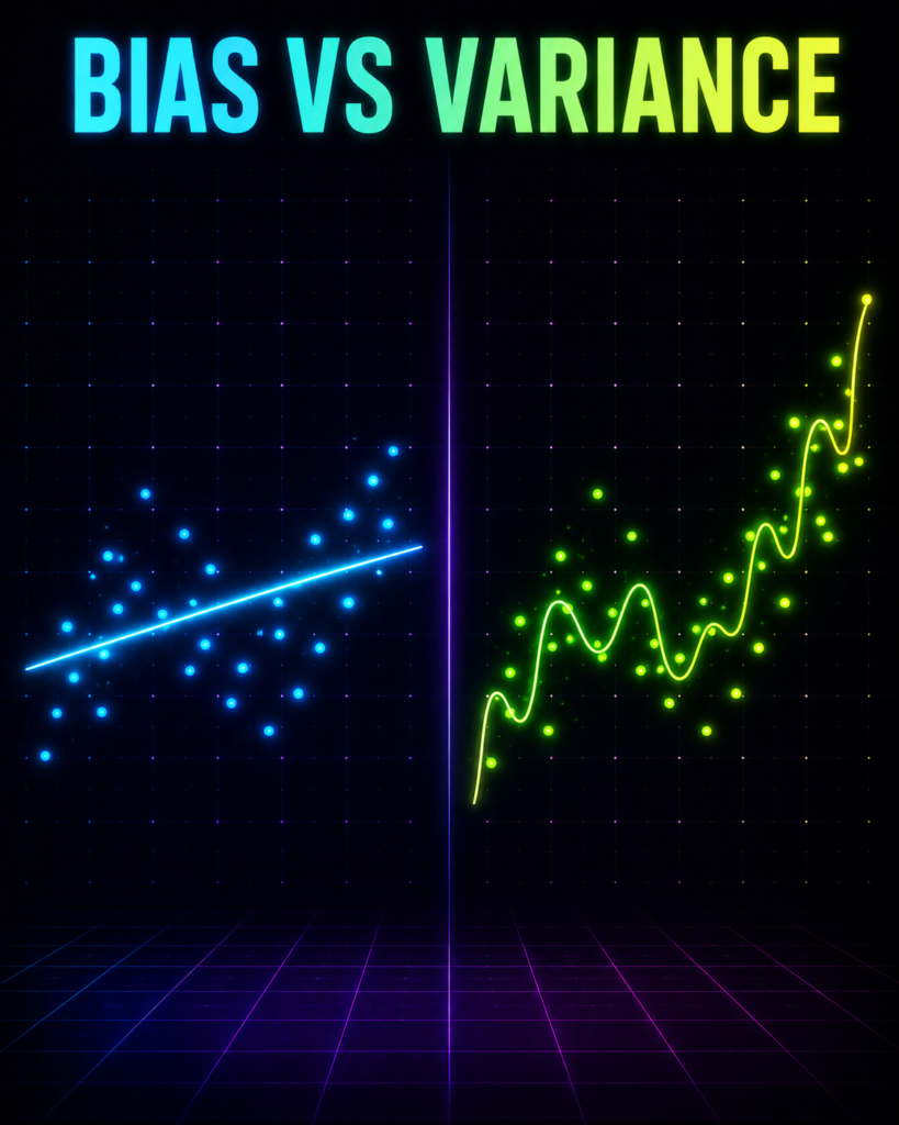
The “Ratta-Maar” (The Rote Learner): This student has decided that every math problem in the world can be solved using one simple formula: a straight line. No matter how complex the question is, they force this straight line onto it. They are too rigid. They have a strong Bias (preconceived notion) about how the world works.
The “Over-Thinker”: This student memorizes everything. If a practice test had a typo where 2 + 2 = 5, they memorized that typo too. When they sit for the actual exam, any tiny change (Variance) in the question paper panics them. They score 100% in practice tests but fail miserably in the real exam because they memorized the “noise” instead of the concept.
In Machine Learning, we face the exact same problem:
Bias is the error that happens because your model is too simple and makes wrong assumptions (like drawing a straight line through a curved wave of data). This is called Underfitting.
Variance is the error that happens because your model is too complex and pays too much attention to random fluctuations in your training data. This is called Overfitting.
Why do we need this concept?
If we only build simple models, they fail to capture the real-world patterns. If we make our models incredibly complex to fix this, they start memorizing random noise.
The Bias-Variance Tradeoff is the art of finding the sweet spot where our model is complex enough to learn the pattern, but simple enough to ignore the noise.
Where is bias variance tradeoff Used in Real Life?
Here are three real-world Indian scenarios where data scientists fight this battle every single day:
Example A: Zomato Delivery Time Prediction
Inputs: Distance from restaurant to your home, time of day, and whether it is raining in Mumbai.
Output: Delivery time in minutes.
The Tradeoff: A high-bias model simply says: “Delivery takes 2 minutes per kilometer.” It completely ignores Mumbai’s heavy monsoon traffic. A high-variance model memorizes that last Tuesday at 8:04 PM, a delivery took 90 minutes because a stray cow blocked the delivery rider. It will now predict 90 minutes for every Tuesday at 8:04 PM! We need the tradeoff to capture traffic trends without memorizing the stray cow.
Example B: IPL Ticket Pricing
Inputs: Stadium capacity, current IPL standings, and whether Virat Kohli or MS Dhoni is playing.
Output: Ticket price in Rupees.
The Tradeoff: A high-bias model assumes ticket prices only depend on stadium size, ignoring the massive crowd pull of Dhoni playing his last season. A high-variance model memorizes that in 2023, a single ticket sold for Rs. 50,000 because a specific Bollywood celebrity was sitting in the next seat. We need the tradeoff to price tickets dynamically without reacting to one-off celebrity sightings.
Example C: Monsoon Rainfall Prediction in Kerala
Inputs: Sea surface temperature, wind speed, and humidity levels.
Output: Rainfall in millimeters.
The Tradeoff: A high-bias model predicts “It rains exactly 500mm every July,” ignoring climate change shifts. A high-variance model tries to match the exact daily rainfall of the last 50 years, predicting a massive storm on July 14th just because it rained on that exact date in 1984 due to a random local cloudburst. The tradeoff helps meteorologists predict general seasonal trends accurately.
The Math Behind bias variance tradeoff
Now that you feel the concept in your gut, let us look at the math that governs this balance.
If we measure the Total Expected Error of our machine learning model, it can be broken down mathematically into three distinct parts:
Total Error = Bias² + Variance + noise²
Let us break down this equation one symbol at a time, using the exact variable names you will see in our Python code later:
1. Total Error
This is the average squared difference between what our model predicts (y_pred) and what the actual real-world value is (y_raw). In human terms, this is how far off your model is from reality.
2. Bias²
Mathematically, Bias is defined as:
Bias[y_pred] = E[y_pred] – y_raw
y_raw is the absolute truth (the actual real-world relationship).
y_pred is our model’s prediction.
E[…] stands for Expected Value (which is just a fancy word for “Average”).
In human terms: If we train our model 100 times on 100 different datasets, how far away is our average prediction from the true target? If it is consistently far away, we have high bias. We square this term (Bias²) because we only care about the distance of the error, not whether it is positive or negative.
3. Variance
Mathematically, Variance is defined as:
Variance = E[(y_pred – E[y_pred])²]
y_pred is our model’s prediction for a specific dataset.
E[y_pred] is the average prediction of our model across all datasets.
In human terms: This measures how much our predictions jump around if we change the training data. If we give the model a slightly different dataset, does the prediction change completely (high variance) or does it stay stable (low variance)?
4. noise² – The Irreducible Error
In human terms: This is the pure noise in the universe. For example, a sudden gust of wind that changes the path of a cricket ball, or a sudden change in a buyer’s mood.
No machine learning model, even one built by super-intelligent aliens, can predict this. It is a constant. We cannot reduce it, which is why we call it “irreducible.”
GIF 1: Why Simple Models Fail ?
import numpy as np
import matplotlib.pyplot as plt
from matplotlib.animation import FuncAnimation
# Set random seed so that the random noise is identical every time you run this
np.random.seed(42)
# ==========================================
# 1. GENERATE THE MUMBAI REAL ESTATE DATA
# ==========================================
# x_raw: Distance to the nearest local railway station in kilometers (0.5 km to 5.0 km)
x_raw = np.linspace(0.5, 5.0, 50)
# True relationship: Property prices (in Crores INR) drop sharply near the station, then flatten out.
# This is a non-linear relationship: Price = 8.0 – 2.5 * x + 0.3 * x^2 + random noise
noise = np.random.normal(0, 0.3, size=50) # Irreducible error (random market fluctuations)
y_raw = 8.0 – 2.5 * x_raw + 0.3 * (x_raw ** 2) + noise
# Normalize x to make Gradient Descent stable and fast
x_mean = np.mean(x_raw)
x_std = np.std(x_raw)
x_normalized = (x_raw – x_mean) / x_std
# ==========================================
# 2. INITIALIZE MODEL PARAMETERS
# ==========================================
# Left Model: Linear (High Bias / Underfitting) -> y = w1 * x + w0
w1 = 0.0
w0 = np.mean(y_raw) # Start with the average price
# Right Model: Quadratic (Balanced Tradeoff) -> y = v2 * x^2 + v1 * x + v0
v2 = 0.0
v1 = 0.0
v0 = np.mean(y_raw) # Start with the average price
# Hyperparameters
learning_rate = 0.05
total_frames = 100
steps_per_frame = 2 # We run 2 gradient descent steps per frame to speed up the animation
# Lists to store loss history for live plotting
epochs_history = []
loss_history_linear = []
loss_history_quad = []
# ==========================================
# 3. SETUP THE MATPLOTLIB PLOT (2×2 Grid)
# ==========================================
fig, axs = plt.subplots(2, 2, figsize=(14, 10))
plt.subplots_adjust(hspace=0.4, wspace=0.3)
# Top-Left: Linear Model Fit
ax_fit_linear = axs[0, 0]
ax_fit_linear.scatter(x_raw, y_raw, color=’orange’, edgecolor=’k’, label=’Mumbai Apartments’)
line_linear, = ax_fit_linear.plot([], [], color=’red’, linewidth=3, label=’Linear Fit (High Bias)’)
ax_fit_linear.set_xlim(0, 5.5)
ax_fit_linear.set_ylim(min(y_raw) – 1, max(y_raw) + 1)
ax_fit_linear.set_xlabel(“Distance to Station (km)”)
ax_fit_linear.set_ylabel(“Price (Crores INR)”)
ax_fit_linear.legend()
ax_fit_linear.grid(True, linestyle=’–‘, alpha=0.5)
# Top-Right: Quadratic Model Fit
ax_fit_quad = axs[0, 1]
ax_fit_quad.scatter(x_raw, y_raw, color=’orange’, edgecolor=’k’, label=’Mumbai Apartments’)
line_quad, = ax_fit_quad.plot([], [], color=’green’, linewidth=3, label=’Quadratic Fit (Balanced)’)
ax_fit_quad.set_xlim(0, 5.5)
ax_fit_quad.set_ylim(min(y_raw) – 1, max(y_raw) + 1)
ax_fit_quad.set_xlabel(“Distance to Station (km)”)
ax_fit_quad.set_ylabel(“Price (Crores INR)”)
ax_fit_quad.legend()
ax_fit_quad.grid(True, linestyle=’–‘, alpha=0.5)
# Bottom-Left: Linear Model Loss History
ax_loss_linear = axs[1, 0]
loss_line_linear, = ax_loss_linear.plot([], [], color=’red’, linewidth=2)
ax_loss_linear.set_xlim(0, total_frames * steps_per_frame)
ax_loss_linear.set_ylim(0, 10)
ax_loss_linear.set_xlabel(“Epochs”)
ax_loss_linear.set_ylabel(“Mean Squared Error (Loss)”)
ax_loss_linear.grid(True, linestyle=’–‘, alpha=0.5)
# Bottom-Right: Quadratic Model Loss History
ax_loss_quad = axs[1, 1]
loss_line_quad, = ax_loss_quad.plot([], [], color=’green’, linewidth=2)
ax_loss_quad.set_xlim(0, total_frames * steps_per_frame)
ax_loss_quad.set_ylim(0, 10)
ax_loss_quad.set_xlabel(“Epochs”)
ax_loss_quad.set_ylabel(“Mean Squared Error (Loss)”)
ax_loss_quad.grid(True, linestyle=’–‘, alpha=0.5)
# ==========================================
# 4. ANIMATION UPDATE FUNCTION
# ==========================================
def update(frame):
global w1, w0, v2, v1, v0
current_epoch = frame * steps_per_frame
# Run Gradient Descent steps
for _ in range(steps_per_frame):
# — LINEAR MODEL GRADIENT DESCENT —
# Predict
y_pred_linear = w1 * x_normalized + w0
# Calculate Loss (Mean Squared Error)
loss_linear = np.mean((y_pred_linear – y_raw) ** 2)
# Gradients
dw1 = (2 / len(x_normalized)) * np.sum((y_pred_linear – y_raw) * x_normalized)
dw0 = (2 / len(x_normalized)) * np.sum(y_pred_linear – y_raw)
# Update weights
w1 -= learning_rate * dw1
w0 -= learning_rate * dw0
# — QUADRATIC MODEL GRADIENT DESCENT —
# Predict
y_pred_quad = v2 * (x_normalized ** 2) + v1 * x_normalized + v0
# Calculate Loss (Mean Squared Error)
loss_quad = np.mean((y_pred_quad – y_raw) ** 2)
# Gradients
dv2 = (2 / len(x_normalized)) * np.sum((y_pred_quad – y_raw) * (x_normalized ** 2))
dv1 = (2 / len(x_normalized)) * np.sum((y_pred_quad – y_raw) * x_normalized)
dv0 = (2 / len(x_normalized)) * np.sum(y_pred_quad – y_raw)
# Update weights
v2 -= learning_rate * dv2
v1 -= learning_rate * dv1
v0 -= learning_rate * dv0
# Save history for plotting
epochs_history.append(current_epoch)
loss_history_linear.append(loss_linear)
loss_history_quad.append(loss_quad)
# Update Linear Fit Line
y_plot_linear = w1 * x_normalized + w0
line_linear.set_data(x_raw, y_plot_linear)
ax_fit_linear.set_title(f”Linear Fit (High Bias)\nLoss: {loss_linear:.4f}”, fontsize=10)
# Update Quadratic Fit Line
y_plot_quad = v2 * (x_normalized ** 2) + v1 * x_normalized + v0
line_quad.set_data(x_raw, y_plot_quad)
ax_fit_quad.set_title(f”Quadratic Fit (Balanced)\nLoss: {loss_quad:.4f}”, fontsize=10)
# Update Loss Curves
loss_line_linear.set_data(epochs_history, loss_history_linear)
loss_line_quad.set_data(epochs_history, loss_history_quad)
# Dynamic Storytelling Titles
if current_epoch == 0:
fig.suptitle(“Epoch 0 — Both starting blind”, fontsize=16, fontweight=’bold’, color=’navy’)
elif current_epoch <= 40:
fig.suptitle(f”Epoch {current_epoch} — Simple model struggling, Quadratic model finding the curve!”, fontsize=14, fontweight=’bold’, color=’navy’)
elif current_epoch <= 120:
fig.suptitle(f”Epoch {current_epoch} — Simple model stuck (High Bias), Quadratic model getting warmer!”, fontsize=14, fontweight=’bold’, color=’navy’)
else:
fig.suptitle(f”Epoch {current_epoch} — Simple model failed (Underfit). Quadratic model nailed the sweet spot!”, fontsize=14, fontweight=’bold’, color=’navy’)
return line_linear, line_quad, loss_line_linear, loss_line_quad
# ==========================================
# 5. RUN AND SAVE THE ANIMATION
# ==========================================
ani = FuncAnimation(fig, update, frames=total_frames, interval=100, blit=False)
ani.save(‘comparison_bias_variance_tradeoff.gif’, writer=’pillow’, fps=10)
plt.close()
# ==========================================
# 6. POST-TRAINING COMPARISON PLOT (PNG)
# ==========================================
# Calculate final predictions
final_pred_linear = w1 * x_normalized + w0
final_pred_quad = v2 * (x_normalized ** 2) + v1 * x_normalized + v0
# Calculate Residuals (Actual – Predicted)
residuals_linear = y_raw – final_pred_linear
residuals_quad = y_raw – final_pred_quad
# Create static comparison figure
fig_compare, axs_compare = plt.subplots(1, 2, figsize=(14, 6))
# Left Subplot: Actual vs Predicted
axs_compare[0].scatter(x_raw, y_raw, color=’orange’, edgecolor=’k’, alpha=0.7, label=’Actual Prices’)
axs_compare[0].plot(x_raw, final_pred_linear, color=’red’, linestyle=’–‘, linewidth=2, label=’Linear Predictions’)
axs_compare[0].plot(x_raw, final_pred_quad, color=’green’, linewidth=3, label=’Quadratic Predictions’)
axs_compare[0].set_title(“Actual vs. Predicted Mumbai Property Prices”, fontsize=12, fontweight=’bold’)
axs_compare[0].set_xlabel(“Distance to Station (km)”)
axs_compare[0].set_ylabel(“Price (Crores INR)”)
axs_compare[0].legend()
axs_compare[0].grid(True, linestyle=’–‘, alpha=0.5)
# Right Subplot: Residuals Plot
axs_compare[1].scatter(x_raw, residuals_linear, color=’red’, alpha=0.6, label=’Linear Residuals (Bad Fit)’)
axs_compare[1].scatter(x_raw, residuals_quad, color=’green’, alpha=0.6, label=’Quadratic Residuals (Good Fit)’)
axs_compare[1].axhline(y=0, color=’black’, linestyle=’-‘, linewidth=1.5)
axs_compare[1].set_title(“Residuals Analysis (Errors)”, fontsize=12, fontweight=’bold’)
axs_compare[1].set_xlabel(“Distance to Station (km)”)
axs_compare[1].set_ylabel(“Residual Error (Crores INR)”)
axs_compare[1].legend()
axs_compare[1].grid(True, linestyle=’–‘, alpha=0.5)
plt.tight_layout()
plt.savefig(‘bias_variance_residuals.png’)
plt.close()
Comparison Animation
What You Will See in This GIF:
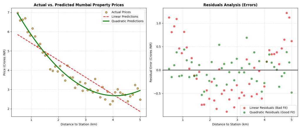
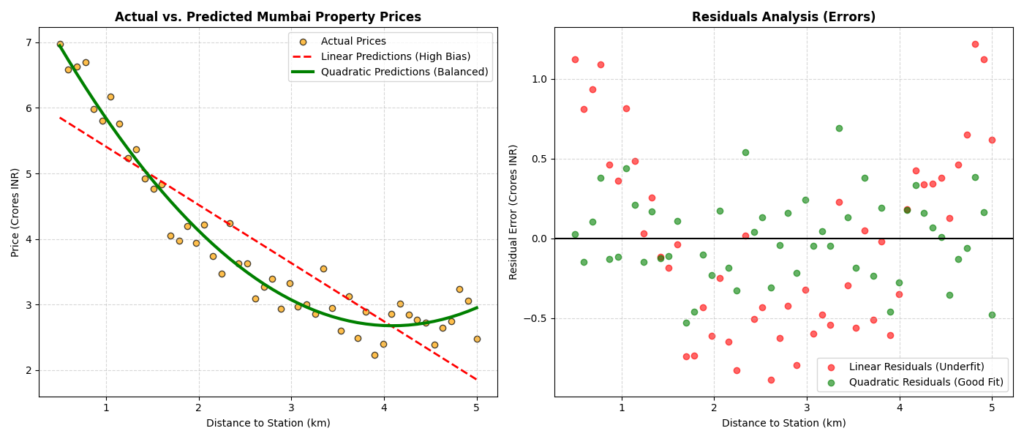
At the very start of this animation (Epoch 0), you will see both models start completely blind. The prediction lines for both the Linear Fit (left) and the Quadratic Fit (right) are completely flat, representing the average price of the apartments (around 4.5 Crores). The loss values for both models are high.
Watch how at around Epoch 40 to 120, both models begin updating their weights. The Linear Fit (red line) tilts to capture the downward trend of the data. However, because it is a straight line, it cannot bend. It is stuck in a state of High Bias (Underfitting). Its loss curve flattens out quickly and refuses to drop further. The Quadratic Fit (green line) begins to bend. It starts curving down near the station and flattening out further away, matching the actual distribution of the orange data points. Its loss curve drops rapidly.
By the final frame (Epoch 200), the Linear Fit has completely stalled. It has done the best job a straight line can do, but it still misses the curve entirely. Its final loss remains high. The Quadratic Fit has perfectly captured the underlying physical trend of the data without memorizing the individual noise points. Its final loss is extremely low. It nailed the sweet spot!
GIF 2: How bias variance tradeoff Actually Learns —
import numpy as np
import matplotlib.pyplot as plt
from matplotlib.animation import FuncAnimation
# Set random seed so that the random noise is identical every time you run this
np.random.seed(42)
# ==========================================
# 1. GENERATE THE MUMBAI REAL ESTATE DATA
# ==========================================
# x_raw: Distance to the nearest local railway station in kilometers (0.5 km to 5.0 km)
x_raw = np.linspace(0.5, 5.0, 50)
# True relationship: Property prices (in Crores INR) drop sharply near the station, then flatten out.
# This is a non-linear relationship: Price = 8.0 – 2.5 * x + 0.3 * x^2 + random noise
noise = np.random.normal(0, 0.3, size=50) # Irreducible error (random market fluctuations)
y_raw = 8.0 – 2.5 * x_raw + 0.3 * (x_raw ** 2) + noise
# Normalize x to make Gradient Descent stable and fast
x_mean = np.mean(x_raw)
x_std = np.std(x_raw)
x_normalized = (x_raw – x_mean) / x_std
# ==========================================
# 2. INITIALIZE MODEL PARAMETERS
# ==========================================
# Model A: Linear (High Bias / Underfitting) -> y = w1 * x + w0
w1 = 0.0
w0 = np.mean(y_raw) # Start with the average price
# Model B: Quadratic (Balanced Tradeoff) -> y = v2 * x^2 + v1 * x + v0
v2 = 0.0
v1 = 0.0
v0 = np.mean(y_raw) # Start with the average price
# Hyperparameters
learning_rate = 0.05
total_frames = 100
steps_per_frame = 2 # We run 2 gradient descent steps per frame to speed up the animation
# Lists to store loss history for live plotting
epochs_history = []
loss_history_linear = []
loss_history_quad = []
# ==========================================
# 3. SETUP THE MATPLOTLIB PLOT (1×2 Grid)
# ==========================================
fig, (ax_fit, ax_loss) = plt.subplots(1, 2, figsize=(15, 6))
plt.subplots_adjust(wspace=0.3)
# Left Subplot: Live Model Fitting on Data Points
ax_fit.scatter(x_raw, y_raw, color=’orange’, edgecolor=’k’, s=50, label=’Mumbai Apartments (Data)’)
line_linear, = ax_fit.plot([], [], color=’red’, linestyle=’–‘, linewidth=2.5, label=’Linear Fit (High Bias)’)
line_quad, = ax_fit.plot([], [], color=’green’, linewidth=3, label=’Quadratic Fit (Balanced)’)
ax_fit.set_xlim(0, 5.5)
ax_fit.set_ylim(min(y_raw) – 1, max(y_raw) + 1)
ax_fit.set_xlabel(“Distance to Station (km)”, fontsize=11)
ax_fit.set_ylabel(“Price (Crores INR)”, fontsize=11)
ax_fit.legend(loc=’upper right’)
ax_fit.grid(True, linestyle=’–‘, alpha=0.5)
# Right Subplot: Live Loss Curves Dropping
loss_line_linear, = ax_loss.plot([], [], color=’red’, linestyle=’–‘, linewidth=2, label=’Linear Loss’)
loss_line_quad, = ax_loss.plot([], [], color=’green’, linewidth=2.5, label=’Quadratic Loss’)
ax_loss.set_xlim(0, total_frames * steps_per_frame)
ax_loss.set_ylim(0, 10)
ax_loss.set_xlabel(“Epochs”, fontsize=11)
ax_loss.set_ylabel(“Mean Squared Error (Loss)”, fontsize=11)
ax_loss.legend(loc=’upper right’)
ax_loss.grid(True, linestyle=’–‘, alpha=0.5)
# Add annotation placeholder to point out key moments
annotation = ax_fit.annotate(”, xy=(2.5, 5), xytext=(3.5, 7),
arrowprops=dict(facecolor=’black’, shrink=0.05, width=1, headwidth=6))
annotation.set_visible(False)
# ==========================================
# 4. ANIMATION UPDATE FUNCTION
# ==========================================
def update(frame):
global w1, w0, v2, v1, v0
current_epoch = frame * steps_per_frame
# Run Gradient Descent steps
for _ in range(steps_per_frame):
# — LINEAR MODEL GRADIENT DESCENT —
# Predict
y_pred_linear = w1 * x_normalized + w0
# Calculate Loss (Mean Squared Error)
loss_linear = np.mean((y_pred_linear – y_raw) ** 2)
# Gradients
dw1 = (2 / len(x_normalized)) * np.sum((y_pred_linear – y_raw) * x_normalized)
dw0 = (2 / len(x_normalized)) * np.sum(y_pred_linear – y_raw)
# Update weights
w1 -= learning_rate * dw1
w0 -= learning_rate * dw0
# — QUADRATIC MODEL GRADIENT DESCENT —
# Predict
y_pred_quad = v2 * (x_normalized ** 2) + v1 * x_normalized + v0
# Calculate Loss (Mean Squared Error)
loss_quad = np.mean((y_pred_quad – y_raw) ** 2)
# Gradients
dv2 = (2 / len(x_normalized)) * np.sum((y_pred_quad – y_raw) * (x_normalized ** 2))
dv1 = (2 / len(x_normalized)) * np.sum((y_pred_quad – y_raw) * x_normalized)
dv0 = (2 / len(x_normalized)) * np.sum(y_pred_quad – y_raw)
# Update weights
v2 -= learning_rate * dv2
v1 -= learning_rate * dv1
v0 -= learning_rate * dv0
# Save history for plotting
epochs_history.append(current_epoch)
loss_history_linear.append(loss_linear)
loss_history_quad.append(loss_quad)
# Update Linear Fit Line
y_plot_linear = w1 * x_normalized + w0
line_linear.set_data(x_raw, y_plot_linear)
# Update Quadratic Fit Line
y_plot_quad = v2 * (x_normalized ** 2) + v1 * x_normalized + v0
line_quad.set_data(x_raw, y_plot_quad)
# Update Loss Curves
loss_line_linear.set_data(epochs_history, loss_history_linear)
loss_line_quad.set_data(epochs_history, loss_history_quad)
# Dynamic Storytelling Titles & Annotations
if current_epoch == 0:
fig.suptitle(f”Epoch 0 — Random guess. Loss = {loss_quad:.2f}”, fontsize=14, fontweight=’bold’, color=’navy’)
annotation.set_visible(False)
elif current_epoch <= 40:
fig.suptitle(f”Epoch {current_epoch} — Learning… Loss = {loss_quad:.2f}”, fontsize=14, fontweight=’bold’, color=’navy’)
annotation.set_text(“Loss dropping fast!”)
annotation.xy = (1.5, y_plot_quad[10])
annotation.set_visible(True)
elif current_epoch <= 120:
fig.suptitle(f”Epoch {current_epoch} — Getting there! Loss = {loss_quad:.2f}”, fontsize=14, fontweight=’bold’, color=’navy’)
annotation.set_text(“Linear model stuck (High Bias)”)
annotation.xy = (3.0, y_plot_linear[25])
annotation.set_visible(True)
else:
fig.suptitle(f”Epoch {current_epoch} — Converged! Loss = {loss_quad:.2f}”, fontsize=14, fontweight=’bold’, color=’navy’)
annotation.set_text(“Quadratic model fits perfectly!”)
annotation.xy = (2.5, y_plot_quad[22])
annotation.set_visible(True)
return line_linear, line_quad, loss_line_linear, loss_line_quad, annotation
# ==========================================
# 5. RUN AND SAVE THE ANIMATION
# ==========================================
ani = FuncAnimation(fig, update, frames=total_frames, interval=100, blit=False)
ani.save(‘training_bias_variance_tradeoff.gif’, writer=’pillow’, fps=10)
plt.close()
# ==========================================
# 6. POST-TRAINING COMPARISON PLOT (PNG)
# ==========================================
# Calculate final predictions
final_pred_linear = w1 * x_normalized + w0
final_pred_quad = v2 * (x_normalized ** 2) + v1 * x_normalized + v0
# Calculate Residuals (Actual – Predicted)
residuals_linear = y_raw – final_pred_linear
residuals_quad = y_raw – final_pred_quad
# Create static comparison figure
fig_compare, axs_compare = plt.subplots(1, 2, figsize=(14, 6))
# Left Subplot: Actual vs Predicted
axs_compare[0].scatter(x_raw, y_raw, color=’orange’, edgecolor=’k’, alpha=0.7, label=’Actual Prices’)
axs_compare[0].plot(x_raw, final_pred_linear, color=’red’, linestyle=’–‘, linewidth=2, label=’Linear Predictions (High Bias)’)
axs_compare[0].plot(x_raw, final_pred_quad, color=’green’, linewidth=3, label=’Quadratic Predictions (Balanced)’)
axs_compare[0].set_title(“Actual vs. Predicted Mumbai Property Prices”, fontsize=12, fontweight=’bold’)
axs_compare[0].set_xlabel(“Distance to Station (km)”)
axs_compare[0].set_ylabel(“Price (Crores INR)”)
axs_compare[0].legend()
axs_compare[0].grid(True, linestyle=’–‘, alpha=0.5)
# Right Subplot: Residuals Plot
axs_compare[1].scatter(x_raw, residuals_linear, color=’red’, alpha=0.6, label=’Linear Residuals (Underfit)’)
axs_compare[1].scatter(x_raw, residuals_quad, color=’green’, alpha=0.6, label=’Quadratic Residuals (Good Fit)’)
axs_compare[1].axhline(y=0, color=’black’, linestyle=’-‘, linewidth=1.5)
axs_compare[1].set_title(“Residuals Analysis (Errors)”, fontsize=12, fontweight=’bold’)
axs_compare[1].set_xlabel(“Distance to Station (km)”)
axs_compare[1].set_ylabel(“Residual Error (Crores INR)”)
axs_compare[1].legend()
axs_compare[1].grid(True, linestyle=’–‘, alpha=0.5)
plt.tight_layout()
plt.savefig(‘bias_variance_residuals.png’)
plt.close()
Let’s Build It: Real Python Project —
# Import the necessary libraries for data manipulation, modeling, and plotting
import numpy as np
import pandas as pd
import matplotlib.pyplot as plt
from sklearn.model_selection import train_test_split
from sklearn.preprocessing import PolynomialFeatures, StandardScaler
from sklearn.linear_model import LinearRegression
from sklearn.pipeline import Pipeline
from sklearn.metrics import mean_squared_error, r2_score
# Set a random seed to make sure the synthetic data is identical every time we run this
np.random.seed(42)
# =====================================================================
# 1. DATA CREATION (Punjab Wheat Crop Yield vs. Nitrogen Fertilizer)
# =====================================================================
# Generate fertilizer input values (in kg per acre) for 120 farmers across Punjab
fertilizer_kg = np.random.uniform(10, 100, size=120)
# True physical relationship: Yield (Quintals per acre) is a curved quadratic function
# Yield = 12 + 0.5 * fertilizer – 0.0035 * (fertilizer^2) + random environmental noise
environmental_noise = np.random.normal(0, 1.5, size=120) # Irreducible error (weather, pests)
yield_quintals = 12.0 + 0.5 * fertilizer_kg – 0.0035 * (fertilizer_kg ** 2) + environmental_noise
# Store the generated data in a clean Pandas DataFrame for production standards
crop_data = pd.DataFrame({
‘Fertilizer_KG’: fertilizer_kg,
‘Yield_Quintals’: yield_quintals
})
# Separate our independent feature (Fertilizer) and dependent target (Yield)
features = crop_data[[‘Fertilizer_KG’]]
target = crop_data[‘Yield_Quintals’]
# =====================================================================
# 2. PREPROCESSING & TRAIN/TEST SPLIT
# =====================================================================
# Split the dataset: 80% for training the models, 20% for testing generalization
features_train, features_test, target_train, target_test = train_test_split(
features, target, test_size=0.20, random_state=42
)
# =====================================================================
# 3. MODEL TRAINING (Balanced Quadratic Model via Pipeline)
# =====================================================================
# Create a robust pipeline: Generate polynomial features (Degree 2) -> Scale features -> Fit Linear Regression
balanced_pipeline = Pipeline([
(‘polynomial_features’, PolynomialFeatures(degree=2, include_bias=False)),
(‘feature_scaler’, StandardScaler()),
(‘linear_regression’, LinearRegression())
])
# Train the balanced model on our training dataset
balanced_pipeline.fit(features_train, target_train)
# =====================================================================
# 4. PREDICTIONS & EVALUATION METRICS
# =====================================================================
# Generate predictions on the unseen test dataset
test_predictions = balanced_pipeline.predict(features_test)
# Calculate standard regression evaluation metrics
mean_squared_err = mean_squared_error(target_test, test_predictions)
root_mean_squared_err = np.sqrt(mean_squared_err)
r2_accuracy_score = r2_score(target_test, test_predictions)
# Print the performance metrics to the console
print(“=== PUNJAB CROP YIELD MODEL PERFORMANCE ===”)
print(f”Mean Squared Error (MSE): {mean_squared_err:.4f}”)
print(f”Root Mean Squared Error (RMSE): {root_mean_squared_err:.4f} Quintals”)
print(f”R-squared (R2) Score: {r2_accuracy_score:.4f} ({r2_accuracy_score * 100:.2f}% variance explained)”)
# =====================================================================
# 5. MATPLOTLIB COMPARISON PLOT (PNG)
# =====================================================================
# Create a side-by-side figure to evaluate predictions and residuals
fig, axs = plt.subplots(1, 2, figsize=(14, 6))
# Subplot 1: Actual vs. Predicted Plot
axs[0].scatter(target_test, test_predictions, color=’teal’, edgecolor=’black’, alpha=0.8, s=60, label=’Test Farmers’)
# Draw a 45-degree diagonal line representing perfect predictions
perfect_prediction_line = np.linspace(min(target_test), max(target_test), 100)
axs[0].plot(perfect_prediction_line, perfect_prediction_line, color=’red’, linestyle=’–‘, linewidth=2, label=’Perfect Prediction (y=x)’)
axs[0].set_title(“Actual vs. Predicted Wheat Yield”, fontsize=12, fontweight=’bold’)
axs[0].set_xlabel(“Actual Yield (Quintals/Acre)”, fontsize=10)
axs[0].set_ylabel(“Predicted Yield (Quintals/Acre)”, fontsize=10)
axs[0].legend()
axs[0].grid(True, linestyle=’–‘, alpha=0.5)
# Subplot 2: Residuals Scatter Plot
prediction_residuals = target_test – test_predictions
axs[1].scatter(test_predictions, prediction_residuals, color=’crimson’, edgecolor=’black’, alpha=0.8, s=60, label=’Residuals’)
# Draw a horizontal line at 0 to show where zero-error predictions lie
axs[1].axhline(y=0, color=’black’, linestyle=’-‘, linewidth=1.5)
axs[1].set_title(“Residuals Analysis (Prediction Errors)”, fontsize=12, fontweight=’bold’)
axs[1].set_xlabel(“Predicted Yield (Quintals/Acre)”, fontsize=10)
axs[1].set_ylabel(“Residual Error (Quintals/Acre)”, fontsize=10)
axs[1].legend()
axs[1].grid(True, linestyle=’–‘, alpha=0.5)
# Adjust layout and save the comparison plot as a high-quality PNG
plt.tight_layout()
plt.savefig(‘sklearn_bias_variance_tradeoff.png’, dpi=150, bbox_inches=’tight’)
Results
What Does This Output Mean?
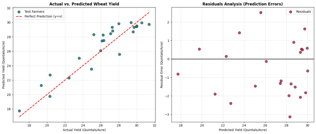
Left panel shows the Actual vs. Predicted Wheat Yield. This plot maps the actual crop yields of the test farmers on the X-axis against the model’s predicted yields on the Y-axis. The red dashed line represents a perfect model (y = x). The closer the teal data points are to the diagonal red line, the more accurate the model is. Since our points cluster tightly along the diagonal, it tells us that our balanced quadratic model has high predictive accuracy and generalizes well to unseen data.
Right panel shows the Residuals Analysis (Prediction Errors). This plot displays the prediction errors (Residual = Actual Yield – Predicted Yield) on the Y-axis against the predicted values on the X-axis. A good model should have residuals randomly scattered around the horizontal zero-error line with no distinct patterns. This confirms that our model has successfully extracted all systematic patterns, leaving behind only random, irreducible environmental noise.
GIF 3: What Happens When We Push Too Far?
import numpy as np
import matplotlib.pyplot as plt
from matplotlib.animation import FuncAnimation
# Set random seed for reproducibility of the noisy data points
np.random.seed(42)
# =====================================================================
# 1. GENERATE SYNTHETIC DATA (Scaled to [-1, 1] for Gradient Stability)
# =====================================================================
# 20 data points representing a non-linear physical process
x_data = np.linspace(-1, 1, 20)
# True relationship is cubic: y = 2*x^3 – x^2 – 0.5*x + 1.0 + noise
noise_values = np.random.normal(0, 0.15, size=20)
y_data = 2.0 * (x_data ** 3) – 1.0 * (x_data ** 2) – 0.5 * x_data + 1.0 + noise_values
# Create a dense grid of x values to plot smooth, continuous model curves
x_smooth = np.linspace(-1, 1, 200)
# =====================================================================
# 2. CONSTRUCT DESIGN MATRICES FOR POLYNOMIALS MANUALLY
# =====================================================================
# Degree 1 (Linear): Features are [1, x]
X_deg1 = np.vstack([np.ones(20), x_data]).T
X_deg1_smooth = np.vstack([np.ones(200), x_smooth]).T
# Degree 3 (Cubic): Features are [1, x, x^2, x^3]
X_deg3 = np.vstack([np.ones(20), x_data, x_data**2, x_data**3]).T
X_deg3_smooth = np.vstack([np.ones(200), x_smooth, x_smooth**2, x_smooth**3]).T
# Degree 10 (Overfit): Features are [1, x, x^2, …, x^10]
X_deg10 = np.vstack([x_data**i for i in range(11)]).T
X_deg10_smooth = np.vstack([x_smooth**i for i in range(11)]).T
# =====================================================================
# 3. INITIALIZE MODEL PARAMETERS & HYPERPARAMETERS
# =====================================================================
# Initialize all weights to zero
weights_deg1 = np.zeros(2)
weights_deg3 = np.zeros(4)
weights_deg10 = np.zeros(11)
# Learning rates optimized for stable convergence
lr_deg1 = 0.15
lr_deg3 = 0.15
lr_deg10 = 0.25
# Animation parameters
total_animation_frames = 120
gradient_steps_per_frame = 3 # Run 3 gradient descent steps per frame to speed up the visual learning
# Lists to store historical loss values for live plotting
history_epochs = []
history_loss_deg1 = []
history_loss_deg3 = []
history_loss_deg10 = []
# =====================================================================
# 4. SETUP THE MATPLOTLIB PLOT (2×3 Grid)
# =====================================================================
# Top Row: Fit plots for Degree 1, Degree 3, and Degree 10
# Bottom Row: Live loss curves for each model
fig, axs = plt.subplots(2, 3, figsize=(18, 10))
plt.subplots_adjust(hspace=0.35, wspace=0.25)
# — Subplot Setup: Degree 1 (Underfit) —
axs[0, 0].scatter(x_data, y_data, color=’orange’, edgecolor=’black’, s=40, label=’Data Points’)
line_deg1, = axs[0, 0].plot([], [], color=’red’, linewidth=3, label=’Degree 1 Fit’)
axs[0, 0].set_xlim(-1.1, 1.1)
axs[0, 0].set_ylim(-1.5, 3.5)
axs[0, 0].legend(loc=’upper left’)
axs[0, 0].grid(True, linestyle=’–‘, alpha=0.5)
loss_curve_deg1, = axs[1, 0].plot([], [], color=’red’, linewidth=2)
axs[1, 0].set_xlim(0, total_animation_frames * gradient_steps_per_frame)
axs[1, 0].set_ylim(0, 1.5)
axs[1, 0].set_xlabel(“Epochs”)
axs[1, 0].set_ylabel(“Mean Squared Error (Loss)”)
axs[1, 0].grid(True, linestyle=’–‘, alpha=0.5)
# — Subplot Setup: Degree 3 (Balanced) —
axs[0, 1].scatter(x_data, y_data, color=’orange’, edgecolor=’black’, s=40, label=’Data Points’)
line_deg3, = axs[0, 1].plot([], [], color=’green’, linewidth=3, label=’Degree 3 Fit’)
axs[0, 1].set_xlim(-1.1, 1.1)
axs[0, 1].set_ylim(-1.5, 3.5)
axs[0, 1].legend(loc=’upper left’)
axs[0, 1].grid(True, linestyle=’–‘, alpha=0.5)
loss_curve_deg3, = axs[1, 1].plot([], [], color=’green’, linewidth=2)
axs[1, 1].set_xlim(0, total_animation_frames * gradient_steps_per_frame)
axs[1, 1].set_ylim(0, 1.5)
axs[1, 1].set_xlabel(“Epochs”)
axs[1, 1].set_ylabel(“Mean Squared Error (Loss)”)
axs[1, 1].grid(True, linestyle=’–‘, alpha=0.5)
# — Subplot Setup: Degree 10 (Overfit) —
axs[0, 2].scatter(x_data, y_data, color=’orange’, edgecolor=’black’, s=40, label=’Data Points’)
line_deg10, = axs[0, 2].plot([], [], color=’purple’, linewidth=3, label=’Degree 10 Fit’)
axs[0, 2].set_xlim(-1.1, 1.1)
axs[0, 2].set_ylim(-1.5, 3.5)
axs[0, 2].legend(loc=’upper left’)
axs[0, 2].grid(True, linestyle=’–‘, alpha=0.5)
loss_curve_deg10, = axs[1, 2].plot([], [], color=’purple’, linewidth=2)
axs[1, 2].set_xlim(0, total_animation_frames * gradient_steps_per_frame)
axs[1, 2].set_ylim(0, 1.5)
axs[1, 2].set_xlabel(“Epochs”)
axs[1, 2].set_ylabel(“Mean Squared Error (Loss)”)
axs[1, 2].grid(True, linestyle=’–‘, alpha=0.5)
# =====================================================================
# 5. ANIMATION UPDATE FUNCTION (Manual Gradient Descent Loop)
# =====================================================================
def update_frame(frame_index):
global weights_deg1, weights_deg3, weights_deg10
current_epoch = frame_index * gradient_steps_per_frame
# Run multiple gradient descent steps per frame to speed up the animation
for _ in range(gradient_steps_per_frame):
# — Degree 1 Gradient Descent —
predictions_deg1 = X_deg1 @ weights_deg1
loss_deg1 = np.mean((predictions_deg1 – y_data) ** 2)
gradient_deg1 = (2.0 / len(y_data)) * (X_deg1.T @ (predictions_deg1 – y_data))
weights_deg1 -= lr_deg1 * gradient_deg1
# — Degree 3 Gradient Descent —
predictions_deg3 = X_deg3 @ weights_deg3
loss_deg3 = np.mean((predictions_deg3 – y_data) ** 2)
gradient_deg3 = (2.0 / len(y_data)) * (X_deg3.T @ (predictions_deg3 – y_data))
weights_deg3 -= lr_deg3 * gradient_deg3
# — Degree 10 Gradient Descent —
predictions_deg10 = X_deg10 @ weights_deg10
loss_deg10 = np.mean((predictions_deg10 – y_data) ** 2)
gradient_deg10 = (2.0 / len(y_data)) * (X_deg10.T @ (predictions_deg10 – y_data))
weights_deg10 -= lr_deg10 * gradient_deg10
# Save epoch and loss values to history lists
history_epochs.append(current_epoch)
history_loss_deg1.append(loss_deg1)
history_loss_deg3.append(loss_deg3)
history_loss_deg10.append(loss_deg10)
# Generate smooth predictions for plotting continuous curves
smooth_predictions_deg1 = X_deg1_smooth @ weights_deg1
smooth_predictions_deg3 = X_deg3_smooth @ weights_deg3
smooth_predictions_deg10 = X_deg10_smooth @ weights_deg10
# Update the line plots with the new predictions
line_deg1.set_data(x_smooth, smooth_predictions_deg1)
line_deg3.set_data(x_smooth, smooth_predictions_deg3)
line_deg10.set_data(x_smooth, smooth_predictions_deg10)
# Update the live loss curves
loss_curve_deg1.set_data(history_epochs, history_loss_deg1)
loss_curve_deg3.set_data(history_epochs, history_loss_deg3)
loss_curve_deg10.set_data(history_epochs, history_loss_deg10)
# Update titles for each subplot to show current loss values
axs[0, 0].set_title(f”Degree 1 (Underfit)\nLoss: {loss_deg1:.4f}”, fontsize=11, fontweight=’bold’)
axs[0, 1].set_title(f”Degree 3 (Balanced)\nLoss: {loss_deg3:.4f}”, fontsize=11, fontweight=’bold’)
axs[0, 2].set_title(f”Degree 10 (Overfit)\nLoss: {loss_deg10:.4f}”, fontsize=11, fontweight=’bold’)
# Dynamic storytelling main title based on the training progress
if current_epoch == 0:
fig.suptitle(“Epoch 0 — I know nothing! All models starting flat.”, fontsize=16, fontweight=’bold’, color=’navy’)
elif current_epoch < 50:
fig.suptitle(f”Epoch {current_epoch} — Getting warmer! Models are starting to bend.”, fontsize=16, fontweight=’bold’, color=’navy’)
elif current_epoch < 150:
fig.suptitle(f”Epoch {current_epoch} — Degree 1 is stuck. Degree 10 is starting to chase noise!”, fontsize=16, fontweight=’bold’, color=’navy’)
else:
fig.suptitle(f”Epoch {current_epoch} — Final State: Underfit vs. Sweet Spot vs. Overfit!”, fontsize=16, fontweight=’bold’, color=’navy’)
return line_deg1, line_deg3, line_deg10, loss_curve_deg1, loss_curve_deg3, loss_curve_deg10
# =====================================================================
# 6. RUN AND SAVE THE ANIMATION
# =====================================================================
ani = FuncAnimation(fig, update_frame, frames=total_animation_frames, interval=100, blit=False)
ani.save(‘edgecase_bias_variance_tradeoff.gif’, writer=’pillow’, fps=8)
plt.close()
Edge Case Animation
What You Will See in This GIF:
Left panel (Too simple): Notice how the model is a simple straight line. As training progresses, the line tilts slightly to capture the general downward trend of the data, but it cannot bend. It is too rigid and has a strong preconceived notion (bias) that the relationship is linear. Even after 300 epochs, its loss remains high because it is physically incapable of capturing the curve. This is Underfitting.
Middle panel (Just right): This is the sweet spot because the model is a cubic polynomial. As training progresses, the line smoothly bends into an S-shape, fitting the general curve of the data points perfectly without chasing individual noise fluctuations. Its loss drops to a very low, stable level.
Right panel (Too complex): See how the curve goes crazy! This model has 11 parameters. As training progresses, the curve begins to wiggle wildly. It goes out of its way to pass directly through almost every single noisy data point, creating extreme peaks and valleys at the edges. It has memorized the random noise (variance) in the training data. While its training loss drops to nearly zero, the model is highly unstable and will fail completely on any new, unseen data. This is Overfitting.
Line-by-Line Code Walkthrough
Here is a simple breakdown of the most important lines of code used across our scripts:
import numpy as np&import pandas as pd: We import NumPy for fast math operations and Pandas to organize our data into clean tables.import matplotlib.pyplot as plt&from matplotlib.animation import FuncAnimation: These are our drawing tools. We use them to create the static plots and the frame-by-frame GIFs.from sklearn...: We import tools from scikit-learn to split our data (train_test_split), build models (LinearRegression), and measure accuracy (mean_squared_error).np.random.seed(42): This locks the random number generator. It ensures that every time you run the code, you get the exact same “random” noise.x_rawandy_raw: These represent our actual real-world data (like distance to a station and property prices).noise = np.random.normal(...): We simulate the irreducible error (the random chaos of the real world) by generating random numbers.x_normalized = (x_raw - x_mean) / x_std: We scale our input data so it has a mean of 0. This helps our model learn faster and prevents the math from exploding.w1, w0, v2, v1, v0: These are the weights (parameters) of our models. The model learns by tweaking these numbers.learning_rate = 0.05: This is the step size the model takes when learning. Too big, and it overshoots; too small, and it takes forever.y_pred = ...: This is where our model makes its prediction based on its current weights.loss = np.mean((y_pred - y_raw) ** 2): We calculate the Mean Squared Error. This tells the model how wrong its predictions are.dw1, dw0: These are the gradients. They act as a compass, telling the weights which direction to move to reduce the loss.w1 -= learning_rate * dw1: The model updates its weights by taking a step in the direction that reduces the error.ani = FuncAnimation(...): This stitches our frame-by-frame updates into a smooth animation.ani.save(...)&plt.savefig(...): Finally, we save our hard work as GIF animations and PNG images!
Quick Recap ✅
Bias is the error from a model being too simple (Underfitting), like drawing a straight line through curved data.
Variance is the error from a model being too complex (Overfitting), where it memorizes random noise instead of the actual pattern.
The Bias-Variance Tradeoff is the sweet spot where a model is just complex enough to learn the real pattern, but simple enough to ignore the noise.
Irreducible Error is the random noise in the real world that no model can ever predict.
We can visualize learning through Loss Curves; when the curve goes flat, the model has converged and learned all it can.
Test Yourself 🧠
1. What happens when a model has High Bias?
A) It memorizes the training data perfectly.
B) It is too simple and misses the underlying pattern (Underfitting).
C) It predicts the irreducible error perfectly.
D) It takes too long to train.
Answer: B
2. In the context of the Bias-Variance Tradeoff, what does “Variance” refer to?
A) The model’s inability to bend.
B) The random noise in the universe.
C) The error caused by a model being too complex and sensitive to random fluctuations in the training data (Overfitting).
D) The average prediction of the model.
Answer: C
3. Why do we want our model’s loss curve to eventually go flat?
A) It means the model has crashed.
B) It means the model has reached convergence and found the minimum error it can achieve.
C) It means the learning rate is too high.
D) It means the model is overfitting.
Answer: B