The Problem
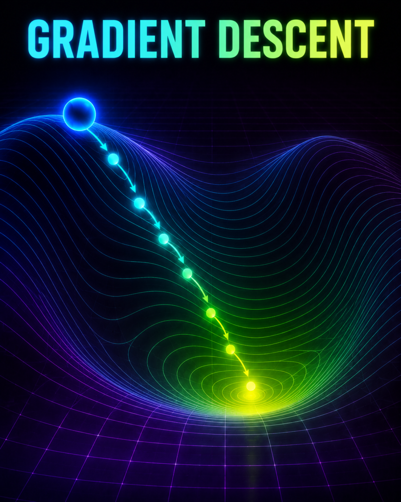
Imagine you are trekking down the foggy hills of Kudremukh in Karnataka, and suddenly, a thick cloud rolls in, reducing your visibility to zero. You cannot see the base camp at the bottom of the valley, but you must reach it before sunset. How do you find your way down when you can only see the ground right beneath your feet?
What is gradient descent in ml? (And Why Should You Care?)
The Foot-Step Analogy
Since you cannot see the valley, you have to rely on your feet. You stand still and feel the slope of the ground.
If the ground slopes downward to your left, you take a step to the left.
If it slopes downward to your right, you step to the right.
If the slope is very steep, you take a confident, larger step.
As the ground starts to feel flatter, you take smaller, careful baby steps so you don’t accidentally overshoot the bottom and start climbing up another hill.
Eventually, when the ground feels completely flat under your feet, you stop. You have successfully reached the lowest point—your base camp.
The Formal Definition
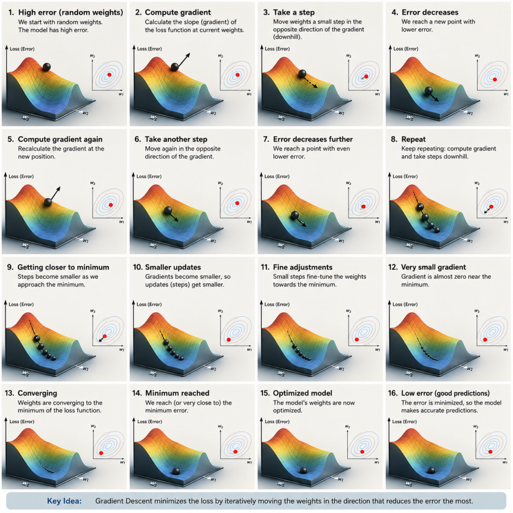
In Machine Learning, gradient descent in ml is an optimization algorithm used to minimize the errors made by a model. It acts exactly like that blind trekker, adjusting the model’s internal settings (called weights) step-by-step in the direction that reduces the prediction error (the “slope”) until the error is as close to zero as possible.
Why Do We Need It?
Why can’t we just use a direct mathematical formula to calculate the perfect settings instantly?
For tiny datasets, we can. But imagine a massive dataset like Jio’s 400 million users. Calculating the perfect settings in one single mathematical leap requires inverting giant matrices. This would instantly freeze and crash even the world’s fastest supercomputers.
Gradient descent in ml is the savior here. It doesn’t try to be a genius in one step. Instead, it takes small, computationally cheap steps to guide the model to the best settings without breaking your computer.
Where is gradient descent in ml Used in Real Life?
1. Cricket Shot Selection (Batting Coach Example)
Imagine a young cricketer in a Mumbai academy who wants to become a perfect batsman. He has many things to adjust — bat angle, foot movement, shoulder position, timing, etc.
The coach cannot tell him the “perfect position” in one go. Instead, the coach watches him play one ball and says:
- “Your bat was too high — bring it down a little.”
- “Your front foot was too far — step a bit less next time.”
After every ball (every step), the coach gives small feedback to reduce the mistake. Slowly, ball by ball, the batsman improves and gets closer to the perfect shot.
In ML terms: Gradient Descent is like that coach. It watches the model’s mistakes (errors) after every step and makes small changes in the model’s settings (weights) so that the total mistakes keep reducing. Just like the batsman slowly becomes better.
2. Street Food Vendor Adjusting Masala (Chaat Seller Example)
A chaat seller in Delhi’s Chandni Chowk wants to make the perfect spicy-sweet-sour balance that customers love.
He cannot guess the exact amount of masala, imli, and green chutney in one try. So he does this:
- He makes one plate and gives it to customers.
- Customers say “Bahut tez hai” (too spicy) or “Namkeen kam hai” (less salty).
- He makes small changes — thoda sa kam mirch, thoda sa zyada namak.
- He keeps adjusting little by little with every new plate until maximum customers say “Ekdum perfect!”
In ML terms: Gradient Descent works the same way. The “taste” is the error (loss). The seller (model) keeps making small adjustments in the recipe (weights) to reduce the complaints (error) until the chaat becomes perfect for most people.
3. Auto-Rickshaw Driver Finding the Best Route in Bangalore Traffic
An auto driver in Bangalore wants to reach from Majestic to Whitefield in the shortest time possible.
He cannot see the full road because of heavy traffic and rain. So he drives like this:
- He drives a little, checks how much traffic is ahead.
- If one road has heavy jam, he takes a small turn to another lane.
- He keeps making small route changes based on real-time traffic.
- Slowly he finds the fastest route without getting stuck.
In ML terms: Gradient Descent is like this auto driver. The “shortest time” is the lowest error. The driver (model) cannot see the final answer directly, so he makes small, smart changes (steps) based on current conditions (gradient) until he reaches the best possible route (minimum loss).
The Math Behind gradient descent in ml
To understand how the computer takes these steps, let’s look at the math that powers gradient descent in ML.
The core formula used to update the model’s settings is:
w_new = w_old – η × (∂L / ∂w)
Let’s break this down symbol by symbol:
w_old (Current Weight): This is your current position on the foggy hill. It represents the current setting of the model.
w_new (Updated Weight): This is your next position on the hill after taking a step.
– (The Minus Sign): This is the most important sign! If the slope is positive (meaning the hill goes up to the right), we want to go the opposite way (to the left) to go down. The minus sign ensures we always walk downhill.
η (Learning Rate): Pronounced “eta”, this represents your step size. In our code, you will see this as
learning_rate.If η is too large, you are taking giant leaps. You might jump right over the valley and land on another peak.
If η is too small, you are taking tiny baby steps. It will take you three days to reach the bottom.
(∂L / ∂w) (The Gradient): This is the mathematical way of saying “the slope of the hill at your current spot.” It tells us how much our error (L) changes if we tweak our weight (w) by a tiny amount.
The Cost Function: Our “Pain Meter”
To know how bad our model’s predictions are, we use a Cost Function (often called Loss, denoted by L). A common one is the Mean Squared Error (MSE):
L = (1/N) · Σᵢ (y_actual – y_predicted)²
In human terms, the Cost Function is a pain meter.
If our model makes terrible predictions, the pain meter shoots up.
“Minimizing” the cost function simply means turning the knobs of our model until the pain meter reads the lowest possible number (ideally zero).
What do Weights and Biases physically represent?
When we build a model, we use the equation of a line:
y = w · x + b
Weights (w): Think of these as volume knobs on a music system. Each knob controls how much importance we give to a specific feature. For example, in UPI fraud, the “distance from your usual location” knob might be turned up high (w is large), while the “day of the week” knob is turned down low (w is small).
Bias (b): This is the starting baseline. Even if all inputs (x) are zero, what is the default starting guess? It is like the default volume of your TV the moment you turn it on.
Gradient descent in ml gently turns these w and b knobs, step-by-step, until the music (our prediction) sounds absolutely perfect!
1: Why Simple Models Fail ?
import numpy as np
import matplotlib.pyplot as plt
from matplotlib.animation import FuncAnimation
# 1. Generate Synthetic Punjab Wheat Yield Data
# We set a random seed so the data is exactly the same every time you run it
np.random.seed(42)
# X represents Nitrogen Fertilizer input (normalized to -1 to 1 for mathematical stability)
X = np.linspace(-1, 1, 100)
# Y represents Wheat Yield in Quintals per Hectare
# The true relationship is quadratic: too much fertilizer reduces yield
noise = np.random.normal(0, 0.15, size=100)
Y = -1.5 * (X**2) + 0.5 * X + 1.2 + noise
# 2. Pre-compute Gradient Descent for both models to ensure smooth animation
epochs = 300
learning_rate = 0.15
# — Model 1: Linear Model (Wrong/Too-Simple Approach) —
# Equation: y = w1 * x + b
w1_linear, b_linear = 0.0, 0.0
linear_loss_history = []
linear_preds_history = []
# — Model 2: Polynomial Model (Correct/Gradient Descent Approach) —
# Equation: y = w2 * x^2 + w1 * x + b
w2_poly, w1_poly, b_poly = 0.0, 0.0, 0.0
poly_loss_history = []
poly_preds_history = []
# Manual Gradient Descent Loop
for epoch in range(epochs):
# — Linear Model Step —
y_pred_linear = w1_linear * X + b_linear
loss_linear = np.mean((Y – y_pred_linear)**2)
linear_loss_history.append(loss_linear)
linear_preds_history.append(y_pred_linear)
# Gradients for Linear Model
dw1_linear = -2 * np.mean((Y – y_pred_linear) * X)
db_linear = -2 * np.mean(Y – y_pred_linear)
# Update weights
w1_linear -= learning_rate * dw1_linear
b_linear -= learning_rate * db_linear
# — Polynomial Model Step —
y_pred_poly = w2_poly * (X**2) + w1_poly * X + b_poly
loss_poly = np.mean((Y – y_pred_poly)**2)
poly_loss_history.append(loss_poly)
poly_preds_history.append(y_pred_poly)
# Gradients for Polynomial Model
dw2_poly = -2 * np.mean((Y – y_pred_poly) * (X**2))
dw1_poly = -2 * np.mean((Y – y_pred_poly) * X)
db_poly = -2 * np.mean(Y – y_pred_poly)
# Update weights
w2_poly -= learning_rate * dw2_poly
w1_poly -= learning_rate * dw1_poly
b_poly -= learning_rate * db_poly
# 3. Set up Matplotlib Figure for Animation (2×2 Grid)
# Top Row: Model fits | Bottom Row: Live Loss Curves
fig, axs = plt.subplots(2, 2, figsize=(14, 10))
fig.patch.set_facecolor(‘#F5F5F5′) # Light grey background for clean look
# Subplot references
ax_lin = axs[0, 0]
ax_lin_loss = axs[1, 0]
ax_poly = axs[0, 1]
ax_poly_loss = axs[1, 1]
# Plot static farm data points on both top subplots
ax_lin.scatter(X, Y, color=’#FF5722′, alpha=0.7, edgecolors=’k’, label=’Punjab Farm Data’)
ax_poly.scatter(X, Y, color=’#4CAF50′, alpha=0.7, edgecolors=’k’, label=’Punjab Farm Data’)
# Initialize empty line objects to update during animation
line_linear_fit, = ax_lin.plot([], [], color=’red’, lw=3, label=’Linear Fit (Underfit)’)
line_poly_fit, = ax_poly.plot([], [], color=’green’, lw=3, label=’Polynomial Fit (Correct)’)
line_linear_loss, = ax_lin_loss.plot([], [], color=’red’, lw=2, label=’Linear Loss’)
line_poly_loss, = ax_poly_loss.plot([], [], color=’green’, lw=2, label=’Polynomial Loss’)
# Format the fit plots
for ax in [ax_lin, ax_poly]:
ax.set_xlim(-1.1, 1.1)
ax.set_ylim(min(Y) – 0.5, max(Y) + 0.5)
ax.set_xlabel(‘Fertilizer Usage (Normalized)’, fontsize=10)
ax.set_ylabel(‘Wheat Yield (Quintals/Hectare)’, fontsize=10)
ax.grid(True, linestyle=’–‘, alpha=0.5)
ax.legend(loc=’upper left’)
# Format the loss plots
for ax in [ax_lin_loss, ax_poly_loss]:
ax.set_xlim(0, epochs)
ax.set_xlabel(‘Epochs’, fontsize=10)
ax.set_ylabel(‘Mean Squared Error (MSE)’, fontsize=10)
ax.grid(True, linestyle=’–‘, alpha=0.5)
# Set static Y limits for loss curves based on maximum initial losses
ax_lin_loss.set_ylim(0, max(linear_loss_history) * 1.1)
ax_poly_loss.set_ylim(0, max(poly_loss_history) * 1.1)
# Animation Update Function
def update(frame):
# Update fit lines with predictions at current frame
line_linear_fit.set_data(X, linear_preds_history[frame])
line_poly_fit.set_data(X, poly_preds_history[frame])
# Update loss lines up to current frame
line_linear_loss.set_data(range(frame), linear_loss_history[:frame])
line_poly_loss.set_data(range(frame), poly_loss_history[:frame])
# Update subplot titles with live loss values
ax_lin.set_title(f”Linear Model (Wrong Approach)\nLive Loss (MSE): {linear_loss_history[frame]:.4f}”, fontsize=11, color=’red’, weight=’bold’)
ax_poly.set_title(f”Polynomial Model (Gradient Descent)\nLive Loss (MSE): {poly_loss_history[frame]:.4f}”, fontsize=11, color=’green’, weight=’bold’)
# Dynamic main title narrating the story frame-by-frame
if frame == 0:
story_title = “Epoch 0 — Both starting blind”
elif frame < 50:
story_title = f”Epoch {frame} — Getting warmer! Models adjusting weights…”
elif frame < 150:
story_title = f”Epoch {frame} — Simple model stuck, gradient descent in ml learning fast!”
else:
story_title = f”Epoch {frame} — Simple model failed. gradient descent in ml nailed it!”
fig.suptitle(story_title, fontsize=16, fontweight=’bold’, color=’#333333′)
return line_linear_fit, line_poly_fit, line_linear_loss, line_poly_loss
# Create animation
ani = FuncAnimation(fig, update, frames=epochs, interval=50, blit=False)
# Save animation as GIF
ani.save(‘comparison_gradient_descent_in_ml.gif’, writer=’pillow’, fps=10)
plt.close()
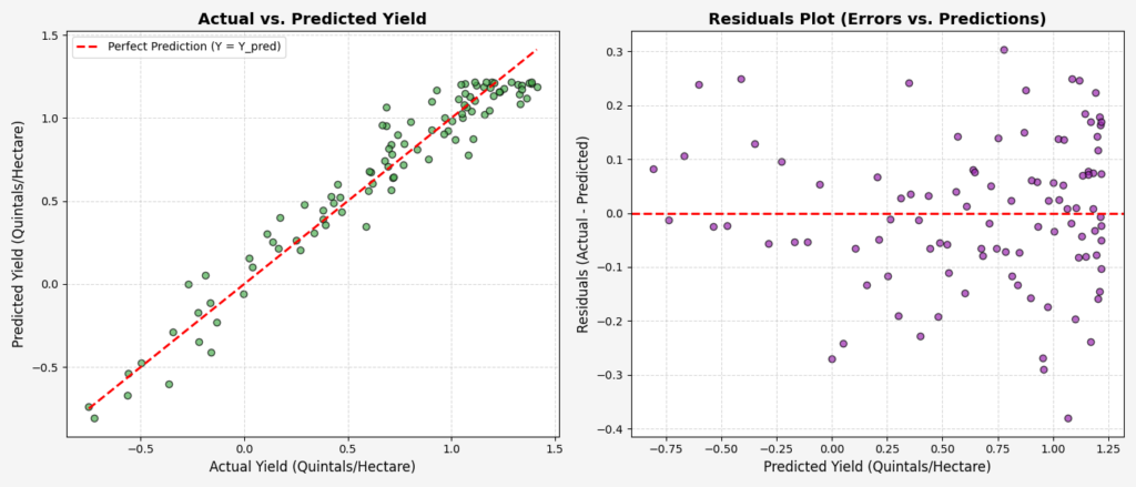
# 4. Post-Training Comparison Plot (Actual vs Predicted & Residuals)
# Using the final trained Polynomial Model
final_y_pred_poly = w2_poly * (X**2) + w1_poly * X + b_poly
residuals = Y – final_y_pred_poly
fig_comp, (ax_act_pred, ax_res) = plt.subplots(1, 2, figsize=(14, 6))
fig_comp.patch.set_facecolor(‘#F5F5F5′)
# Left Plot: Actual vs Predicted
ax_act_pred.scatter(Y, final_y_pred_poly, color=’#4CAF50′, alpha=0.7, edgecolors=’k’)
ideal_line = np.linspace(min(Y), max(Y), 100)
ax_act_pred.plot(ideal_line, ideal_line, color=’red’, linestyle=’–‘, lw=2, label=’Perfect Prediction (Y = Y_pred)’)
ax_act_pred.set_title(‘Actual vs. Predicted Yield’, fontsize=14, fontweight=’bold’)
ax_act_pred.set_xlabel(‘Actual Yield (Quintals/Hectare)’, fontsize=12)
ax_act_pred.set_ylabel(‘Predicted Yield (Quintals/Hectare)’, fontsize=12)
ax_act_pred.grid(True, linestyle=’–‘, alpha=0.5)
ax_act_pred.legend()
# Right Plot: Residuals Plot
ax_res.scatter(final_y_pred_poly, residuals, color=’#9C27B0′, alpha=0.7, edgecolors=’k’)
ax_res.axhline(0, color=’red’, linestyle=’–‘, lw=2)
ax_res.set_title(‘Residuals Plot (Errors vs. Predictions)’, fontsize=14, fontweight=’bold’)
ax_res.set_xlabel(‘Predicted Yield (Quintals/Hectare)’, fontsize=12)
ax_res.set_ylabel(‘Residuals (Actual – Predicted)’, fontsize=12)
ax_res.grid(True, linestyle=’–‘, alpha=0.5)
plt.tight_layout()
plt.savefig(‘crop_yield_residuals_comparison.png’)
plt.close()
Comparison Animation
What You Will See in This GIF:
At the very start of this animation (Epoch 0 to 10): You will see a 2×2 grid. The top-left shows the Linear Model, and the top-right shows the Polynomial Model. Both models start completely flat at y = 0. They have no idea where the data points are. The loss values on both sides are at their maximum because the models are making blind guesses.
Watch how at around Epoch 100: The models are actively adjusting their parameters. The Linear Model (Left) tilts and tries to pass through the center of the data, but because it is a straight line, it cannot bend to match the curve of the data and gets stuck. The Polynomial Model (Right) begins to curve and hug the peak of the crop yield data. The Polynomial loss curve drops rapidly toward zero, while the Linear loss curve flattens out early.
By the final frame (Epoch 150 to 300): The Linear Model remains a straight line, completely missing the peak crop yield (underfitting). The Polynomial Model forms a perfect parabola, passing directly through the center of the data points. The Polynomial loss settles at a very low value, while the Linear loss remains high. This visually proves that choosing the correct model capacity and optimizing it with gradient descent in ml is essential for non-linear real-world problems.
2: How gradient descent in ml Actually Learns ?
import numpy as np
import matplotlib.pyplot as plt
from matplotlib.animation import FuncAnimation
# 1. Generate Synthetic Mumbai House Price Data
# We set a random seed so the data is exactly the same every time you run it
np.random.seed(42)
# flat_area_1000sqft represents the size of the flat in thousands of square feet (0.5 to 3.5)
flat_area_1000sqft = np.linspace(0.5, 3.5, 100)
# flat_price_crores represents the price of the flat in Crores (INR)
# The true relationship is linear with some real-world noise added
noise = np.random.normal(0, 0.3, size=100)
flat_price_crores = 1.8 * flat_area_1000sqft + 0.5 + noise
# 2. Pre-compute Gradient Descent step-by-step to store history for the animation
epochs = 150
learning_rate = 0.05
# Initialize parameters to zero (starting completely blind)
weight_slope = 0.0
bias_intercept = 0.0
# Lists to store history for animation frames
weight_history = []
bias_history = []
loss_history = []
predictions_history = []
# Manual Gradient Descent Loop
for epoch in range(epochs):
# Calculate current predictions: y = w * x + b
current_predictions = weight_slope * flat_area_1000sqft + bias_intercept
# Calculate Mean Squared Error (MSE) Loss
current_loss = np.mean((flat_price_crores – current_predictions) ** 2)
# Save values to history lists
weight_history.append(weight_slope)
bias_history.append(bias_intercept)
loss_history.append(current_loss)
predictions_history.append(current_predictions)
# Calculate Gradients (Partial Derivatives of Loss with respect to weight and bias)
gradient_weight = -2 * np.mean((flat_price_crores – current_predictions) * flat_area_1000sqft)
gradient_bias = -2 * np.mean(flat_price_crores – current_predictions)
# Update weight and bias by stepping in the opposite direction of the gradient
weight_slope -= learning_rate * gradient_weight
bias_intercept -= learning_rate * gradient_bias
# 3. Set up Matplotlib Figure for Animation (1 Row, 2 Columns)
# Left Plot: Live Model Fitting | Right Plot: Live Loss Curve
fig, (ax_fit, ax_loss) = plt.subplots(1, 2, figsize=(14, 6))
fig.patch.set_facecolor(‘#F9F9F9′) # Soft light grey background
# Plot static Mumbai house data points on the left subplot
ax_fit.scatter(flat_area_1000sqft, flat_price_crores, color=’#FF9900′, alpha=0.8, edgecolors=’k’, label=’Mumbai Flats (Data)’)
# Initialize empty line objects to update during animation
line_fit, = ax_fit.plot([], [], color=’#1A73E8′, lw=3, label=’Fitted Line (Model)’)
line_loss, = ax_loss.plot([], [], color=’#D93025′, lw=2.5, label=’Mean Squared Error (MSE)’)
# Format the left fit plot
ax_fit.set_xlim(0.3, 3.7)
ax_fit.set_ylim(0, 8)
ax_fit.set_xlabel(‘Area (in 1000 sq ft)’, fontsize=11)
ax_fit.set_ylabel(‘Price (in Crores INR)’, fontsize=11)
ax_fit.grid(True, linestyle=’–‘, alpha=0.5)
ax_fit.legend(loc=’upper left’)
# Format the right loss plot
ax_loss.set_xlim(0, epochs)
ax_loss.set_ylim(0, max(loss_history) * 1.1)
ax_loss.set_xlabel(‘Epochs’, fontsize=11)
ax_loss.set_ylabel(‘Loss (MSE)’, fontsize=11)
ax_loss.grid(True, linestyle=’–‘, alpha=0.5)
ax_loss.legend(loc=’upper right’)
# Animation Update Function
def update(frame):
# Update the fitted line with predictions from the current frame
line_fit.set_data(flat_area_1000sqft, predictions_history[frame])
# Update the loss curve line with all loss values up to the current frame
line_loss.set_data(range(frame), loss_history[:frame])
# Extract current loss value for the title
current_loss_val = loss_history[frame]
# Dynamic main title narrating the story frame-by-frame
if frame == 0:
story_title = f”Epoch 0 — Random guess! Loss = {current_loss_val:.4f}”
elif frame < 15:
story_title = f”Epoch {frame} — Learning fast! Loss = {current_loss_val:.4f}”
elif frame < 50:
story_title = f”Epoch {frame} — Getting warmer! Loss = {current_loss_val:.4f}”
elif frame < 100:
story_title = f”Epoch {frame} — Fine-tuning weights… Loss = {current_loss_val:.4f}”
else:
story_title = f”Epoch {frame} — Converged! Perfect fit. Loss = {current_loss_val:.4f}”
fig.suptitle(story_title, fontsize=14, fontweight=’bold’, color=’#333333′)
return line_fit, line_loss
# Create the animation
ani = FuncAnimation(fig, update, frames=epochs, interval=80, blit=False)
# Save the animation as a GIF
ani.save(‘training_gradient_descent_in_ml.gif’, writer=’pillow’, fps=10)
plt.close()
# 4. Post-Training Comparison Plot (Actual vs Predicted & Residuals)
# Using the final trained parameters
final_predictions = weight_slope * flat_area_1000sqft + bias_intercept
residuals = flat_price_crores – final_predictions
fig_comp, (ax_act_pred, ax_res) = plt.subplots(1, 2, figsize=(14, 6))
fig_comp.patch.set_facecolor(‘#F9F9F9′)
# Left Plot: Actual vs Predicted
ax_act_pred.scatter(flat_price_crores, final_predictions, color=’#1A73E8′, alpha=0.8, edgecolors=’k’)
ideal_line = np.linspace(min(flat_price_crores), max(flat_price_crores), 100)
ax_act_pred.plot(ideal_line, ideal_line, color=’#D93025′, linestyle=’–‘, lw=2, label=’Perfect Prediction (Y = Y_pred)’)
ax_act_pred.set_title(‘Actual vs. Predicted Prices’, fontsize=12, fontweight=’bold’)
ax_act_pred.set_xlabel(‘Actual Price (Crores INR)’, fontsize=10)
ax_act_pred.set_ylabel(‘Predicted Price (Crores INR)’, fontsize=10)
ax_act_pred.grid(True, linestyle=’–‘, alpha=0.5)
ax_act_pred.legend()
# Right Plot: Residuals Plot
ax_res.scatter(final_predictions, residuals, color=’#107C41′, alpha=0.8, edgecolors=’k’)
ax_res.axhline(0, color=’#D93025′, linestyle=’–‘, lw=2)
ax_res.set_title(‘Residuals Plot (Errors vs. Predictions)’, fontsize=12, fontweight=’bold’)
ax_res.set_xlabel(‘Predicted Price (Crores INR)’, fontsize=10)
ax_res.set_ylabel(‘Residuals (Actual – Predicted)’, fontsize=10)
ax_res.grid(True, linestyle=’–‘, alpha=0.5)
plt.tight_layout()
plt.savefig(‘mumbai_house_prices_residuals.png’)
plt.close()
Training Animation
What You Will See in This GIF:
At Epoch 0: You see a side-by-side layout. The left plot shows the orange Mumbai flat data points, and the right plot shows an empty loss graph. The blue model line starts completely flat at y = 0. It has no idea where the data points are, and the loss value is at its maximum.
In the Learning Phase (Epoch 1 to 50): The blue line begins to tilt and climb upward rapidly. It behaves like a compass needle finding north, quickly aligning itself with the trend of the orange data points. The right subplot is the loss curve. Notice how the red loss curve drops like a steep roller coaster. This represents the model rapidly shedding its errors as it learns the relationship between flat size and price.
When the loss curve goes completely flat (Epoch 100 to 150): That means the gradients have become nearly zero—taking further steps does not reduce the error anymore. The blue line stops moving dramatically and only makes tiny, microscopic adjustments to settle perfectly through the center of the data points. The model has successfully found the bottom of the valley and has converged!
3: What Happens When We Push Too Far?
# Import the necessary libraries for mathematical operations and animation
import numpy as np
import matplotlib.pyplot as plt
from matplotlib.animation import FuncAnimation
# Set a random seed for reproducibility
np.random.seed(42)
# Generate synthetic non-linear data (e.g., crop yield vs fertilizer)
total_data_points = 80
# Generate input features normalized between -1 and 1
X_raw = np.linspace(-1, 1, total_data_points)
# Generate target values using a cubic function with added noise
Y_raw = 1.5 * (X_raw**3) – 0.9 * (X_raw**2) – 0.5 * X_raw + 0.5 + np.random.normal(0, 0.12, total_data_points)
# Helper function to manually build polynomial feature matrices
def build_polynomial_features(input_x, model_degree):
feature_columns = []
for power in range(model_degree + 1):
feature_columns.append(input_x ** power)
return np.column_stack(feature_columns)
# Build polynomial feature matrices for all three models
X_features_deg1 = build_polynomial_features(X_raw, 1) # Shape: (80, 2)
X_features_deg3 = build_polynomial_features(X_raw, 3) # Shape: (80, 4)
X_features_deg8 = build_polynomial_features(X_raw, 8) # Shape: (80, 9)
# Initialize model weights to zero
weights_deg1 = np.zeros(2)
weights_deg3 = np.zeros(4)
weights_deg8 = np.zeros(9)
# Set learning rates (higher degrees require smaller learning rates to prevent exploding gradients)
learning_rate_deg1 = 0.15
learning_rate_deg3 = 0.15
learning_rate_deg8 = 0.08
# Define training parameters
total_epochs = 200
# Lists to store historical predictions and losses for each frame of the animation
history_predictions_deg1 = []
history_predictions_deg3 = []
history_predictions_deg8 = []
history_loss_deg1 = []
history_loss_deg3 = []
history_loss_deg8 = []
# Manual Gradient Descent Loop
for current_epoch in range(total_epochs):
# — Degree 1 Model Step —
predictions_deg1 = X_features_deg1 @ weights_deg1
loss_deg1 = np.mean((Y_raw – predictions_deg1) ** 2)
gradient_deg1 = -2 * (X_features_deg1.T @ (Y_raw – predictions_deg1)) / total_data_points
weights_deg1 -= learning_rate_deg1 * gradient_deg1
history_predictions_deg1.append(predictions_deg1)
history_loss_deg1.append(loss_deg1)
# — Degree 3 Model Step —
predictions_deg3 = X_features_deg3 @ weights_deg3
loss_deg3 = np.mean((Y_raw – predictions_deg3) ** 2)
gradient_deg3 = -2 * (X_features_deg3.T @ (Y_raw – predictions_deg3)) / total_data_points
weights_deg3 -= learning_rate_deg3 * gradient_deg3
history_predictions_deg3.append(predictions_deg3)
history_loss_deg3.append(loss_deg3)
# — Degree 8 Model Step —
predictions_deg8 = X_features_deg8 @ weights_deg8
loss_deg8 = np.mean((Y_raw – predictions_deg8) ** 2)
gradient_deg8 = -2 * (X_features_deg8.T @ (Y_raw – predictions_deg8)) / total_data_points
weights_deg8 -= learning_rate_deg8 * gradient_deg8
history_predictions_deg8.append(predictions_deg8)
history_loss_deg8.append(loss_deg8)
# Set up a 2×3 grid of subplots for the animation
# Top Row: Model Fits | Bottom Row: Live Loss Curves
fig, axs = plt.subplots(2, 3, figsize=(18, 10))
fig.patch.set_facecolor(‘#F5F5F5′) # Soft grey background
# Assign descriptive names to each subplot axis
ax_fit_deg1, ax_fit_deg3, ax_fit_deg8 = axs[0, 0], axs[0, 1], axs[0, 2]
ax_loss_deg1, ax_loss_deg3, ax_loss_deg8 = axs[1, 0], axs[1, 1], axs[1, 2]
# Plot static raw data points on the top row subplots
for ax in [ax_fit_deg1, ax_fit_deg3, ax_fit_deg8]:
ax.scatter(X_raw, Y_raw, color=’#34495E’, alpha=0.6, edgecolors=’k’, label=’Raw Data’)
ax.set_xlim(-1.1, 1.1)
ax.set_ylim(min(Y_raw) – 0.5, max(Y_raw) + 0.5)
ax.set_xlabel(‘Input Feature (X)’, fontsize=10)
ax.set_ylabel(‘Target (Y)’, fontsize=10)
ax.grid(True, linestyle=’–‘, alpha=0.5)
# Initialize empty line objects for the dynamic fit lines
line_fit_deg1, = ax_fit_deg1.plot([], [], color=’#E74C3C’, lw=3, label=’Degree 1 Fit’)
line_fit_deg3, = ax_fit_deg3.plot([], [], color=’#2ECC71′, lw=3, label=’Degree 3 Fit’)
line_fit_deg8, = ax_fit_deg8.plot([], [], color=’#9B59B6′, lw=3, label=’Degree 8 Fit’)
# Initialize empty line objects for the dynamic loss curves
line_loss_deg1, = ax_loss_deg1.plot([], [], color=’#E74C3C’, lw=2.5, label=’Loss (Deg 1)’)
line_loss_deg3, = ax_loss_deg3.plot([], [], color=’#2ECC71′, lw=2.5, label=’Loss (Deg 3)’)
line_loss_deg8, = ax_loss_deg8.plot([], [], color=’#9B59B6′, lw=2.5, label=’Loss (Deg 8)’)
# Format the loss subplots
for ax, max_loss in zip([ax_loss_deg1, ax_loss_deg3, ax_loss_deg8], [history_loss_deg1[0], history_loss_deg3[0], history_loss_deg8[0]]):
ax.set_xlim(0, total_epochs)
ax.set_ylim(0, max_loss * 1.1)
ax.set_xlabel(‘Epochs’, fontsize=10)
ax.set_ylabel(‘Mean Squared Error (MSE)’, fontsize=10)
ax.grid(True, linestyle=’–‘, alpha=0.5)
# Add legends to all subplots
for ax in axs.ravel():
ax.legend(loc=’upper right’)
# Animation Update Function
def update_frame(frame_index):
# Update fit lines with predictions at the current frame
line_fit_deg1.set_data(X_raw, history_predictions_deg1[frame_index])
line_fit_deg3.set_data(X_raw, history_predictions_deg3[frame_index])
line_fit_deg8.set_data(X_raw, history_predictions_deg8[frame_index])
# Update loss lines up to the current frame
line_loss_deg1.set_data(range(frame_index), history_loss_deg1[:frame_index])
line_loss_deg3.set_data(range(frame_index), history_loss_deg3[:frame_index])
line_loss_deg8.set_data(range(frame_index), history_loss_deg8[:frame_index])
# Update subplot titles with live loss values
ax_fit_deg1.set_title(f”Degree 1 (Underfit)\nLive Loss: {history_loss_deg1[frame_index]:.4f}”, fontsize=11, fontweight=’bold’, color=’#E74C3C’)
ax_fit_deg3.set_title(f”Degree 3 (Good Fit)\nLive Loss: {history_loss_deg3[frame_index]:.4f}”, fontsize=11, fontweight=’bold’, color=’#2ECC71′)
ax_fit_deg8.set_title(f”Degree 8 (Overfit)\nLive Loss: {history_loss_deg8[frame_index]:.4f}”, fontsize=11, fontweight=’bold’, color=’#9B59B6′)
# Dynamic main title narrating the story frame-by-frame
if frame_index == 0:
story_title = “Epoch 0 — All models starting blind with zero weights!”
elif frame_index < 30:
story_title = f”Epoch {frame_index} — Gradient Descent active! Models adjusting shapes…”
elif frame_index < 100:
story_title = f”Epoch {frame_index} — Degree 1 is stuck. Degree 3 & 8 are learning complex curves.”
else:
story_title = f”Epoch {frame_index} — Degree 8 is chasing noise! Degree 3 is perfectly balanced.”
fig.suptitle(story_title, fontsize=16, fontweight=’bold’, color=’#2C3E50′)
return line_fit_deg1, line_fit_deg3, line_fit_deg8, line_loss_deg1, line_loss_deg3, line_loss_deg8
# Create the animation object
ani = FuncAnimation(fig, update_frame, frames=total_epochs, interval=60, blit=False)
# Save the animation as a high-quality GIF
ani.save(‘edgecase_gradient_descent_in_ml.gif’, writer=’pillow’, fps=8)
Edge Case Animation
What You Will See in This GIF:
Left panel (Too simple – Degree 1): Notice how the red line starts completely flat. As epochs progress, it quickly tilts to find the best-fitting straight line. However, because a straight line cannot bend, it cannot capture the curve of the data. It gets stuck early. The red loss curve drops quickly but flattens out at a high value. No matter how long you run it, a model with too little capacity (underfit) can never solve a complex problem.
Middle panel (Just right – Degree 3): This is the sweet spot because the green line starts flat and gradually bends into a beautiful, smooth S-curve that passes directly through the center of the data points. The green loss curve drops smoothly and stabilizes at a very low value, showing healthy convergence where the model learns the true underlying pattern.
Right panel (Too complex – Degree 8): See how the curve goes crazy! The purple line starts flat, but as training continues, it begins to wiggle aggressively. By epoch 200, it forms extreme, unnatural waves at the edges, chasing individual noisy data points. The purple loss curve drops to an extremely low value. While it successfully minimizes training loss to near-zero, the resulting model is overfit and will fail on new, unseen data.
Line-by-Line Code Walkthrough
Here is a breakdown of the key concepts and functions used across our Python scripts:
import numpy as np&import pandas as pd: We use NumPy for fast mathematical operations on arrays and Pandas to structure our data into clean tables (DataFrames).import matplotlib.pyplot as plt&from matplotlib.animation import FuncAnimation: Matplotlib is our plotting interface to create visual charts, and FuncAnimation is the engine that lets us update plots frame-by-frame to create GIFs.from sklearn.linear_model import SGDRegressor: This imports scikit-learn’s Stochastic Gradient Descent linear regressor, which is the production-ready version of the algorithm we built from scratch.from sklearn.preprocessing import StandardScaler: This scaler normalizes our features (making them have a mean of 0 and variance of 1), which is essential to keep gradient descent in ml stable and prevent it from taking wild steps.np.random.seed(42): Sets a starting seed for random number generation so that the synthetic datasets are identical every time you run the scripts.epochs&learning_rate:epochsdefines the total number of training iterations (how many steps the trekker takes).learning_rate(η) sets the step size for gradient updates.w -= learning_rate * gradient: This is the core update rule! We update the weight by taking a step in the opposite direction of the gradient (hence the minus sign) to move downhill toward lower error.loss = np.mean((Y - y_pred)**2): This calculates the Mean Squared Error (MSE), our “pain meter” that tells us how far off our predictions are from the actual values.gradient = -2 * np.mean((Y - y_pred) * X): This computes the derivative of the loss with respect to the weight parameter, telling us the slope of the error hill.model.fit(X_train_scaled, y_train): In the scikit-learn code, this single line runs the entire iterative gradient descent in ml optimization loop to find the optimal weights for our Ola Surge Pricing model.ani.save('filename.gif', writer='pillow', fps=10): Saves our dynamic Matplotlib animations as high-quality GIFs so we can visualize the learning process.
Quick Recap ✅
Gradient descent in ml is like a blind trekker: It finds the lowest point of error by feeling the slope of the data and taking steps downhill.
The Learning Rate (η) is your step size: Too big, and you overshoot the valley; too small, and it takes forever to reach the bottom.
The Cost Function (Loss) is a pain meter: We use Mean Squared Error (MSE) to measure how bad our predictions are, and our goal is to minimize this pain to zero.
Model capacity matters: A simple straight line will underfit curved data, while an overly complex model will overfit and chase noise. You need the “just right” sweet spot.
Scaling is crucial: In real-world projects (like our Ola Surge Pricing model), you must scale your features using tools like
StandardScalerto ensure gradient descent in ml converges smoothly.
Test Yourself 🧠
1. What does the minus sign in the gradient descent in ml update formula (w_new = w_old – η × (∂L/∂w)) do?
A) It makes the weights negative.
B) It ensures we take a step in the opposite direction of the slope to go downhill.
C) It reduces the learning rate over time.
D) It subtracts the bias from the weight.
Answer: B) It ensures we take a step in the opposite direction of the slope to go downhill.
2. If your learning rate (η) is set way too high, what is most likely to happen during training?
A) The model will learn perfectly in just one step.
B) The model will take tiny baby steps and take days to train.
C) The model will take giant leaps, overshoot the minimum error, and the loss might explode.
D) The model will automatically switch to a polynomial curve.
Answer: C) The model will take giant leaps, overshoot the minimum error, and the loss might explode.
3. In our Edge Case Animation, why did the Degree 8 polynomial model fail to be the best choice, even though it had the lowest training loss?
A) It underfit the data and got stuck as a straight line.
B) It overfit the data by chasing individual noisy points, meaning it would fail on new, unseen data.
C) It required too much memory to run.
D) It ignored the gradient descent in ml algorithm completely.
Answer: B) It overfit the data by chasing individual noisy points, meaning it would fail on new, unseen data.