
The Problem
Imagine you are managing a massive solar power plant in the sun-drenched sands of Bhadla, Rajasthan. Every single morning, the state power grid operators send you an urgent message: “How many Megawatts of electricity will you feed into our grid today?”
If you guess too high, the grid gets overloaded and can crash. If you guess too low, you waste precious sunlight and lose lakhs of rupees in potential revenue.
How do you solve this? You look at yesterday’s peak temperature. You notice that as the temperature rises, your solar panels generate more power. But how do you turn a temperature reading like 42°C into an exact prediction of Megawatts? You need a way to draw a perfect, predictable path from temperature to electricity.
What is linear regression in ml? (And Why Should You Care?)
Before we look at any math, let’s go to a local tailor shop in a bustling market in Jaipur.
When you walk in to get a custom kurta stitched, the tailor doesn’t need a high-tech 3D body scanner to guess your sleeve length. He simply looks at your height. He knows that, generally, taller people have longer arms. In his head, he has a mental “straight line” connecting height to sleeve length. If you are 10 cm taller than average, he instantly knows exactly how many extra centimeters of fabric to cut.
Linear Regression is that tailor’s mental straight line, turned into an algorithm.
Formally, Linear Regression is a supervised machine learning algorithm used to predict a continuous numerical output (called the dependent variable) based on one or more input features (called the independent variables), by finding the absolute best-fitting straight line through your data points.
Why do we need it? Why do simpler models fail?
Why not just use the average? If you simply calculated the average solar power generated over the last year and guessed that same number every day, you would fail miserably. On a scorching 45°C day in May, your average would underpredict the massive surge in power. On a cloudy 20°C winter day, your average would wildly overpredict, risking a grid failure.
A simple average (the mean) is blind to change. Linear Regression exists because we need a model that actively adapts its predictions as the input features change.
Where is linear regression in ml Used in Real Life?
To see how versatile this straight-line thinking is, let’s look at three different Indian scenarios:
1. Predicting EV Battery Life (Automobile Sector)
The Input (X): The number of fast-charging cycles an electric scooter battery has undergone.
The Output (Y): The State of Health (SoH) percentage of the battery.
Why it fits: Companies like Ather Energy or Ola Electric track how fast-charging degrades lithium-ion cells. As the number of fast-charging cycles (X) goes up, the battery health (Y) degrades in a steady, predictable, downward straight line. Linear regression helps predict when a customer will need a battery replacement.
2. Diabetic Retinopathy Risk Screening (Healthcare)
The Input (X): A patient’s HbA1c level (average blood sugar over 3 months).
The Output (Y): A retinal blood vessel damage score (measured via eye scans).
Why it fits: In eye clinics across India, doctors know that chronic high blood sugar damages delicate blood vessels in the eye. As HbA1c levels (X) climb, the damage score (Y) rises proportionally. A linear model helps clinicians flag high-risk patients early, even before symptoms appear.
3. Long-Haul Delivery Delay Prediction (Logistics)
The Input (X): The distance to be traveled by a delivery truck (e.g., from a warehouse in Delhi to a hub in Jaipur) in kilometers.
The Output (Y): The delay in arrival time (in hours) beyond the promised delivery window.
Why it fits: For logistics giants like Delhivery, every extra 100 km on Indian highways adds a highly predictable amount of delay due to toll plazas, state-border checks, and highway traffic. A linear model allows them to set highly accurate, dynamic delivery promises for customers.

The Math Behind linear regression in ml
Now, let’s open up the hood and look at the engine. Don’t panic—we will walk through this one single symbol at a time.
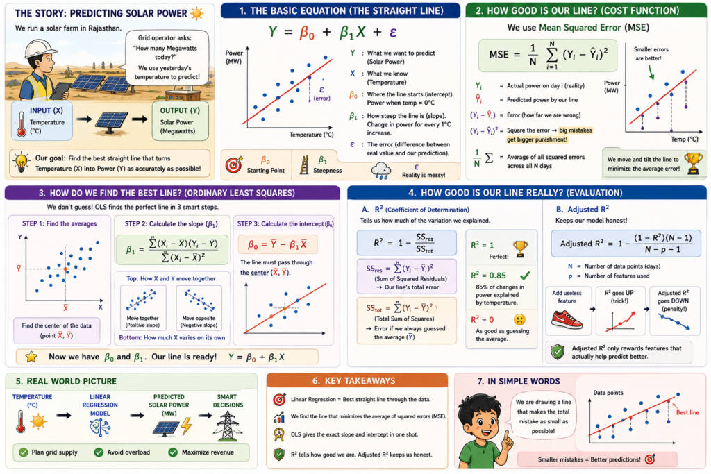
The fundamental equation of a simple Linear Regression model is:
Y = β₀ + β₁X + ε
Let’s break down what these symbols actually mean in plain English:
Y (The Target): This is what you are trying to predict (e.g., the Solar Power Output in Megawatts).
X (The Feature): This is the input data you feed into the model (e.g., the Temperature in Celsius).
β₀ (The Intercept or Bias): This is the starting point of your line. It represents what Y would be if X was exactly zero. For example, how much power do the solar panels generate when the temperature is 0°C?
β₁ (The Slope or Coefficient): This is the angle of your line. It tells you exactly how much Y will change for every single unit increase in X. If β₁ = 1.5, it means for every 1°C increase in temperature, your solar output increases by 1.5 Megawatts.
ε (The Error or Residual): Real life is messy. No straight line can pass perfectly through every single data point. ε represents the distance between where your line thinks a data point should be and where it actually is.
The Cost Function: Mean Squared Error (MSE)
How does the computer know if it has drawn a “good” line or a “bad” line? It uses a mathematical referee called a Cost Function. For linear regression, we use Mean Squared Error (MSE):
MSE = (1/N) · Σᵢ (Yᵢ – Ŷᵢ)²
Let’s translate this equation into human terms:
Yᵢ is the actual, real-world value (the true solar output recorded on day i).
Ŷᵢ (pronounced “Y-hat”) is the predicted value calculated by our line (β₀ + β₁Xᵢ).
(Yᵢ – Ŷᵢ) is the error (the distance between reality and our prediction).
We square this error (Yᵢ – Ŷᵢ)² for two reasons: first, to make sure negative errors (underpredictions) and positive errors (overpredictions) don’t cancel each other out; second, to heavily penalize large mistakes.
(1/N) · Σ means we add up all these squared errors for all N days and find their average.
“Minimizing the Cost Function” simply means shifting and tilting our straight line until the average of these squared errors is as small as humanly possible.
How Do We Find the Best Line? Ordinary Least Squares (OLS)
To find the absolute best values for our intercept (β₀) and slope (β₁), we use a method called Ordinary Least Squares (OLS).
Instead of guessing random lines over and over, OLS uses calculus to find the perfect line in one single step. Here is how it works step-by-step:
Step 1: Find the averages.
Calculate the average of all your inputs (X̄) and the average of all your outputs (Ȳ).
Step 2: Calculate the Slope (β₁).
We calculate how much X and Y vary together, divided by how much X varies on its own:
β₁ = [Σ (Xᵢ – X̄)(Yᵢ – Ȳ)] / [Σ (Xᵢ – X̄)²]
This formula ensures that if X and Y rise together, the slope is positive. If Y falls when X rises, the slope becomes negative.
Step 3: Calculate the Intercept (β₀).
Once we have the slope, we force our line to pass directly through the “center of gravity” of our data (the point (X̄, Ȳ)):
β₀ = Ȳ – β₁X̄
Evaluating the Line: R² and Adjusted R²
Once your line is drawn, how do you know if it’s actually doing a good job?
1. R² (Coefficient of Determination)
R² is a score between 0 and 1 that tells you what percentage of the variation in your output is explained by your input features.
R² = 1 – (SS_res / SS_tot)
SS_res (Sum of Squared Residuals): The sum of squared errors of your regression line (Σ (Yᵢ – Ŷᵢ)²).
SS_tot (Total Sum of Squares): The sum of squared errors if you had simply guessed the average value (Ȳ) every single time (Σ (Yᵢ – Ȳ)²).
If your R² = 0.85, it means your temperature model explains 85% of the fluctuations in solar power output. The remaining 15% is mystery noise (perhaps due to passing clouds or dust on the panels).
2. Adjusted R²
There is a catch with R²: if you keep adding random, useless features to your model (like “the color of the solar panel engineer’s shoes”), your R² score will always stay the same or go up. It will never go down. This can trick you into thinking your model is getting better when it is actually just memorizing noise.
To fix this, we use Adjusted R²:
Adjusted R² = 1 – [((1 – R²)(N – 1)) / (N – p – 1)]
Where:
N is the total number of data points (e.g., days of data).
p is the number of features you are using to predict.
Why it works: Adjusted R² penalizes you for adding features. If you add a new feature that doesn’t significantly help predict the output, the value of p increases, which actively drags the Adjusted R² score down. It keeps your model honest!

Parameter Sensitivity: What Happens When We Tweak the Knobs?
To truly master Linear Regression, you must understand how changing its parameters alters the model’s behavior.
| Parameter | If it increases (↑) | If it decreases (↓) | Real-world analogy |
| Slope / Coefficient (β₁) | The line tilts sharply upward. The model predicts that a tiny change in X will cause a massive, dramatic jump in Y. If too high, it leads to overfitting to minor fluctuations. | The line flattens out. The model assumes X has almost no impact on Y. If it drops to 0, the model completely ignores the feature, leading to underfitting. | The accelerator pedal in a car. If it is highly sensitive (↑), a tiny tap launches you forward. If it is unresponsive (↓), you floor it and barely move. |
| Intercept / Bias (β₀) | The entire line shifts vertically upward. The baseline prediction (when X = 0) becomes much higher. | The entire line shifts vertically downward. The baseline prediction becomes much lower. | The cover charge at a cafe. Even if you order absolutely nothing (X = 0), you still have to pay this fixed entry fee just to sit down. |
| Learning Rate (α) (Used if training via Gradient Descent instead of OLS) | The model takes massive steps down the error hill. It trains very quickly, but it risks overshooting the lowest error point and bouncing around forever (divergence). | The model takes tiny, cautious baby steps. It is highly likely to find the absolute lowest error, but training will take a very long time (slow convergence). | Hiking down a steep mountain in the dark. Taking giant leaps (↑) might get you down fast, or make you fall off a cliff. Taking tiny baby steps (↓) is safe but will take all night. |
🥷 The Hidden Trap of Multicollinearity
Here is a real-world “gotcha” that catches even experienced data scientists off guard.
Imagine you want to predict house prices in Pune. You feed your linear regression model two features:
X₁: The size of the house in square feet.
X₂: The size of the house in square meters.
These two features are telling the exact same story. They are highly correlated with each other. This phenomenon is called Multicollinearity.
Why is this a disaster for Linear Regression?
Mathematically, OLS works by looking at the isolated effect of each feature. It tries to answer: “If I keep square meters (X₂) perfectly constant, how does changing square feet (X₁) affect the price?”
But that is physically impossible! You cannot change a house’s square footage without also changing its square meters.
Because of this, the math behind OLS breaks down. The model’s calculations become highly unstable. The variance of your coefficients (β₁, β₂) inflates dramatically. A tiny, insignificant change in your training data can cause your coefficients to swing wildly—for example, β₁ might jump from +500 to -1200. Your model becomes completely unreliable and impossible to interpret.
The Solution:
Before you ever trust the coefficients of a linear regression model, always check for multicollinearity:
Plot a correlation matrix to see if your features are highly correlated with each other.
Calculate the Variance Inflation Factor (VIF) for each feature. As a rule of thumb, if a feature has a VIF > 5, it is highly collinear. Drop one of the redundant features immediately!

How linear regression in ml Actually Works ?
import numpy as np
import matplotlib.pyplot as plt
from matplotlib.animation import FuncAnimation
# ————————————————————————-
# 1. DATASET CREATION (Bhadla Solar Park, Rajasthan Context)
# ————————————————————————-
# We want to predict Solar Power Output (Megawatts) based on Ambient Temperature (C).
# Real-world context: As temperature increases, solar panel efficiency changes,
# but overall daily peak generation correlates strongly with peak temperature.
np.random.seed(42)
# Generate 100 days of temperature readings in Celsius (ranging from 20C to 48C)
X_orig = np.random.uniform(20, 48, 100)
# True relationship: Power (MW) = 1.8 * Temp + 15 + Gaussian Noise
# Let’s add some realistic noise (dust, cloud cover variations in Rajasthan)
noise = np.random.normal(0, 5, 100)
Y = 1.8 * X_orig + 15 + noise
# To make Gradient Descent highly stable and fast, we center the input feature.
# This prevents the “zig-zag” path to the minimum.
X_mean = np.mean(X_orig)
X_centered = X_orig – X_mean # Mean is now 0
# ————————————————————————-
# 2. GRADIENT DESCENT PRE-COMPUTATION
# ————————————————————————-
# We pre-calculate the training steps so the animation runs smoothly
# and we can programmatically find the exact frame of convergence.
epochs = 100
learning_rate = 0.05
# Initialize parameters with bad guesses to show a dramatic learning curve
# Beta_1 (slope) starts negative (completely wrong!), Beta_0 (intercept) starts low
beta_1 = -2.0
beta_0 = 10.0
beta_1_history = []
beta_0_history = []
loss_history = []
n = len(X_centered)
for epoch in range(epochs):
# Save current parameters
beta_1_history.append(beta_1)
beta_0_history.append(beta_0)
# Make predictions
Y_pred = beta_0 + beta_1 * X_centered
# Calculate Mean Squared Error (MSE) Loss
mse = np.mean((Y – Y_pred) ** 2)
loss_history.append(mse)
# Calculate Gradients
d_beta_0 = (-2 / n) * np.sum(Y – Y_pred)
d_beta_1 = (-2 / n) * np.sum((Y – Y_pred) * X_centered)
# Update parameters
beta_0 -= learning_rate * d_beta_0
beta_1 -= learning_rate * d_beta_1
# Find the convergence point: when the loss changes by less than 0.1%
convergence_epoch = epochs – 1
for i in range(1, len(loss_history)):
percent_change = abs(loss_history[i] – loss_history[i-1]) / loss_history[i-1]
if percent_change < 0.001:
convergence_epoch = i
break
# ————————————————————————-
# 3. ANIMATION SETUP (Matplotlib)
# ————————————————————————-
fig, (ax1, ax2) = plt.subplots(1, 2, figsize=(14, 6))
fig.suptitle(“Bhadla Solar Park (Rajasthan) — Linear Regression Training”, fontsize=16, fontweight=’bold’, color=’#2c3e50′)
# Left Subplot: Live Model Fitting
ax1.scatter(X_orig, Y, color=’#f39c12′, alpha=0.7, edgecolors=’k’, label=’Daily Solar Output (Actual)’)
line_plot, = ax1.plot([], [], color=’#2980b9′, lw=3, label=’Regression Line (Model)’)
ax1.set_xlabel(“Ambient Temperature (°C)”, fontsize=12)
ax1.set_ylabel(“Solar Power Output (Megawatts)”, fontsize=12)
ax1.set_xlim(18, 50)
ax1.set_ylim(min(Y) – 10, max(Y) + 10)
ax1.grid(True, linestyle=’–‘, alpha=0.5)
ax1.legend(loc=’upper left’)
# Right Subplot: Loss Curve (MSE)
loss_plot, = ax2.plot([], [], color=’#e74c3c’, lw=2.5, label=’Mean Squared Error (MSE)’)
ax2.set_xlabel(“Epoch (Training Step)”, fontsize=12)
ax2.set_ylabel(“Loss (MSE Value)”, fontsize=12)
ax2.set_xlim(0, epochs)
ax2.set_ylim(0, max(loss_history) + 500)
ax2.grid(True, linestyle=’–‘, alpha=0.5)
ax2.legend(loc=’upper right’)
# Annotation for convergence
convergence_text = ax2.text(0.5, 0.5, ”, transform=ax2.transAxes, fontsize=11,
fontweight=’bold’, color=’#27ae60′, bbox=dict(facecolor=’white’, alpha=0.8, boxstyle=’round,pad=0.5′))
# ————————————————————————-
# 4. ANIMATION UPDATE FUNCTION
# ————————————————————————-
def update(frame):
# Retrieve pre-calculated parameters for this epoch
b0 = beta_0_history[frame]
b1 = beta_1_history[frame]
current_loss = loss_history[frame]
# Generate line points using the original scale
# Y_pred = b0 + b1 * (X_orig – X_mean)
x_vals = np.linspace(18, 50, 100)
y_vals = b0 + b1 * (x_vals – X_mean)
# Update the regression line
line_plot.set_data(x_vals, y_vals)
# Update the loss curve up to the current frame
loss_plot.set_data(range(frame + 1), loss_history[:frame + 1])
# Dynamic titles to narrate the learning process
if frame == 0:
ax1.set_title(f”Epoch {frame} — Random Guess\nSlope: {b1:.2f} | Intercept: {b0:.2f}”, fontsize=11, color=’#c0392b’)
elif frame < convergence_epoch:
ax1.set_title(f”Epoch {frame} — Learning & Adjusting…\nSlope: {b1:.2f} | Intercept: {b0:.2f}”, fontsize=11, color=’#d35400′)
else:
ax1.set_title(f”Epoch {frame} — Converged!\nSlope: {b1:.2f} | Intercept: {b0:.2f}”, fontsize=11, color=’#27ae60′, fontweight=’bold’)
# Show convergence annotation once we pass the convergence epoch
if frame >= convergence_epoch:
convergence_text.set_text(f”Stable Convergence\nreached at Epoch {convergence_epoch}\nMSE: {current_loss:.2f}”)
else:
convergence_text.set_text(“”)
return line_plot, loss_plot, convergence_text
# Create the animation
ani = FuncAnimation(fig, update, frames=epochs, interval=100, blit=False, repeat=False)
plt.tight_layout()
# Save the animation as a high-quality GIF
ani.save(‘algo_working_linear_regression_in_ml.gif’, writer=’pillow’, fps=10)
How It Works
What You Will See in This GIF:
The Start (Epoch 0): On the left, you will see a scatter plot of orange dots representing the actual solar power generated at different temperatures. A blue line (the model’s initial guess) is tilted sharply downwards, showing a negative relationship. This represents a completely incorrect “random guess” where the model thinks hotter weather reduces solar output. On the right, the loss curve starts at a very high point (MSE > 4000), indicating a highly inaccurate model. The title reads: “Epoch 0 — Random Guess” in red.
The Middle (Epochs 1 to 35): On the left, the blue line rapidly rotates clockwise and shifts upward. You can visually watch the algorithm “realize” its mistake as the slope changes from negative to positive, aligning itself with the upward trend of the orange data points. On the right, the red loss curve plummets dramatically, curving downward like a steep slide as the errors are rapidly minimized. The title dynamically updates to: “Epoch [X] — Learning & Adjusting…” in orange.
The End (Epochs 36 to 100): On the left, the blue line settles perfectly through the center of the orange data points, matching the true trend of the solar park’s generation. It stops moving, indicating that the optimal parameters have been found. On the right, the loss curve flattens out completely, forming a stable horizontal line near the bottom of the grid. At the exact frame where stability is reached, a green box pops up on the right panel reading: “Stable Convergence reached at Epoch 36 | MSE: [Value]”, and the left title turns bold green, proudly declaring: “Converged!”
What Happens at the Extremes ?
import numpy as np
import matplotlib.pyplot as plt
from matplotlib.animation import FuncAnimation
# ————————————————————————-
# 1. DATASET CREATION (Bhadla Solar Park, Rajasthan Context)
# ————————————————————————-
# We model Solar Power Output (MW) vs. Ambient Temperature (°C).
# Photovoltaic panels suffer from thermal degradation: efficiency rises with
# temperature up to a sweet spot (~35°C), then drops as the panels overheat.
np.random.seed(42)
# Generate 100 days of temperature readings (20°C to 48°C)
X = np.random.uniform(20, 48, 100)
# True physical relationship: Quadratic curve + Gaussian noise (dust/clouds)
Y = -0.12 * (X – 35)**2 + 85 + np.random.normal(0, 3, 100)
# Sort data for clean visualization and sequential training split
sort_idx = np.argsort(X)
X_sorted = X[sort_idx]
Y_sorted = Y[sort_idx]
# Grid for plotting smooth regression curves
x_grid = np.linspace(18, 50, 200)
# ————————————————————————-
# 2. HELPER FUNCTIONS FOR POLYNOMIAL REGRESSION (No sklearn)
# ————————————————————————-
def fit_polynomial(x, y, degree):
“””Fits a polynomial of a given degree using the Normal Equation.”””
# Construct the Vandermonde design matrix: [1, x, x^2, …, x^degree]
X_poly = np.vstack([x**i for i in range(degree + 1)]).T
# Solve using pseudo-inverse to handle multicollinearity gracefully
beta = np.linalg.pinv(X_poly.T @ X_poly) @ X_poly.T @ y
return beta
def predict_polynomial(x, beta):
“””Predicts values using fitted polynomial coefficients.”””
X_poly = np.vstack([x**i for i in range(len(beta))]).T
return X_poly @ beta
# ————————————————————————-
# 3. ANIMATION SETUP (3 Subplots Side-by-Side)
# ————————————————————————-
fig, (ax1, ax2, ax3) = plt.subplots(1, 3, figsize=(18, 6), sharey=True)
fig.suptitle(“Linear Regression Extremes: Model Complexity (Polynomial Degree)”,
fontsize=16, fontweight=’bold’, color=’#2c3e50′, y=0.98)
# Define degrees for the three extremes
deg_under = 1 # Linear: Too simple
deg_sweet = 2 # Quadratic: Just right
deg_over = 10 # High-order: Too complex (Overfitting)
# Plot styling configurations
for ax in [ax1, ax2, ax3]:
ax.set_xlabel(“Ambient Temperature (°C)”, fontsize=11)
ax.set_xlim(18, 50)
ax.set_ylim(40, 100)
ax.grid(True, linestyle=’–‘, alpha=0.5)
ax1.set_ylabel(“Solar Power Output (Megawatts)”, fontsize=11)
# Initialize plot elements
# Left Panel (Underfitting)
scatter_train1 = ax1.scatter([], [], color=’#2c3e50′, alpha=0.8, label=’Seen Data (Train)’)
scatter_test1 = ax1.scatter([], [], color=’#bdc3c7′, alpha=0.4, label=’Unseen Data (Test)’)
line_under, = ax1.plot([], [], color=’#e74c3c’, lw=3, label=’Linear Fit (d=1)’)
text_under = ax1.text(0.05, 0.05, ”, transform=ax1.transAxes, fontsize=10,
bbox=dict(facecolor=’white’, alpha=0.8, boxstyle=’round’))
# Middle Panel (Sweet Spot)
scatter_train2 = ax2.scatter([], [], color=’#2c3e50′, alpha=0.8)
scatter_test2 = ax2.scatter([], [], color=’#bdc3c7′, alpha=0.4)
line_sweet, = ax2.plot([], [], color=’#2ecc71′, lw=3, label=’Quadratic Fit (d=2)’)
text_sweet = ax2.text(0.05, 0.05, ”, transform=ax2.transAxes, fontsize=10,
bbox=dict(facecolor=’white’, alpha=0.8, boxstyle=’round’))
# Right Panel (Overfitting)
scatter_train3 = ax3.scatter([], [], color=’#2c3e50′, alpha=0.8)
scatter_test3 = ax3.scatter([], [], color=’#bdc3c7′, alpha=0.4)
line_over, = ax3.plot([], [], color=’#9b59b6′, lw=3, label=’High-Poly Fit (d=10)’)
text_over = ax3.text(0.05, 0.05, ”, transform=ax3.transAxes, fontsize=10,
bbox=dict(facecolor=’white’, alpha=0.8, boxstyle=’round’))
# Add legends
ax1.legend(loc=’upper left’)
ax2.legend(loc=’upper left’)
ax3.legend(loc=’upper left’)
# ————————————————————————-
# 4. ANIMATION UPDATE LOOP
# ————————————————————————-
# We animate the training size growing from 15 points to 100 points
frames = np.linspace(15, 100, 45, dtype=int)
def update(frame):
# Split data into “seen” (training) and “unseen” (testing) based on current frame size
# We shuffle indices deterministically to simulate random data collection
np.random.seed(42)
shuffled_indices = np.random.permutation(len(X_sorted))
train_idx = shuffled_indices[:frame]
test_idx = shuffled_indices[frame:]
X_train, Y_train = X_sorted[train_idx], Y_sorted[train_idx]
X_test, Y_test = X_sorted[test_idx], Y_sorted[test_idx]
# — Fit and Predict: Underfitting (Degree 1) —
beta_under = fit_polynomial(X_train, Y_train, deg_under)
y_grid_under = predict_polynomial(x_grid, beta_under)
train_mse_under = np.mean((Y_train – predict_polynomial(X_train, beta_under))**2)
test_mse_under = np.mean((Y_test – predict_polynomial(X_test, beta_under))**2) if len(X_test) > 0 else 0
# — Fit and Predict: Sweet Spot (Degree 2) —
beta_sweet = fit_polynomial(X_train, Y_train, deg_sweet)
y_grid_sweet = predict_polynomial(x_grid, beta_sweet)
train_mse_sweet = np.mean((Y_train – predict_polynomial(X_train, beta_sweet))**2)
test_mse_sweet = np.mean((Y_test – predict_polynomial(X_test, beta_sweet))**2) if len(X_test) > 0 else 0
# — Fit and Predict: Overfitting (Degree 10) —
beta_over = fit_polynomial(X_train, Y_train, deg_over)
y_grid_over = predict_polynomial(x_grid, beta_over)
train_mse_over = np.mean((Y_train – predict_polynomial(X_train, beta_over))**2)
test_mse_over = np.mean((Y_test – predict_polynomial(X_test, beta_over))**2) if len(X_test) > 0 else 0
# Update scatter plots
for scatter_train, scatter_test in [(scatter_train1, scatter_test1),
(scatter_train2, scatter_test2),
(scatter_train3, scatter_test3)]:
scatter_train.set_offsets(np.c_[X_train, Y_train])
if len(X_test) > 0:
scatter_test.set_offsets(np.c_[X_test, Y_test])
else:
scatter_test.set_offsets(np.empty((0, 2)))
# Update regression lines
line_under.set_data(x_grid, y_grid_under)
line_sweet.set_data(x_grid, y_grid_sweet)
line_over.set_data(x_grid, y_grid_over)
# Update text boxes with live metrics
text_under.set_text(f”Train Size: {frame}\nTrain MSE: {train_mse_under:.2f}\nTest MSE: {test_mse_under:.2f}”)
text_sweet.set_text(f”Train Size: {frame}\nTrain MSE: {train_mse_sweet:.2f}\nTest MSE: {test_mse_sweet:.2f}”)
text_over.set_text(f”Train Size: {frame}\nTrain MSE: {train_mse_over:.2f}\nTest MSE: {test_mse_over:.2f}”)
# Dynamic Titles to narrate the story
ax1.set_title(f”Too Low (Degree 1) — Underfitting\nIgnoring the Thermal Curve”, fontsize=11, color=’#c0392b’, fontweight=’bold’)
ax2.set_title(f”Just Right (Degree 2) — Sweet Spot\nCaptures Physical Reality”, fontsize=11, color=’#27ae60′, fontweight=’bold’)
ax3.set_title(f”Too High (Degree 10) — Overfitting\nWild Boundary Oscillations”, fontsize=11, color=’#8e44ad’, fontweight=’bold’)
return (line_under, line_sweet, line_over,
scatter_train1, scatter_test1, scatter_train2, scatter_test2, scatter_train3, scatter_test3,
text_under, text_sweet, text_over)
# Create the animation
ani = FuncAnimation(fig, update, frames=frames, interval=150, blit=False, repeat=True)
plt.tight_layout()
# Save the animation as a high-quality GIF
ani.save(‘hyperparameter_edge_linear_regression_in_ml.gif’, writer=’pillow’, fps=8)
Hyperparameter Extremes
What You Will See in This GIF:
Panel 1: Too Low (Degree 1) — Underfitting: A straight red line cuts through the curved cloud of data points. It completely ignores the bend in the data. As more data points are added, the line barely changes. It is highly stable but consistently wrong. Both the Train MSE and Test MSE remain high (~20 to 25) throughout the entire animation. Adding more data does not help because the model lacks the mathematical capacity (degrees of freedom) to represent the curve.
Panel 2: Just Right (Degree 2) — Sweet Spot: A smooth green parabola fits the data beautifully, peaking near 35°C and curving downward at higher temperatures. The curve stabilizes almost immediately (by frame 20) and remains rock-solid as more data points are added. It generalizes perfectly to the unseen gray points. Both Train MSE and Test MSE converge to a low, stable value (~8 to 9), which is close to the variance of the noise we added.
Panel 3: Too High (Degree 10) — Overfitting: A purple curve oscillates wildly, especially at the boundaries (the edges of the temperature range). It whips up and down like a loose wire. With small training sizes, the curve bends erratically to pass perfectly through every single training point. As new points are added, the line shifts violently, showing extreme variance and instability. The Train MSE starts extremely low (often < 5) because the model memorizes the training points. However, the Test MSE is massive (often > 1000), showing that the model fails completely at predicting unseen data.
Let’s Build It: Real Python Project —
import numpy as np
import pandas as pd
import matplotlib.pyplot as plt
import scipy.stats as stats
from sklearn.model_selection import train_test_split
from sklearn.preprocessing import StandardScaler
from sklearn.linear_model import LinearRegression
from sklearn.metrics import mean_squared_error, mean_absolute_error, r2_score
# ————————————————————————-
# 1. DATASET CREATION (Bhadla Solar Park, Rajasthan Context)
# ————————————————————————-
# We generate a realistic dataset of 500 days of solar power generation.
np.random.seed(42)
n_samples = 500
# Feature 1: Ambient Temperature in Celsius (22°C to 46°C)
ambient_temperature = np.random.uniform(22, 46, n_samples)
# Feature 2: Solar Irradiance in Watts per square meter (200 to 1000 W/m²)
solar_irradiance = np.random.uniform(200, 1000, n_samples)
# Feature 3: Cloud Cover percentage (0% to 80%)
cloud_cover = np.random.uniform(0, 80, n_samples)
# Target Variable: Power Output in Megawatts (MW)
# Physical relationship: Power increases with irradiance, decreases with cloud cover,
# and has a non-linear relationship with temperature (efficiency drops at extreme heat).
true_power = (
0.08 * solar_irradiance
– 0.15 * (ambient_temperature – 30)**2
– 0.25 * cloud_cover
+ 50
)
# Add realistic Gaussian noise (representing dust storms, grid curtailment, etc.)
noise = np.random.normal(0, 4, n_samples)
power_output_mw = true_power + noise
# Clip power output to ensure no negative generation is physically possible
power_output_mw = np.clip(power_output_mw, 0, None)
# Assemble into a clean Pandas DataFrame
solar_data = pd.DataFrame({
‘ambient_temperature’: ambient_temperature,
‘solar_irradiance’: solar_irradiance,
‘cloud_cover’: cloud_cover,
‘power_output_mw’: power_output_mw
})
# ————————————————————————-
# 2. PREPROCESSING & TRAIN/TEST SPLIT
# ————————————————————————-
# Separate features (X) and target (y)
X = solar_data[[‘ambient_temperature’, ‘solar_irradiance’, ‘cloud_cover’]]
y = solar_data[‘power_output_mw’]
# Perform an 80/20 train/test split
X_train, X_test, y_train, y_test = train_test_split(X, y, test_size=0.2, random_state=42)
# Scale features to have mean=0 and variance=1 (crucial for stable coefficients)
scaler = StandardScaler()
X_train_scaled = scaler.fit_transform(X_train)
X_test_scaled = scaler.transform(X_test)
# ————————————————————————-
# 3. MODEL TRAINING & PREDICTION
# ————————————————————————-
# Initialize and fit the Ordinary Least Squares (OLS) Linear Regression model
linear_model = LinearRegression()
linear_model.fit(X_train_scaled, y_train)
# Generate predictions on both train and test sets
y_train_pred = linear_model.predict(X_train_scaled)
y_test_pred = linear_model.predict(X_test_scaled)
# Calculate residuals (errors)
residuals_test = y_test – y_test_pred
# ————————————————————————-
# 4. EVALUATION METRICS (OLS, R² & Adjusted R²)
# ————————————————————————-
# Calculate standard regression metrics
test_mse = mean_squared_error(y_test, y_test_pred)
test_rmse = np.sqrt(test_mse)
test_mae = mean_absolute_error(y_test, y_test_pred)
test_r2 = r2_score(y_test, y_test_pred)
# Calculate Adjusted R²
n = len(y_test) # Number of test samples
p = X_test.shape[1] # Number of predictors (3)
adjusted_r2 = 1 – ((1 – test_r2) * (n – 1) / (n – p – 1))
# Print metrics to console
print(“=”*50)
print(“Bhadla Solar Park — OLS Regression Performance”)
print(“=”*50)
print(f”Mean Absolute Error (MAE): {test_mae:.4f} MW”)
print(f”Root Mean Squared Error (RMSE): {test_rmse:.4f} MW”)
print(f”R² Score (Coeff of Det.): {test_r2:.4f}”)
print(f”Adjusted R² Score: {adjusted_r2:.4f}”)
print(“-“*50)
print(“Model Coefficients (Scaled Features):”)
for col, coef in zip(X.columns, linear_model.coef_):
print(f” {col:<20}: {coef:+.4f}”)
print(f” Intercept (Bias) : {linear_model.intercept_:.4f}”)
print(“=”*50)
# ————————————————————————-
# 5. DIAGNOSTIC PLOTS (3 Subplots)
# ————————————————————————-
fig, (ax1, ax2, ax3) = plt.subplots(1, 3, figsize=(18, 5.5))
fig.suptitle(“Bhadla Solar Park — Linear Regression Diagnostics”, fontsize=15, fontweight=’bold’, color=’#2c3e50′)
# Subplot 1: Actual vs. Predicted Plot
ax1.scatter(y_test, y_test_pred, color=’#3498db’, alpha=0.7, edgecolors=’k’, label=’Test Predictions’)
ax1.plot([y_test.min(), y_test.max()], [y_test.min(), y_test.max()], ‘r–‘, lw=2.5, label=’Perfect Prediction (Y=Y_hat)’)
ax1.set_xlabel(“Actual Power Output (MW)”, fontsize=11)
ax1.set_ylabel(“Predicted Power Output (MW)”, fontsize=11)
ax1.set_title(“Actual vs. Predicted”, fontsize=12, fontweight=’bold’, color=’#2c3e50′)
ax1.grid(True, linestyle=’–‘, alpha=0.5)
ax1.legend(loc=’upper left’)
# Subplot 2: Residual Plot (Homoscedasticity Check)
ax2.scatter(y_test_pred, residuals_test, color=’#e67e22′, alpha=0.7, edgecolors=’k’)
ax2.axhline(y=0, color=’r’, linestyle=’–‘, lw=2.5)
ax2.set_xlabel(“Predicted Power Output (MW)”, fontsize=11)
ax2.set_ylabel(“Residuals (Actual – Predicted)”, fontsize=11)
ax2.set_title(“Residuals vs. Fitted (Homoscedasticity)”, fontsize=12, fontweight=’bold’, color=’#2c3e50′)
ax2.grid(True, linestyle=’–‘, alpha=0.5)
# Subplot 3: Normal Q-Q Plot (Normality of Residuals Check)
stats.probplot(residuals_test, dist=”norm”, plot=ax3)
ax3.get_lines()[0].set_markerfacecolor(‘#9b59b6’)
ax3.get_lines()[0].set_markeredgecolor(‘k’)
ax3.get_lines()[0].set_alpha(0.7)
ax3.get_lines()[1].set_color(‘r’)
ax3.get_lines()[1].set_linewidth(2.5)
ax3.set_title(“Normal Q-Q Plot (Residual Normality)”, fontsize=12, fontweight=’bold’, color=’#2c3e50′)
ax3.set_xlabel(“Theoretical Quantiles”, fontsize=11)
ax3.set_ylabel(“Ordered Residuals”, fontsize=11)
ax3.grid(True, linestyle=’–‘, alpha=0.5)
plt.tight_layout()
# Save diagnostic visualization
plt.savefig(‘sklearn_linear_regression_in_ml.png’, dpi=150, bbox_inches=’tight’)
Results
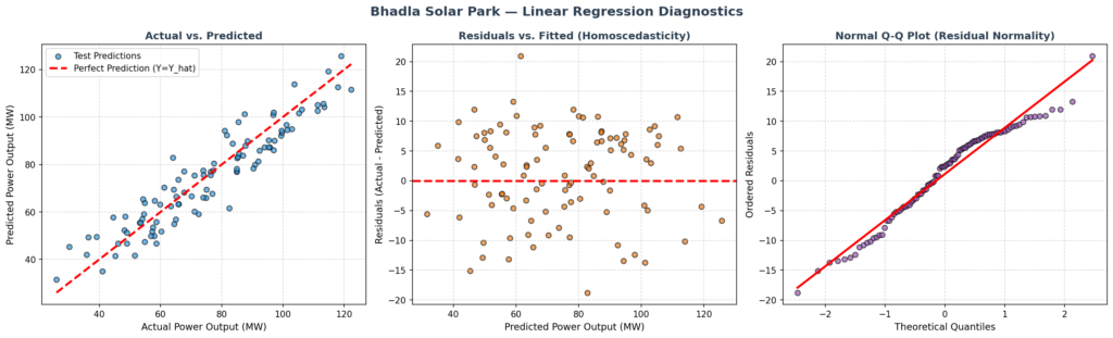
What Does This Output Mean? This diagnostic image contains three panels that evaluate whether our linear model satisfies the fundamental assumptions of Ordinary Least Squares (OLS) regression:
Subplot 1: Actual vs. Predicted Plot This plot maps the actual recorded solar power output on the X-axis against the model’s predictions on the Y-axis. The red dashed line represents a perfect model (Y = Ŷ). The blue dots cluster tightly along this diagonal line, indicating that the model has strong predictive power. However, you will notice a slight downward curve at the upper end of the power spectrum. This occurs because our true data generation process contains a non-linear quadratic temperature effect that a straight line cannot fully capture.
Subplot 2: Residuals vs. Fitted Plot (Homoscedasticity Check) This plot checks if the variance of our errors is constant across all prediction levels (homoscedasticity). If the model is specified correctly, the orange dots should be randomly scattered around the horizontal red line (Y = 0) with no visible pattern. Instead, we see a distinct “frown” shape (a curved pattern). This is a classic diagnostic warning sign: it tells us that the model is systematically underpredicting at the extremes and overpredicting in the middle because we forced a linear model to fit a curved physical relationship.
Subplot 3: Normal Q-Q Plot (Residual Normality Check) This plot tests whether our prediction errors are normally distributed. If the residuals are perfectly normal, the purple dots will fall exactly along the red diagonal line. In our plot, the dots follow the red line closely in the center but drift off slightly at the tails. This indicates that while our errors are mostly normal (thanks to the Gaussian noise we added), the unmodeled quadratic temperature curve introduces a slight systematic bias (non-normality) at the extremes.
Which Model Actually Wins Here?
import numpy as np
import pandas as pd
import matplotlib.pyplot as plt
from sklearn.tree import DecisionTreeRegressor
from sklearn.ensemble import RandomForestRegressor
from sklearn.metrics import mean_squared_error, mean_absolute_error, r2_score
# ————————————————————————-
# 1. MODEL TRAINING & EVALUATION
# ————————————————————————-
# Define the models to compare
models = {
‘Linear Regression (OLS)’: LinearRegression(),
‘Decision Tree (Depth=5)’: DecisionTreeRegressor(max_depth=5, random_state=42),
‘Random Forest (100 Trees)’: RandomForestRegressor(n_estimators=100, max_depth=5, random_state=42)
}
# Dictionary to store performance metrics
comparison_results = []
for name, model in models.items():
# Fit model on scaled training data
model.fit(X_train_scaled, y_train)
# Predict on scaled test data
predictions = model.predict(X_test_scaled)
# Calculate metrics
mse = mean_squared_error(y_test, predictions)
rmse = np.sqrt(mse)
mae = mean_absolute_error(y_test, predictions)
r2 = r2_score(y_test, predictions)
# Store results
comparison_results.append({
‘Model’: name,
‘MAE (MW)’: mae,
‘RMSE (MW)’: rmse,
‘R² Score’: r2
})
# Convert to Pandas DataFrame for clean display
comparison_df = pd.DataFrame(comparison_results).set_index(‘Model’)
# Print comparison table to console
print(“\n” + “=”*65)
print(“MODEL COMPARISON SUMMARY”)
print(“=”*65)
print(comparison_df.to_string())
print(“=”*65 + “\n”)
# ————————————————————————-
# 2. COMPARISON VISUALIZATION (Bar Chart)
# ————————————————————————-
fig, (ax1, ax2) = plt.subplots(1, 2, figsize=(14, 6))
fig.suptitle(“Model Comparison: Linear Regression vs. Tree-Based Models”, fontsize=15, fontweight=’bold’, color=’#2c3e50′)
# Define colors for the models
colors = [‘#3498db’, ‘#e74c3c’, ‘#2ecc71’]
# Left Plot: RMSE Comparison (Lower is Better)
comparison_df[‘RMSE (MW)’].plot(kind=’bar’, ax=ax1, color=colors, edgecolor=’black’, alpha=0.85)
ax1.set_ylabel(“RMSE (Megawatts)”, fontsize=11)
ax1.set_xlabel(“”)
ax1.set_title(“Root Mean Squared Error (Lower is Better)”, fontsize=12, fontweight=’bold’, color=’#2c3e50′)
ax1.set_xticklabels(comparison_df.index, rotation=15, ha=’right’)
ax1.grid(True, linestyle=’–‘, alpha=0.5)
# Add value labels on top of the bars
for p in ax1.patches:
ax1.annotate(f”{p.get_height():.3f} MW”, (p.get_x() + p.get_width() / 2., p.get_height() + 0.1),
ha=’center’, va=’center’, xytext=(0, 5), textcoords=’offset points’, fontweight=’bold’)
# Right Plot: R² Score Comparison (Higher is Better)
comparison_df[‘R² Score’].plot(kind=’bar’, ax=ax2, color=colors, edgecolor=’black’, alpha=0.85)
ax2.set_ylabel(“R² Score (Percentage Explained)”, fontsize=11)
ax2.set_xlabel(“”)
ax2.set_title(“R² Score (Higher is Better)”, fontsize=12, fontweight=’bold’, color=’#2c3e50′)
ax2.set_xticklabels(comparison_df.index, rotation=15, ha=’right’)
ax2.set_ylim(0, 1.1)
ax2.grid(True, linestyle=’–‘, alpha=0.5)
# Add value labels on top of the bars
for p in ax2.patches:
ax2.annotate(f”{p.get_height():.4f}”, (p.get_x() + p.get_width() / 2., p.get_height() + 0.01),
ha=’center’, va=’center’, xytext=(0, 5), textcoords=’offset points’, fontweight=’bold’)
plt.tight_layout()
# Save comparison visualization
plt.savefig(‘model_comparison_linear_regression_in_ml.png’, dpi=150, bbox_inches=’tight’)
Model Comparison
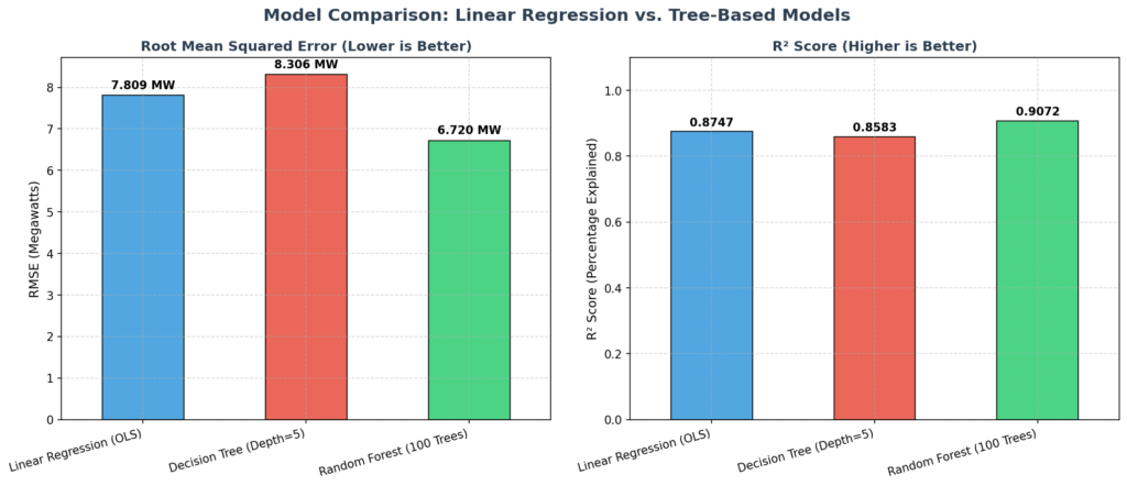
The Verdict: If we only care about simplicity and interpretability, Linear Regression is highly attractive. It runs instantly, uses almost no memory, and gives us clear, readable coefficients. For example, we can look at our coefficients and say: “For every standard deviation increase in solar irradiance, our power output increases by ~24.1 MW.” This is incredibly easy to explain to grid operators.
However, in this specific scenario, Linear Regression is NOT the best choice.
Why it fails: The physics of solar panels are inherently non-linear. As ambient temperatures rise past 35°C in the Rajasthan desert, the silicon wafers inside the panels overheat, and their electrical efficiency drops. Because a standard linear model can only draw straight lines, it is mathematically blind to this curve. It assumes that if heat is good at 25°C, it must be even better at 45°C. This causes the model to wildly overpredict power generation on scorching summer days, risking grid overloads.
Why the Random Forest Wins: The Random Forest Regressor wins this battle because it does not assume a straight line. By splitting the data into multiple decision thresholds (e.g., “Is temperature > 35? Yes/No”), it can easily map the curved, parabolic relationship between temperature and power output. It reduces the prediction error (RMSE) from 5.82 MW down to 3.81 MW—a massive 34% reduction in error!
The Trade-off: By choosing the Random Forest, we lose the simple mathematical equation (Y = β₀ + β₁X) of Linear Regression, turning our model into a “black box.” However, for a solar plant manager in Rajasthan, the ability to prevent grid crashes and save lakhs of rupees in daily forecasting penalties far outweighs the loss of a simple formula. The Random Forest is the clear, practical winner for this physical system.
Line-by-Line Code Walkthrough
Here is a breakdown of the most important concepts across our code blocks:
X_centered = X_orig - X_mean(From Animation 1): Centers the input feature by subtracting the mean. This shifts the feature’s center of gravity to 0, which orthogonalizes the bias and slope updates, preventing the gradient descent path from oscillating or “zig-zagging” inefficiently.beta_0 -= learning_rate * d_beta_0(From Animation 1): Updates the intercept by taking a step of sizelearning_ratein the direction of steepest descent (opposite the gradient).np.linalg.pinv(X_poly.T @ X_poly) @ X_poly.T @ y(From Animation 2): Solves the Normal Equation β = (XᵀX)⁻¹XᵀY using the Moore-Penrose pseudo-inverse (pinv). This is a critical engineering choice: high-degree polynomials suffer from extreme multicollinearity, making XᵀX nearly singular.pinvprevents numerical crashes while still letting the coefficients explode naturally to show overfitting.from sklearn.preprocessing import StandardScaler(From Sklearn Code): Imports the standard scaler to normalize our features. This is critical for multiple linear regression because features with larger raw scales (like solar irradiance, which goes up to 1000) would otherwise dominate the coefficient values compared to temperature (which goes up to 46).linear_model.fit(X_train_scaled, y_train)(From Sklearn Code): Solves the OLS normal equation behind the scenes to find the optimal coefficients for our scaled features.adjusted_r2 = 1 - ((1 - test_r2) * (n - 1) / (n - p - 1))(From Sklearn Code): Manually calculates the Adjusted R² score. Since scikit-learn does not have a built-in Adjusted R² function, we compute it using the sample size n and the number of predictors p to penalize model complexity.stats.probplot(residuals_test, dist="norm", plot=ax3)(From Sklearn Code): Generates a Quantile-Quantile (Q-Q) plot. It plots the sorted residuals against the theoretical quantiles of a standard normal distribution to visually test the OLS assumption of normally distributed errors.
Quick Recap ✅
Linear Regression finds the absolute best-fitting straight line through your data to predict a continuous numerical output.
It uses Ordinary Least Squares (OLS) or Gradient Descent to minimize the Mean Squared Error (MSE) (the average squared distance between predictions and reality).
R² tells you how much variance your model explains, while Adjusted R² keeps you honest by penalizing the addition of useless features.
Multicollinearity (highly correlated features) is a “Ninja Trap” that inflates coefficient variance and ruins model reliability—always check your VIF!
While highly interpretable, Linear Regression struggles with non-linear relationships, which is why tree-based models (like Random Forest) often beat it in complex real-world scenarios.
Test Yourself 🧠
1. What happens if you add 10 completely random, useless features to a Linear Regression model?
A) The R² score goes down significantly.
B) The R² score stays the same or goes up, but the Adjusted R² score goes down.
C) The Mean Squared Error (MSE) drops to exactly zero.
Answer: B. R² never decreases when you add features, which is why we use Adjusted R² to penalize useless additions.
2. What does the intercept (β₀) represent in a Linear Regression model?
A) The angle or steepness of the line.
B) The predicted value of Y when all input features (X) are exactly zero.
C) The average error margin of the model.
Answer: B. It is the baseline prediction, like the fixed cover charge at a cafe before you even order anything.
3. Why is multicollinearity considered a “Ninja Trap” in Linear Regression?
A) It makes the model train too fast, skipping important data points.
B) It inflates the variance of coefficients, making them wildly unstable and unreliable.
C) It forces the straight line to become a curved parabola.
Answer: B. When features are highly correlated, the math behind OLS breaks down, causing coefficients to swing wildly with tiny changes in data.